Palm Pre 2 review
After a false start from Palm, is the Pre 2 the iPhone killer we were always promised?

Palm’s previous incarnation of the Pre was a case of so near yet so far. It had the most elegant user interface beside the iPhone, but the hardware was underpowered and cheap-feeling. Version two promises to address both these issues, as well as boasting a new, multitalented webOS 2.0.
Double take
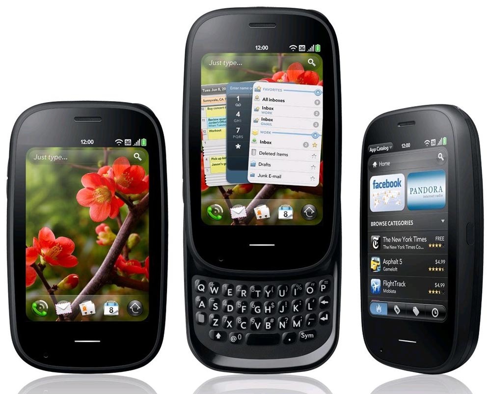
A casual glance won’t detect any design changes from its predecessor, the Pre Plus, but it has been tweaked. Its black pebble-shaped chassis remains highly pocketable, while a new tough Gorilla glass panel is now flush to the front rather than slightly curved and the glossy plastic casing has been replaced with a soft paint finish.
The 3.1in, 320×480 pixel screen isn’t an ideal size or resolution for web browsing, which is best enjoyed in landscape orientation. Adobe Flash 10.1 is supported, but embedded video playback stuttered terribly, even over Wi-Fi, and was unwatchable at times.
If you can get along with the sticky, rubbery keyboard, the Pre 2 is a great messager. It supports multiple email accounts, which can be viewed in one inbox or separately. HP Synergy also brilliantly integrates your various email, phone and Facebook contacts in one place, along with your different calendars.
Super-slick webOS 2.0
The processor has been almost doubled in speed from 600MHz to 1GHz and it shows; performance is nippy, with little sign of lag when handling multitasking duties. It also switches between apps quickly and efficiently via the webOS 2.0’s ace Cards system, with seemingly no limit on the number you can have open.
A new Card Stack function further groups together related apps. The OS will itself decide which ones belong together, but you can manually arrange unrelated cards in this way, too. It all makes toggling between apps super-slick and easy.
Universal Search has been renamed and its capabilities expanded. Start typing from the homescreen and it will bring up related web and phone searches, or you can use the text to instantly create emails, SMS, tasks, memos, calendar events and Facebook status updates, all via the Quick Actions panel. Simple and brilliant.
The Pre 2’s Launcher panels are now fully customisable, allowing you to create new ones, rename and reorder them and move apps from one Launcher to another. This brings webOS 2.0 in line with Android and iOS and gives it the menu personalisation element that was so seriously lacking in previous versions.
Sparse App Catalog
App Catalog has been redesigned for easier navigation – including a superior sub-category search facility – but with only around 4,500 apps on board it’s lagging behind rivals for choice. Having said that, Palm has made an SDK available to developers, which could soon bolster the store.
The Plus’s woefully substandard 3MP snapper has been hiked to 5MP, but it’s still alarmingly bereft of settings and modes. The LED flash is a hit-and-miss affair: it only shoots VGA video and, although the fixed focus optics take surprisingly sharp snaps with a steady hand, we expect better functionality from a flagship smartie.
Intensive use demands a daily charge, but fortunately you can just plonk the handset on the optional magnetic Touchstone to re-juice it. Palm has definitely upped its game with the Pre 2, but the leaps made in the OS need to be mirrored in the design to truly rival the iPhone.


