Polar Vantage V3 review: AMOLED tracking at a price
Even with a few shortcomings, it secured a place on my wrist
Stuff Verdict
A vibrant AMOLED display, slick interface and full suite of fitness features make the Vantage V3 a complete training tool – but a price hike means it’s very much a premium wearable.
Pros
- Clear screen and slick interface
- Watch face customisation options
- Advanced fitness training features
Cons
- Always on display drains battery
- Can’t add maps via the app
- More expensive than before
Introduction
With no apps, limited customisation and a laggy touchscreen, the Polar Vantage V2 was a wearable that favoured utility over connectivity. Yet I found that approach counted in its favour: when I reviewed it back in 2020, the V2 proved a targeted tool with a suite of features focused on training and recovery. Even with a few shortcomings, it secured a place on my wrist – until Polar contacted me about testing its successor.
On paper, Polar has introduced improvements which should make the Vantage V3 a better wearable across the board. It ships with a larger display that’s now a punchy AMOLED number. Slimmer bezels and flush strap mounts give it a neater look. The interface is faster and slicker, too, while new sensors unlock blood oxygen saturation and ECG testing.
But with a significantly higher price tag that puts it firmly in the premium tier – $600/£519 – the Polar Vantage V3 needs to get a lot right to sway fitness fans away from rivals like the Garmin Forerunner 965. Do the upgrades justify the outlay?
How we test wearables
Every smartwatch and fitness tracker reviewed on Stuff is worn 24/7 throughout the testing process. We use our own years of experience to judge general performance, battery life, display, and health monitoring. Manufacturers have no visibility on reviews before they appear online, and we never accept payment to feature products.
Find out more about how we test and rate products.
Original review published on 4 February 2024
Design & build: metal, made better
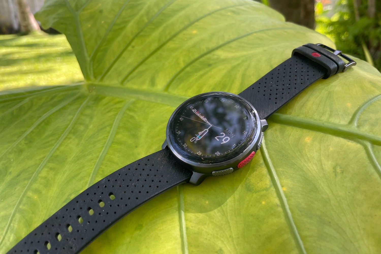
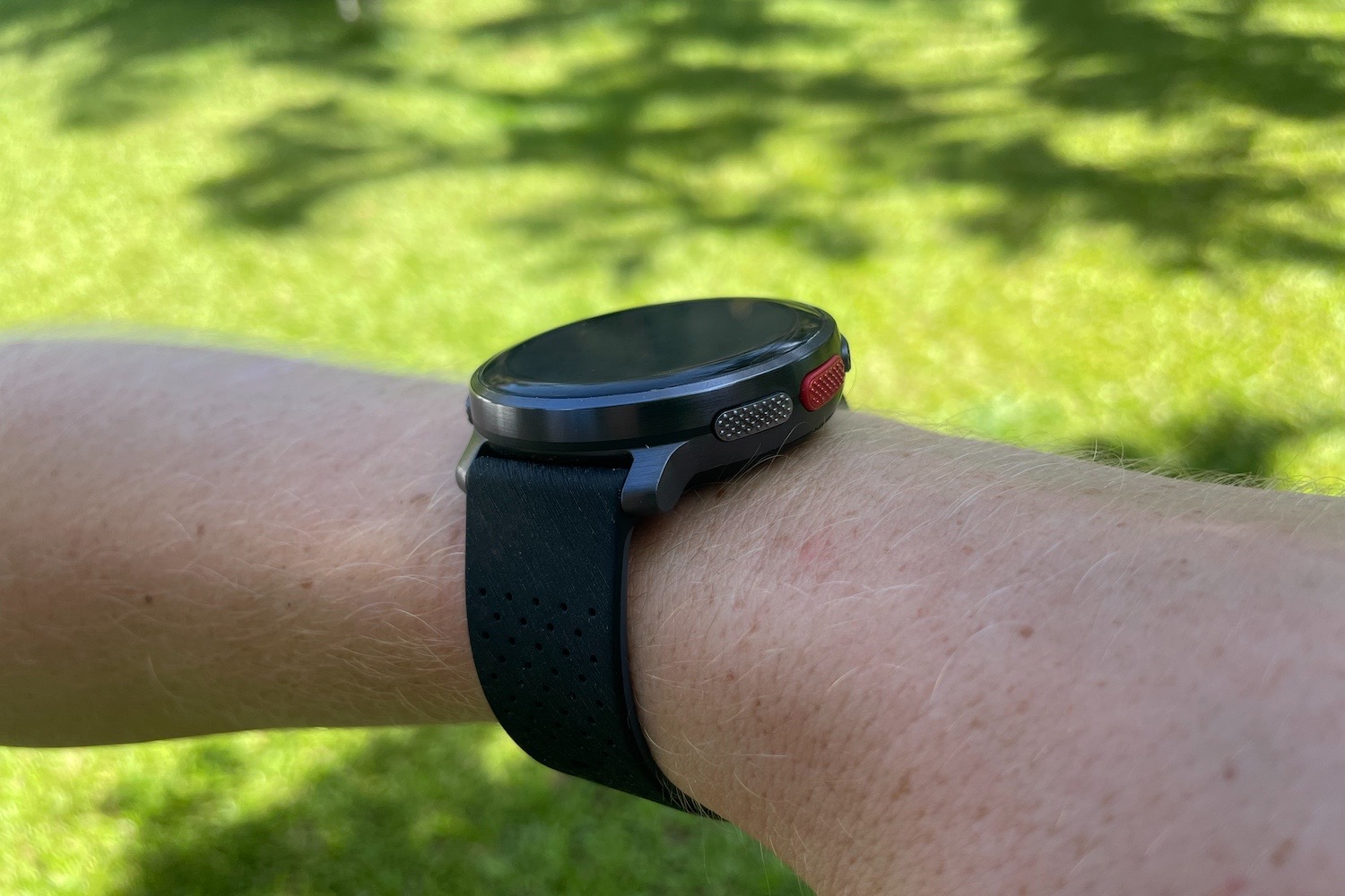
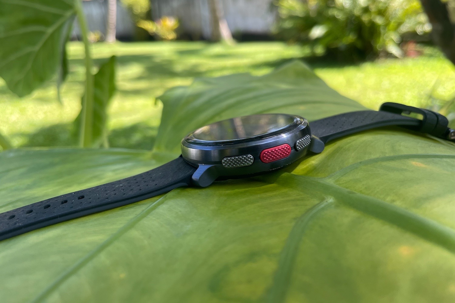
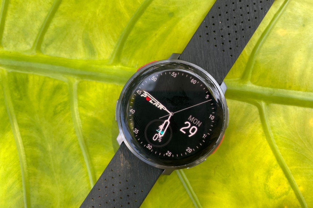
Much of the Vantage V3’s design DNA is adopted from its predecessor, and that’s no bad thing. I was already a fan of the low-key aluminium casing, which is sleeker than some of the bulkier sports wearables out there. The knurled buttons are nicely tactile, too. For me, the stealthy looks of the Night Black model steal the show – although the silver variant is hardly unattractive.
Despite measuring a pinch thicker at 14.5mm (versus 13mm), I think the V3 actually looks slimmer on the wrist. This is partly because the V3 has a flatter back and sides, versus the one-piece curve of the Vantage V2. It also helps that the V3 uses a standard quick-release strap which sits flush with the case, instead of the moulded proprietary mount of the V2.
I’m also glad that Polar has put the bezel on a diet and taken away the minute markers which were printed around the face of the Vantage V2. Together with a Gorilla Glass 3 crystal that curves subtly at the edge, these changes combine to create a cleaner, more stylish timepiece that – despite being water-resistant to 50m – doesn’t shout too loudly about its sporty credentials.
Screen: colour me sharp
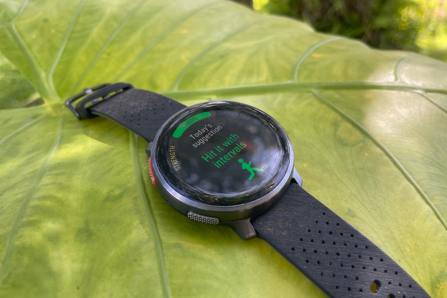
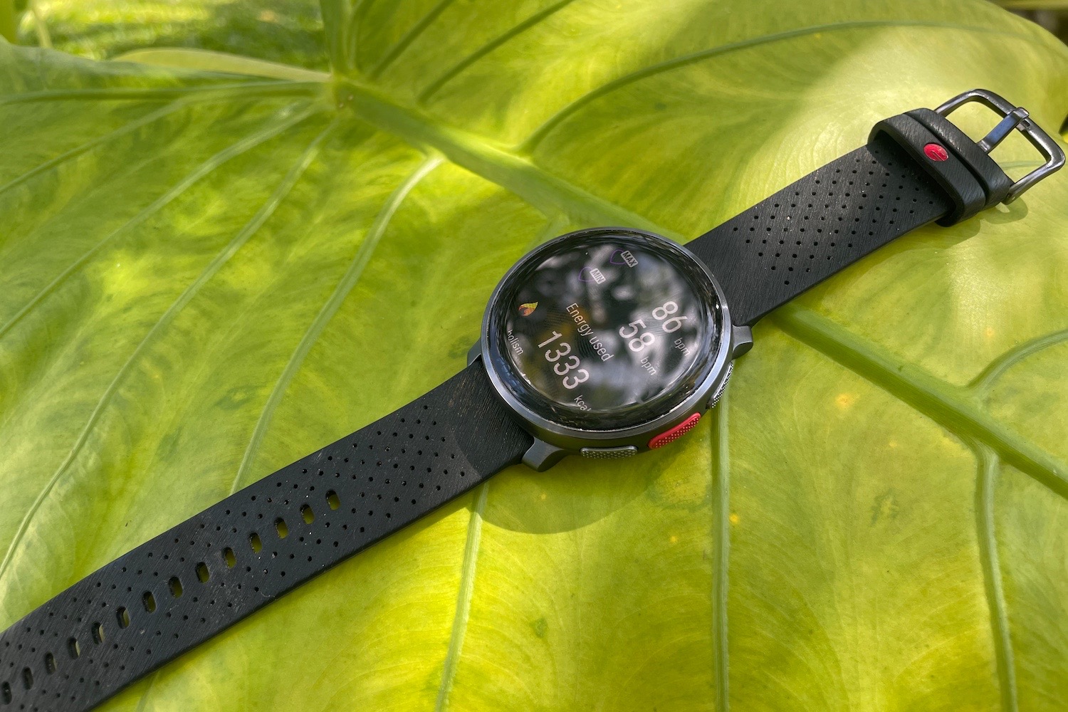
Switching from the Vantage V2 to the V3, the huge boost in screen quality is unmissable. Gone is the low-res MIP display; in its place lives an AMOLED panel that’s almost twice as sharp and infinitely more colourful. I don’t think it’s quite bright enough in full sunlight, but it’s still a treat for the eyes and one that makes the whole interface pop.
The touchscreen is another point of vast improvement. I didn’t find it entirely free from lag, but it proved orders of magnitude more responsive than the V2 – to such an extent that it’s actually a viable and enjoyable way to interact with the watch. Swiping is generally a smooth experience, while a small but notable size increase to 1.39in gives everything on screen a bit more breathing room.
New for the Vantage V3 is an always-on option. When the main AMOLED is off, this can display a dimmer monochrome face featuring just the time. This is a welcome addition for me, even if enabling the setting results in a significant reduction in battery life. My one real gripe is that the wrist-flick-to-wake action wasn’t always responsive enough during a workout.
Interface: as you like it
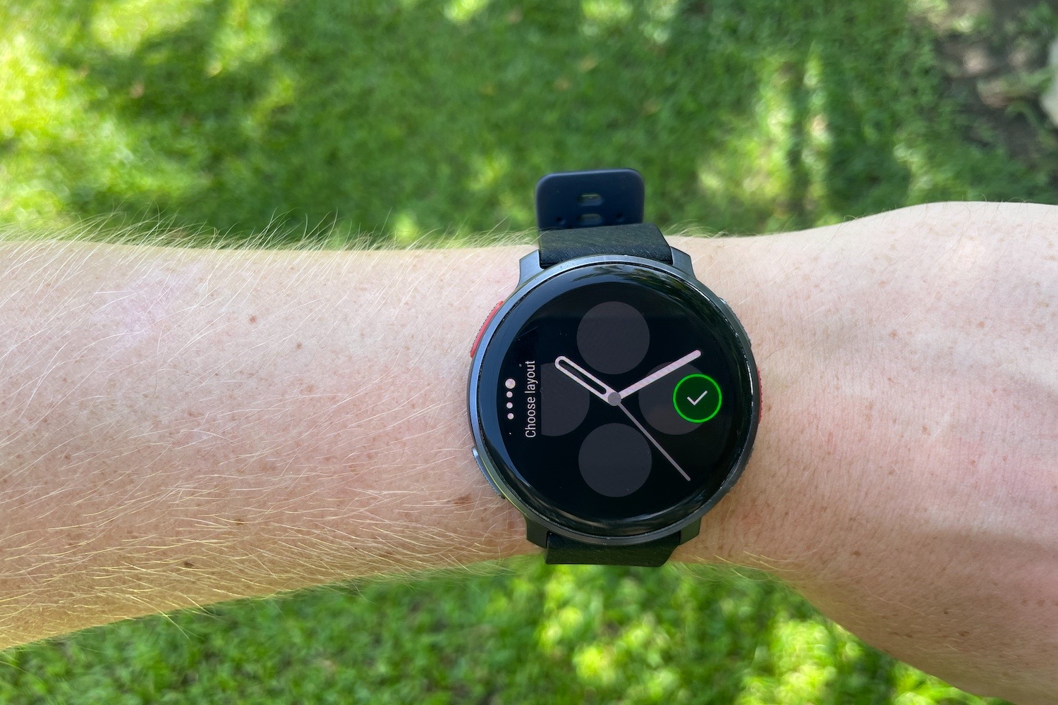
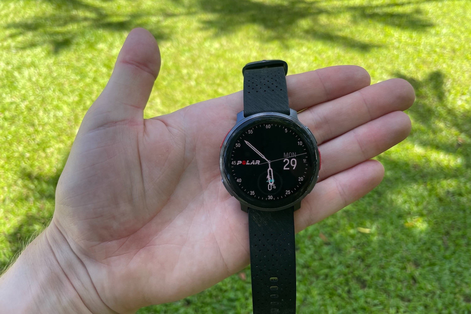
At first glance, the Vantage V3’s interface is very similar to the one found on the V2. But while the bones of the software are the same – including the menu structure and several of the summary screens – there are a number of key updates which make the V3 a more accessible tool.
Chief among them is the addition of widgets to watch faces. These allow you to add up to four data readouts or function shortcuts for easy access. From step count to calendar, I found that these genuinely streamlined my experience with the Vantage V3. Together with the option to select which dashboards you want to scroll through, it’s a wearable you can more easily make your own.
Polar has also amped up the V3’s processing power, something which becomes immediately obvious while navigating the interface. I found everything that much snappier and smoother when swiping through the UI. The only time I really encountered any lag was panning around maps. Even with this delay, the new ability to save maps offline is a useful one, with the additional detail making route guidance more meaningful. I do wish it was possible to load them through the smartphone app, though.
Health & fitness: extra metrics
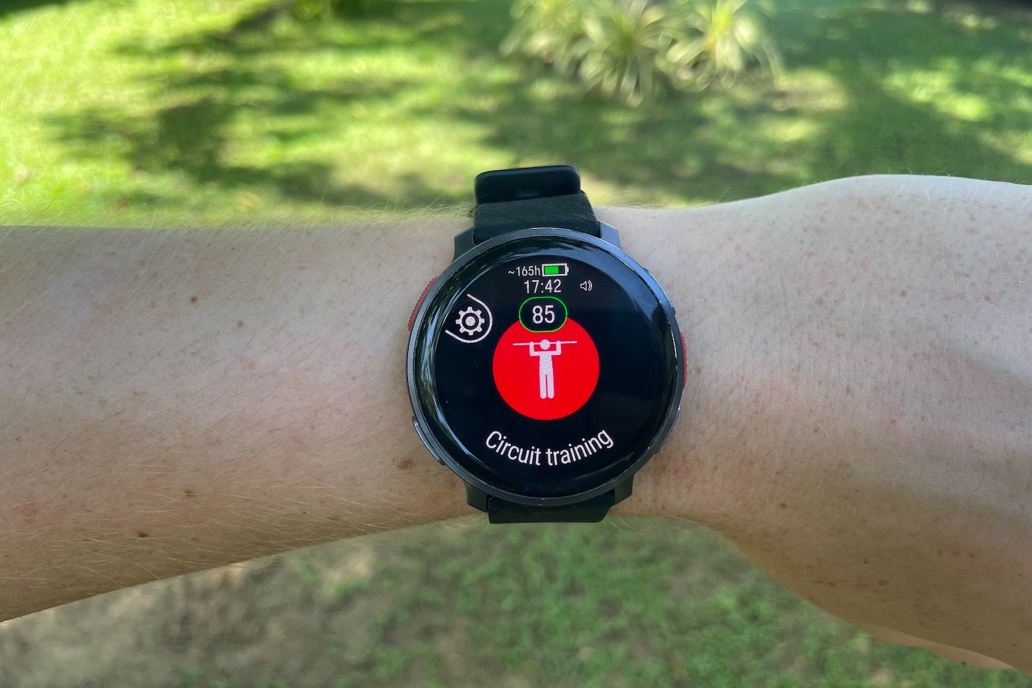
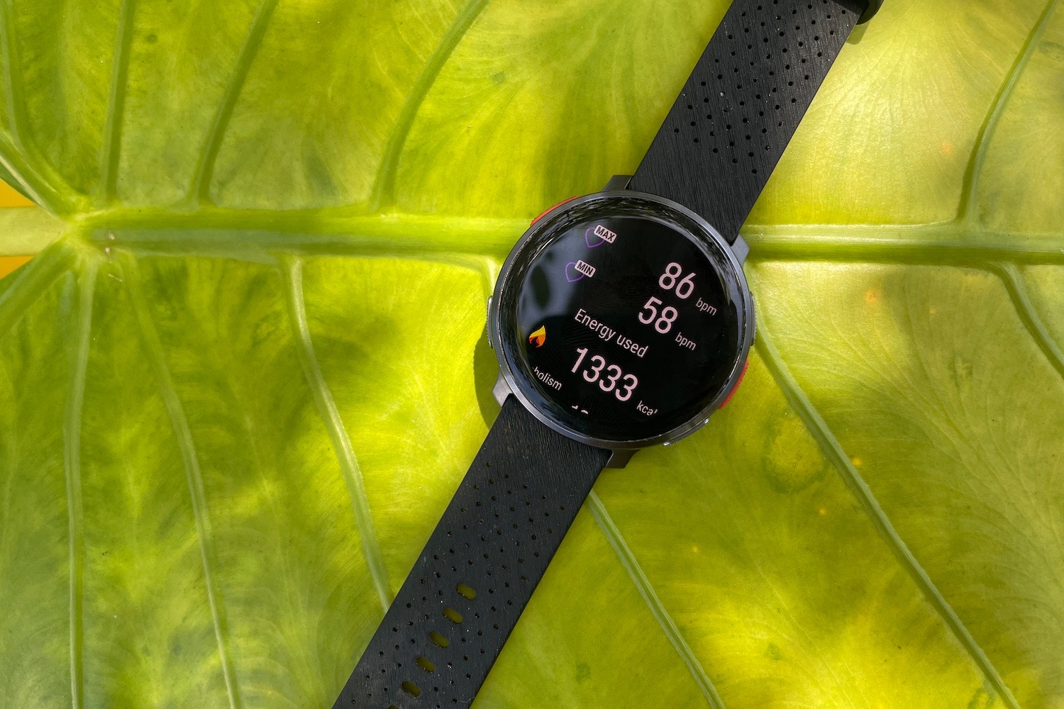
There was no criticising the Vantage V2 when it came to training and recovery tools. Features such as Recovery Pro and Training Load Pro offered genuinely useful conditioning insights to inform your workout schedule, while SleepWise and Sleep Plus Stages provided some of the most detailed nocturnal analysis out there. The V3 takes that same arsenal and adds a handful of new features to make it one of the most comprehensive wearables for wellness tracking and feedback.
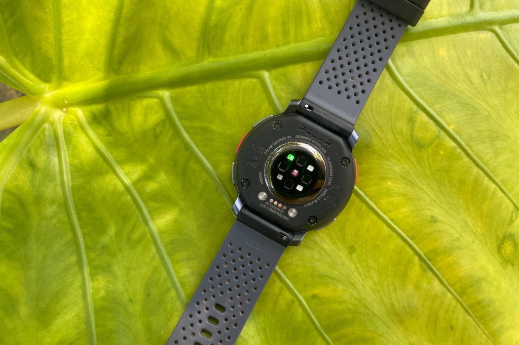
New to the list of sensing skills are blood oxygen saturation, overnight skin temperature and the option to take an electrocardiogram. Together with a more accurate heart rate monitor, these stats add greater depth to the V3’s health insights. I felt like the watch was in my corner, fully assessing my fitness metrics to help me perform better – an impression backed up by the ability to perform an Orthostatic Test without a chest strap.
I was pleasantly surprised by the accuracy of heart rate data, which is often a thorny point for wrist-based wearables. Figures did tend to be a little on the low side, and it wasn’t quite as responsive to rapid changes as a chest strap, but I still found the V3’s readings reliably consistent across multiple workout categories.
The catalogue of sport profiles has been expanded from the V2, with more than 150 now on offer – up to 20 of which can be loaded onto the Vantage V3 at any one time. Feedback and readouts vary by discipline, although I wouldn’t mind a little more scope for customising individual screens. Polar has also refined its swim-tracking for the V3, though I can’t say I noticed a huge difference in results versus stroke counting with the Vantage V2.
GPS made it onto Polar’s upgrade list as well, with a switch to dual-frequency. I already found the Vantage V2 fairly quick to find a satellite fix – and accurate once it had. From my time testing the V3, its support for L1/L5 frequency bands has only improved this. I was never left pacing to find a signal and routes were pretty much bang-on, even when running under tree cover.
Battery life: room for improvement
The Vantage V2 had decent enough battery life, but hitting claimed figures meant taking measures to eke it out. It’s a similar story with the V3. On paper, Polar has boosted capacity significantly, up from 346mAh to 488mAh. Polar reckons that translates into eight days of standard usage, but the reality is a bit different.
For starters, enabling the always on display drastically reduces longevity. This is a shame, because it’s a feature I think a lot of people will want to use – but perhaps not at the expense of two days’ battery life.
With the always on display disabled, I’d say five days of mixed usage is a more realistic estimate. Think a few indoor sessions, a handful of GPS workouts and 24/7 heart rate tracking. That’s essentially the same as the Vantage V2. Like the V2, you can elongate staying power by adjusting certain settings (such as GPS accuracy), but you’re unlikely to achieve that eight-day target with regular usage.
Polar has redesigned the charging cable for the V3. It’s now a USB-C number with a small bar that attaches magnetically to a port on the back. This is a neater setup than previously, but it doesn’t always lock on first try. The cord also remains frustratingly short, while charging from empty takes several hours, even paired with a powerful plug.
Polar Vantage V3 verdict
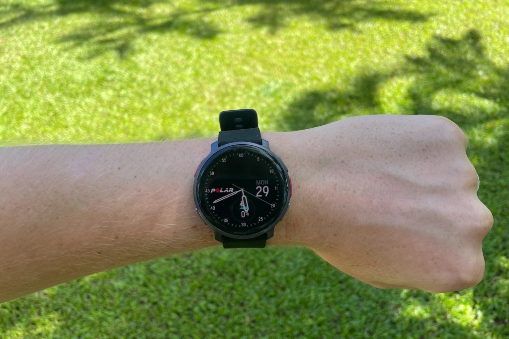
After wearing the Vantage V3 for several weeks, I think it’s the closest thing to a complete wearable that Polar has ever made. It’s well designed, slick to use and tracks as many metrics as pretty much anything on the market. It addresses almost all of the drawbacks of the V2 – including the laggy interface – and refines the whole experience for good measure.
But there are a few reasons why it’s still docked a star. Battery life remains the major stumbling block, particularly if you want to use the always on display. Then you have the minor frustrations that distract from an otherwise lovely experience. The lack of offline music, the inability to load maps through the app, the need to manually press a button to sync activity data to your smartphone – and the charging cable that needs a double check.
For a watch at this price, these feel like the sort of snags that should be ironed out. But I’m being harsh only because this is a truly fantastic piece of kit, and one that’s just inches from perfection. Frankly, every wearable has a few niggles here and there, and the Polar Vantage V3 really delivers where it matters. If you love activity data, like a tidy design and want a watch that’s easy to live with, I can highly recommend the Vantage V3.
Stuff Says…
A vibrant AMOLED display, slick interface and full suite of fitness features make the Vantage V3 a complete training tool – but a price hike means it’s very much a premium wearable.
Pros
Clear screen and slick interface
Watch face customisation options
Advanced fitness training features
Cons
Always on display drains battery
Can’t add maps via the app
More expensive than before
Polar Vantage V3 technical specifications
| Screen | 1.39in, 454×454 AMOLED |
| CPU | 275 MHz |
| Memory | 37MB |
| Storage | 32GB |
| Operating system | Proprietary |
| Sensors | Heart rate, SpO2, skin temperature, ECG, accelerometer, barometer, compass |
| Battery | 488mAh |
| Durability | WR50 |
| Dimensions | 47×50.8×14.5mm, 39g (watch body only) |

