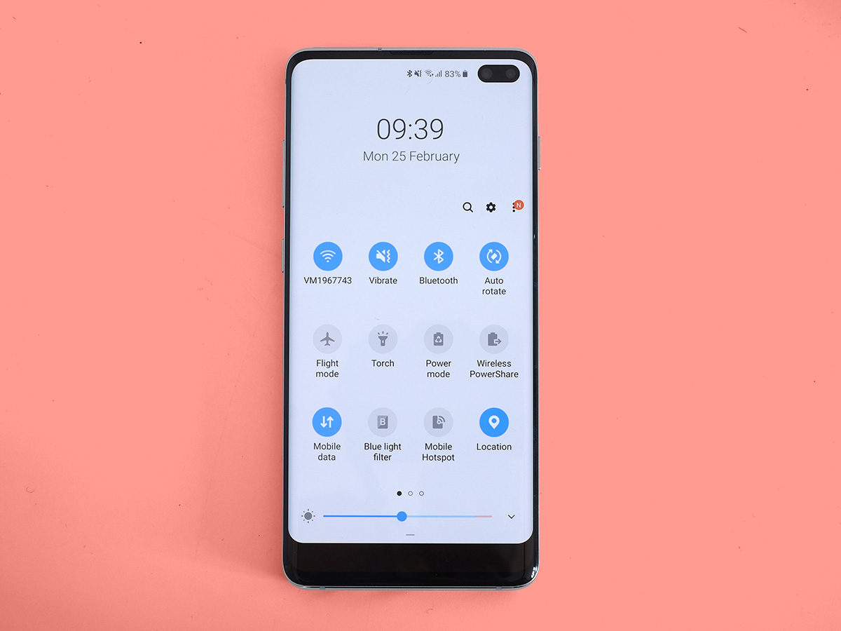
Samsung Galaxy S10+ review
The S10+ is trying really hard to stand out, but is it enough?
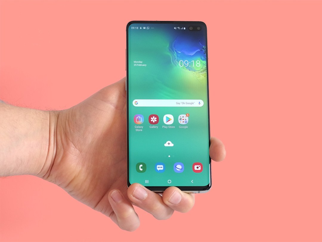
The Samsung Galaxy S10+ is one of the most important phones of the year, and probably one of the best too.
But producing world-class phones is not easy. What makes a phone the talk of tech town one month won’t earn much more than a shrug when another company’s take on the idea arrives a few months down the line.
And that’s the thing. The tech that makes the biggest impact on your day-to-day life in the S10+ was already shown off in the Huawei Mate 20 Pro. And that phone is £150-170 less.
This is the Samsung Galaxy S10+ only real issue, along with a price that’s enough to bring tears to your eyes. Just like last year, it starts at £899, and the 512GB version costs £1099.
Design and build: Bend and stretch
The Samsung Galaxy S10+ is part of Android’s most important phone dynasty. You don’t throw out the formula with that kind of success, and Samsung hasn’t discarded the parts that made its flagship phones since 2015 so popular.
Why 2015? That was the year of the Galaxy S6, when Samsung went full throttle on metal and glass phones. There’s a direct line from that phone to this one.
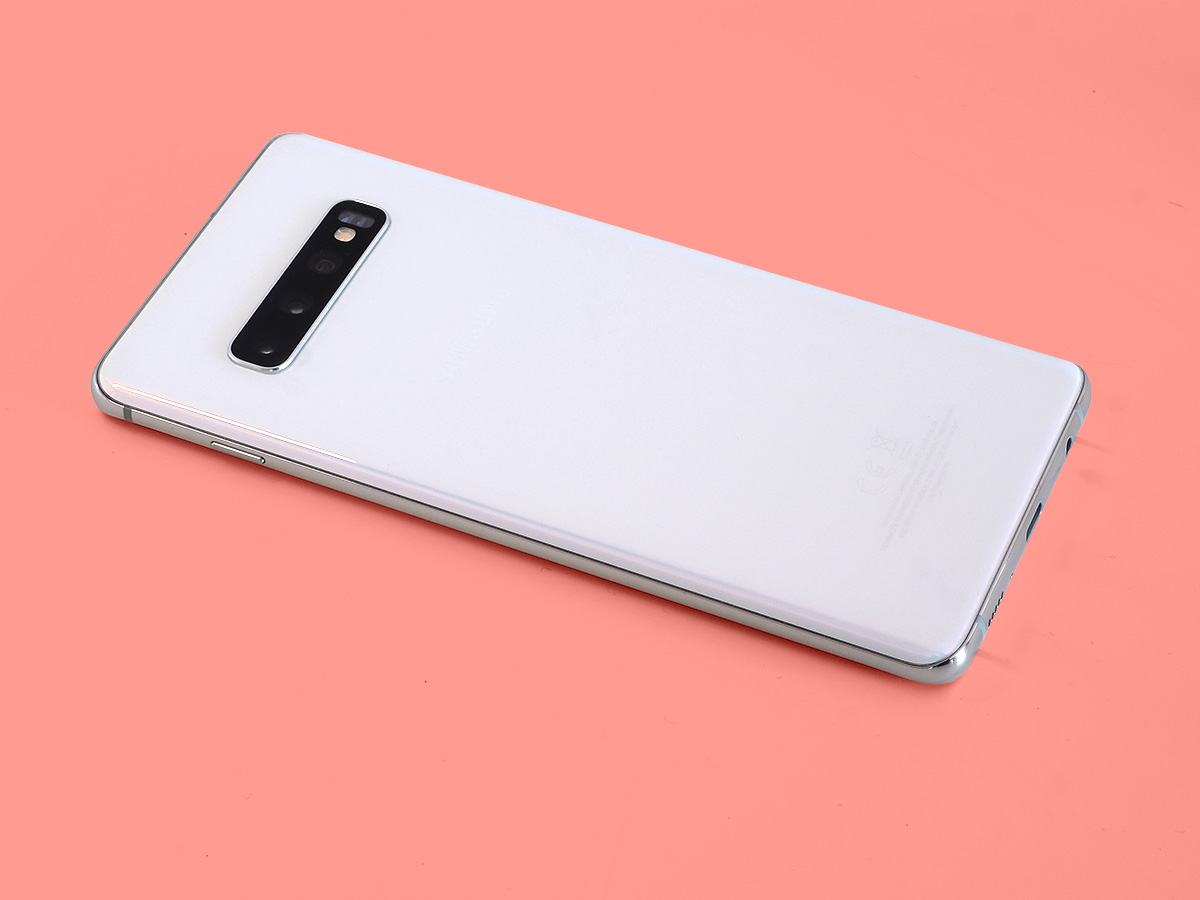
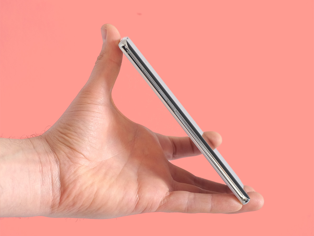
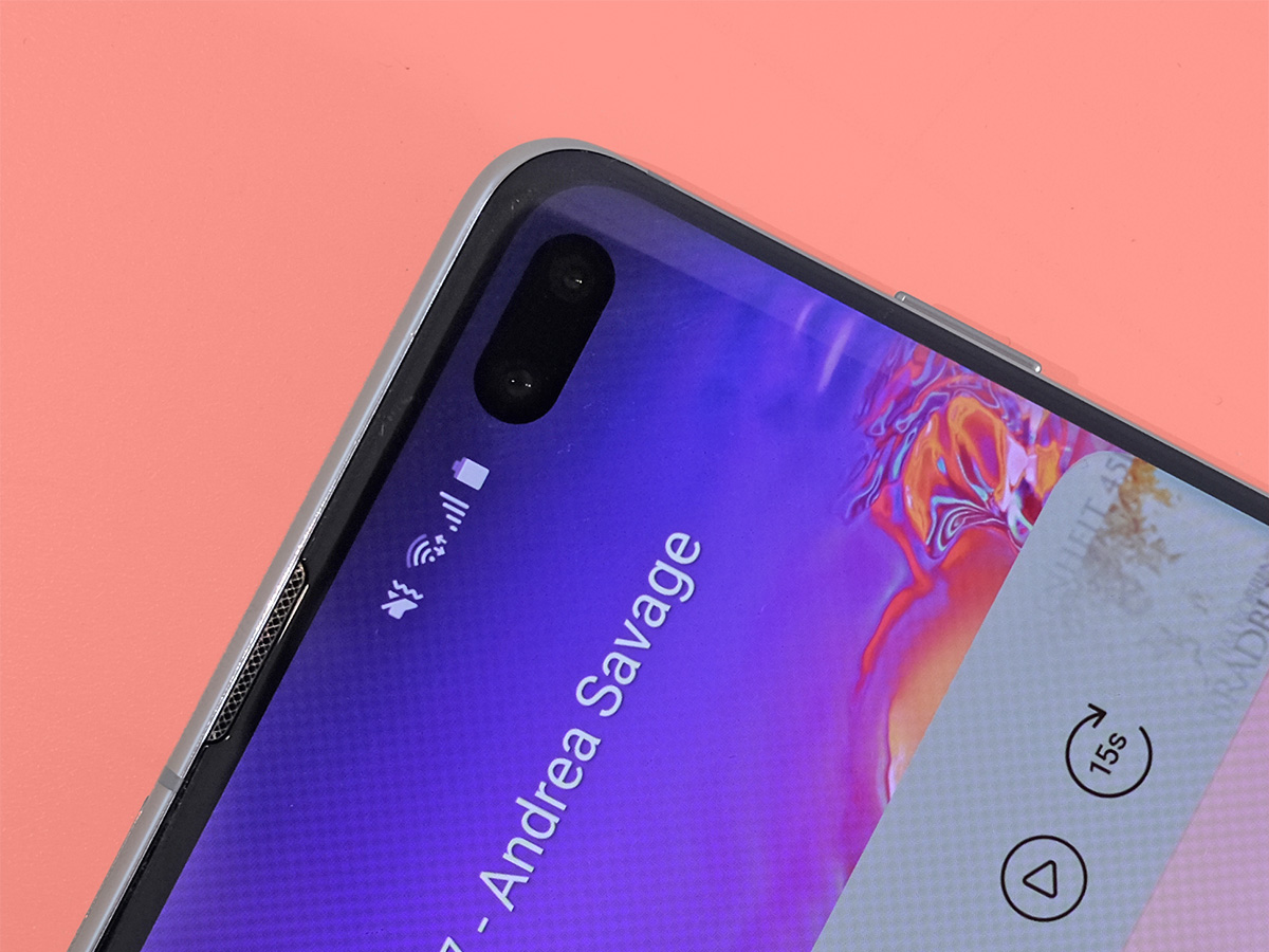
The Samsung Galaxy S10+ has curved Gorilla Glass on front and back, with a band of shiny aluminium that sits between. The Infinity-O display is the year’s big change. In the two other Galaxy S phones for 2019, the S10 and S10e, this involves just a little punch hole cut out of the OLED display, but the Samsung Galaxy S10+’s dual front cameras demand a bit more space.
This means its cut-out is much wider. It is more distracting, but if you can zone out to the extent you don’t see that black blip in the front, the phone has the most all-screen front of any phone that doesn’t have a slider mechanism – 93.1% screen-to-body ratio. And one of those brings its own problems, including a thicker, heavier frame and one more part that might break at some point
There’s some Samsung special sauce here too. The display bends around the curves at the side, allowing for screen surrounds that seem much slighter than those of any mainstream pure flat phone.
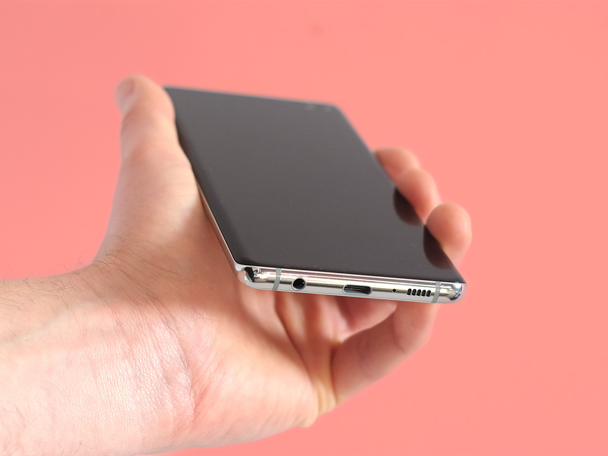
Samsung has also made no moves to put those who own earlier Galaxy S phones off. You still get a microSD slot and a headphone jack, which is becoming rarer by the month among top-end phones. None of the Galaxy S10+ direct rivals have one, which is kind of a big deal.
The Samsung Galaxy S10+ also has IP67 water resistance and at least 128GB storage.
Its ultrasonic finger scanner is one of the tech tentpoles. A bunch of phones now have in-screen fingerprint scanners like this one, but most use an optical sensor, the equivalent of a little camera that takes a snap of your finger to see if it looks like the real deal.
This phone uses ultra-high frequency sound waves. The scanning is ‘3D’ to an extent, and less likely to be derailed by a bit of crisp packet grease or finger moisture than the capacitive sensors of older Samsungs.
It is, to be frank, a bit weird, though. The scanner itself works fairly well, roughly on par with the optical sensor used in the OnePlus 6T. However, where optical pads light up whenever you get a finger near them, as this light is used to make your fingerprint visible, the Samsung Galaxy S10+ makes you guess where the pad is.
A few days in you get used to its position. But it’s the equivalent of a totally flat rear finger scanner you can find by touch. Yes, if you press the power button the Samsung Galaxy S10+’s display turns on and you can see where the pad is on the lock screen. The whole point of an Ultrasonic scanner is that it’s meant to be more reliable, and therefore quicker, though. Pressing the power button slows everything down.
When you get down to it, the real problem with tech in this area is that all the various solutions are great. Front finger pad? Great. Rear one? Perfect. Optical in-screen display? As long as it’s not one of the very earliest ones, why not?
Ultrasonic hardware has a neat backstory, but it doesn’t make the Samsung Galaxy S10+ a better phone in any meaningful way.
Display: Notch avoidance
But does the punch hole screen? This is the most obvious new addition this year. Samsung has avoided putting a notch in any of its flagship phones, jumping straight into this Infinity-O style instead.
We’ve already covered some of the reasons for mixed feelings here. The all-screen look is fantastic, but the chunk of display the cameras eat is obvious if, say, you watch a movie. It’s even more obvious in apps with white backgrounds. And it’s much bigger than that of the Galaxy S10 or Honor View 20. It’s part of the look here.
There’s no removing it either. Most notchy phones let you hide the bulge with a black bar. But Samsung has gone all in. The camera lozenge is there whether you want it or not. If Samsung did add this option it’d leave you with a great big lopsided bit of bezel at the top, which would look worse anyway.
To be honest, if you’re going to get offended by the Infinity-O screen for anything but movie-watching, it’s probably your problem rather than Samsung’s. When you use apps Samsung uses clever optimisation to make sure the hole doesn’t get in the way. It acts like part of the notification bar, but borrows the colour of the app’s own screen to blend in better.
All of Samsung’s usual OLED strengths are here too. This phone can go insanely bright, able to kick brightness up to 1200 nits on a bright day. It shrugs off direct sunlight. Colour is rich, contrast is superb.
Samsung has changed the screen customisations it allows this year, though. The Samsung Galaxy S10+ only has ‘natural’ and ‘vivid’ modes. In previous years you had a handful. It was a real doffing of the cap to the screen nerds. You could say it has sold out and gone mainstream. But can a line this popular actually “sell out”? Probably not.
Performance & software: Devil on horseback
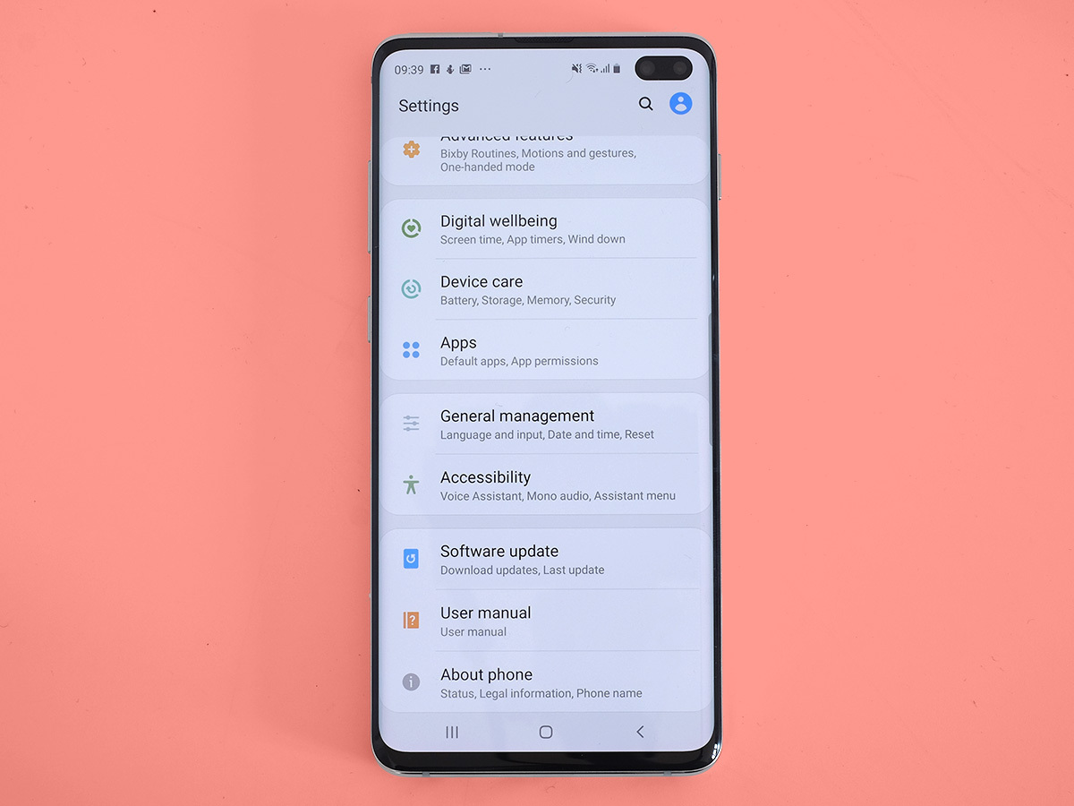
So, why the customisation cutbacks? It’s all about the One UI. This is Samsung’s attempt to slim down its software and make it look more friendly.
