Samsung Galaxy S10e review
The step-up flagship savvy Samsung fans have been waiting for?
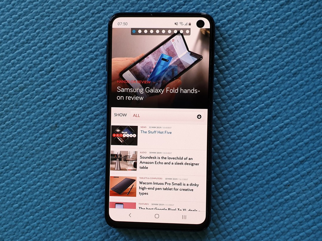
Finally, a flagship phone with a bit of sympathy for your wallet.
With the Galaxy S10+, Huawei P30 Pro and Apple iPhone XS Max all demanding close to £1000 of your hard-earned cash for a place in your pocket, it was starting to look like top-end phones were going to be forbidden fruit for many of us mere mortals. That’s why the prospect of a discount Galaxy has got us salivating.
Samsung has basically stripped back a few of the S10’s more premium features for this smaller, ‘essential’ version – but it’s still every bit the high-end phone. And in one respect, it might actually be the best variety of S10 going.
DESIGN & FEATURES: ZZZ
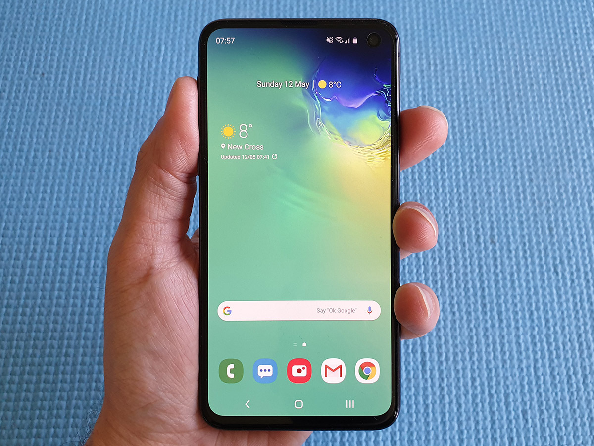
Anyone with dainty digits will appreciate how unwieldy phones have become, but at 5.8in, the S10e is far more manageable than its bigger brothers. It’s far easier to hold and use one-handed, without worrying an errant swipe will send the whole thing tumbling. The flat panel is a bit easier to hold tightly than the curved glass found in the more expensive phones, too.
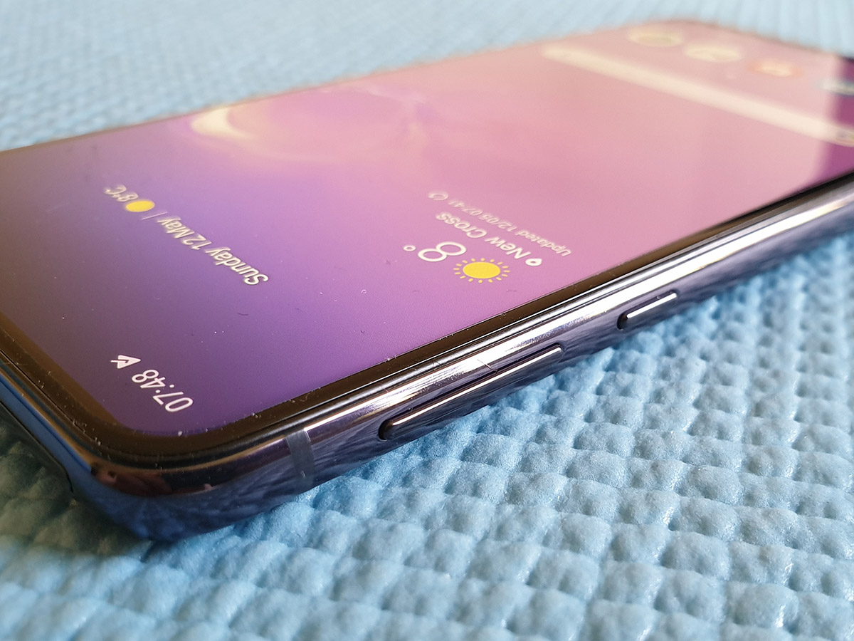
It does help if you’re right-handed, though. That’s because the fingerprint sensor is built into the frame, rather than on the back like last-gen Galaxies or under the display like the S10.
It’s perched near the top, so southpaws will need to stretch their index finger to reach. Better to use your right thumb: it makes it easier to reach and covers the whole sensor, which helps speed up detection. The sensor doubles as a power button, which can be swiped to pull down the notification tray – handy if you can’t quite reach the top of the screen, even on a tiddler of a phone like this.
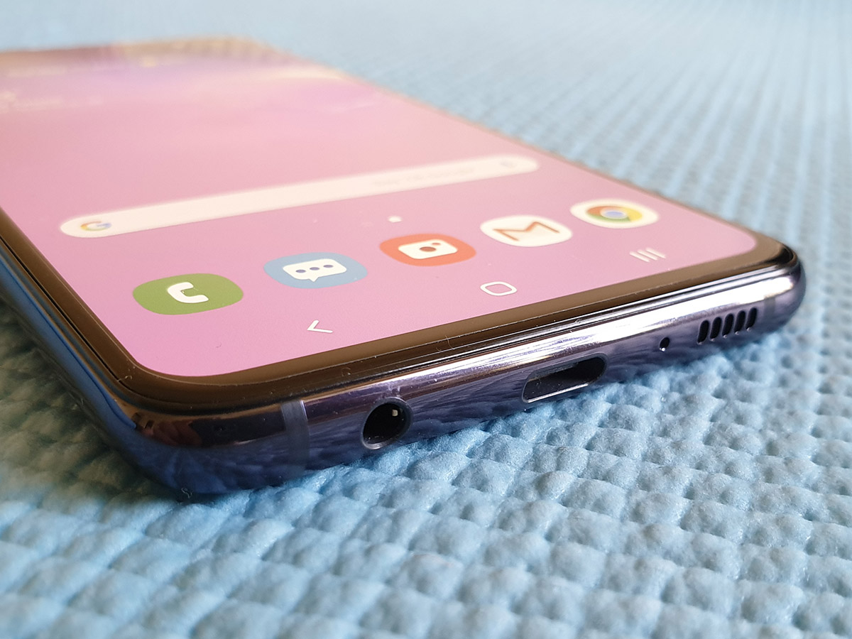
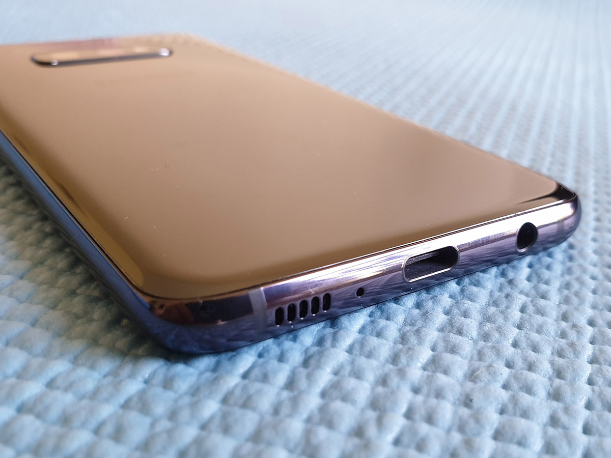
This is still a glass and metal slab, of course – don’t go thinking Samsung would cheap out with plastic on a phone carrying the S10 name. It hasn’t fallen out of love with the humble headphone socket, either; it’s right there next to the USB-C charging port. The S10e feels every bit the premium product, just a bit smaller than we’re used to.
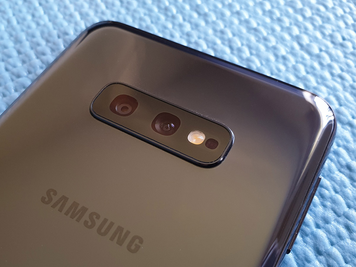
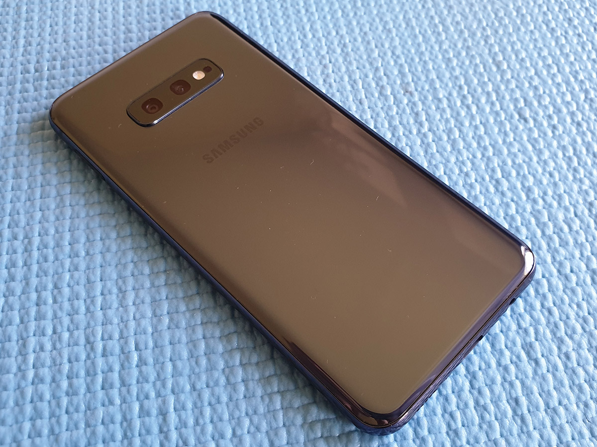
There’s one less camera on the back, and the removal of the rarely-used heart rate sensor means the lenses don’t protrude quite as far – but that also means there’s less to stop the all-glass phone from slip-sliding away on less than flat surfaces. A case should stop it constantly trying to nosedive from the sofa to the floor.
DISPLAY & SOUND: FLAT, STILL FANTASTIC
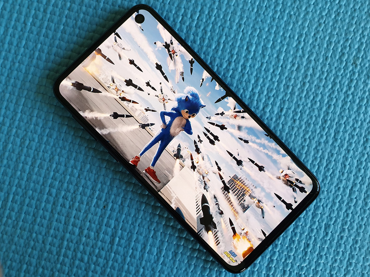
There might not be any fancy curved glass going on here, and resolution has taken a dip compared to the Galaxy S10, but the screen is no second class citizen.
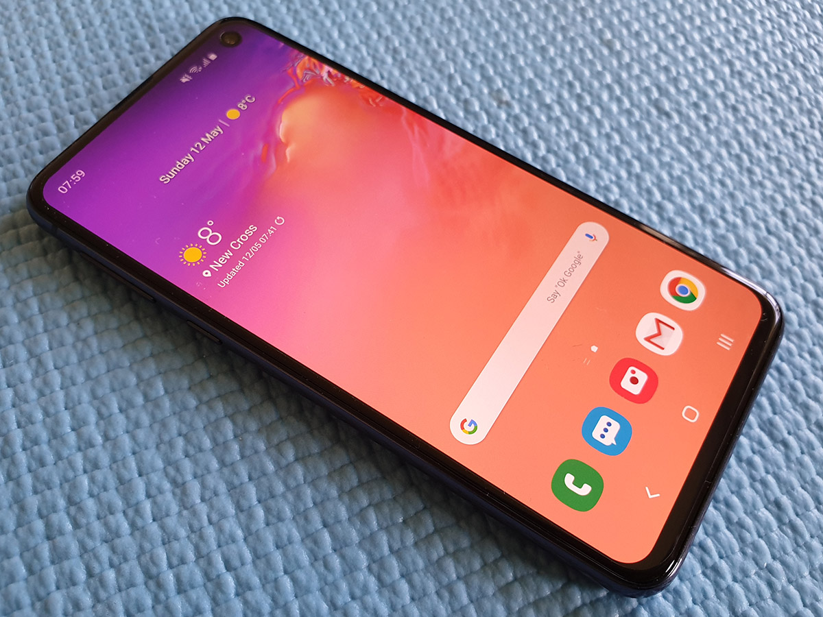
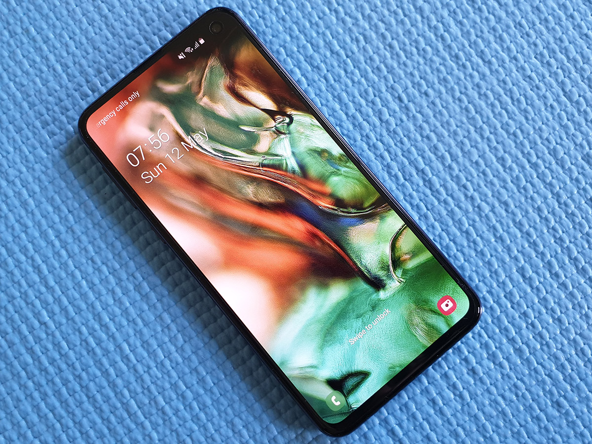
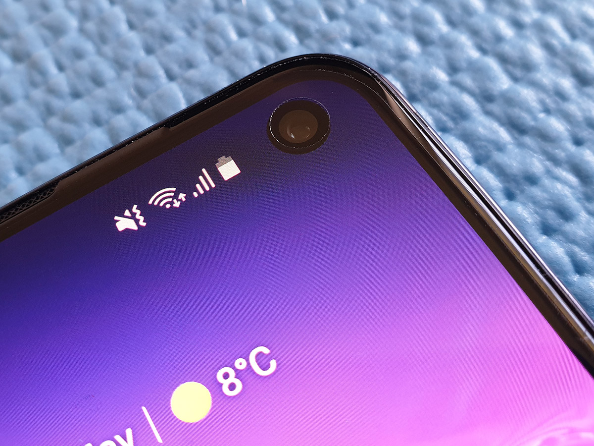
You still get Samsung’s trademark AMOLED panel, at a taller-than-full-HD 2280×1080 resolution and with a distinctive hole-punch camera sat in the top-right corner. It largely fades into the background after a few days of use, especially as most 16:9 videos use black bars to hide it altogether.
There’s no shortage of detail, even if the S10 and S10+ deliver even more clarity with their QHD+ panels, but the smaller size means you won’t notice without a magnifying glass. It’s comfortably among the brightest OLED screens around, so heading outside won’t suddenly render everything unreadable, and viewing angles are impeccable.
The S10 defaults to a ‘natural’ colour mode, which isn’t quite as vivid (some would say lurid) as previous Samsung screens. You can swap modes if you prefer a bit more punch, but you can’t deny it gives photos and videos a more true-to-life vibe. Hues are otherwise accurate, with the unbeatable contrast we expect from OLED.
You’re good to go with HDR10+ content, and impressively clear stereo speakers mean you don’t instantly need to reach for headphones when you want to stream some Netflix, either.
OS & SOFTWARE: PIE WITH UI
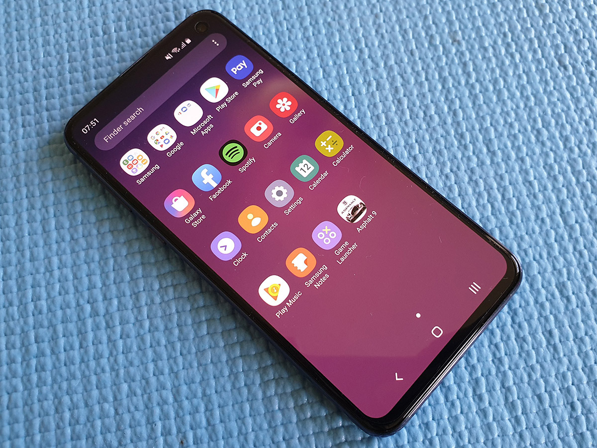
Keep It Simple, Samsung – words we’ve been shouting for years, every time a new Touchwiz handset arrived in the office. The new Android Pie-powered One UI certainly delivers.
The S10e is toned down with cleaner icons, larger text and more straightforward interface elements that are much easier for newcomers to get to grips with – without being so different Galaxy owners will be scratching their heads.
You get all the goodies you’d find on an S10, including Edge Screen shortcuts (despite no curved sides to swipe in from) and the divisive Bixby virtual assistant, physical shortcut key and all. It’s built into the homescreen, accessed with a swipe, and able to listen out for a keyword, just like Google Assistant. The overall look and feel has been tidied up, with actually useful cards and widgets – but it still comes a distant second to Google’s version.
Gestures are on tap if you don’t want onscreen keys, replacing them with three distinct ‘zones’ to swipe up on for back, menu and recents. It’s simple, familiar and nowhere near as complex as some versions we’ve seen on other phones. If you want to max your screen space, it’s well worth turning on.
CAMERA: JUST THE TWO OF US
It loses out on 2x optical zoom, but the S10e is still well-equipped on the snapper front, with a 12MP, dual f/1.5-2.4 aperture main sensor and a 16MP f/2.2 ultrawide acting as wingman, plus a 10MP, f/1.9 camera up front. OIS helps cancel out shaky hands, and dual-pixel autofocus makes it one of the more rapid smartphone cameras.
The flexibility you get with a wide-angle sensor is brilliant for squeezing more into each shot, and there’s not a massive drop-off in quality compared to the main camera, so there’s no reason not to mix up your snaps. Switching between the two is pretty much instant.
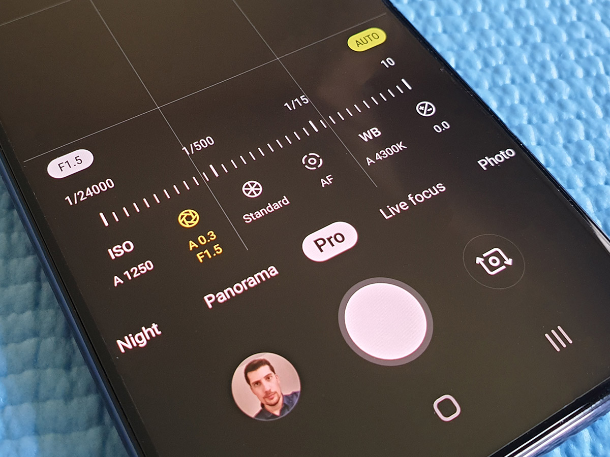
Samsung’s camera app is fit to bursting with modes and settings to play with, including live focus depth blur, AR emojis, Bixby Vision and a scene recognition auto mode that tweaks things like contrast and colour saturation depending on what you point the lens at. Sometimes the results are that little bit better than the default shooting mode, sometimes they aren’t – but there’s not an awful lot in it.
Are Samsung’s cameras the best you’ll find on an Android mobile? Not any more, with the Google Pixel 3 delivering brilliantly exposed shots and the Huawei P30 Pro acing low-light shooting. But the S10e is still among the upper echelons.
Daylight images pack in loads of detail, with accurate colours and well-judged HDR balancing. The processing does err towards over-sharpening, and can even out shadows so much that your pics are stripped of a bit of depth, but skies, foliage and reflections have a real pleasing quality that give your pictures real punch.
Bright Night mode can help rescue otherwise impossible shooting conditions, but Google’s Night Sight does a better job overall – and the Huawei P30 Pro is a level above that. Those are more expensive phones, mind. The S10e is still comfortably one of the better camera phones around.
PERFORMANCE & BATTERY: DOESN’T HOLD BACK
The S10e makes no compromises when it comes to CPU grunt, with the same Exynos 9820 octa-core chip as the rest of the S10 range.
It’s one of the fastest bits of mobile silicon doing the rounds right now, able to keep pace with Qualcomm’s Snapdragon 855 and Huawei’s Kirin 980 in just about every app. Only artificial benchmarks show any difference, and even then the Exynos tends to come out on top.
It’s paired with 6GB of RAM here, rather than 8GB, but you’ll really only notice the difference with some serious multitasking in a side-by-side shootout. But whatever you do with it, you can expect snappy, lag-free performance on the Android homescreen, in apps and with games.
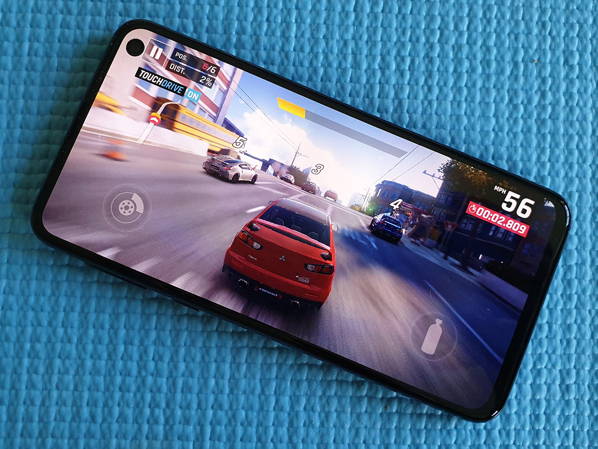
Gaming is where the Snapdragon shows a slight advantage in tests, but we still saw silky smooth frame rates during actual gameplay. The most demanding titles, like PUGB Mobile and Fortnite, are perfectly playable at their best settings.
128GB of storage will be plenty for all but the biggest media addicts, but they can always add a microSD card if they run out of room.
Looking at the spec sheet, a 3,100mAh battery sounds a little on the small side, and the S10e doesn’t quite go the distance like other flagship phones, but still comfortably lasts from breakfast until bedtime without needing to top up. Only seriously heavy users will need to recharge during the day, and wireless charging support lets you do it sans cable.
SAMSUNG GALAXY S10e VERDICT
Can you put a price on screen resolution, battery capacity and a zoom lens? Samsung can – it’s £130.
That’s currently the difference between the S10e and full-fat S10 if you buy SIM-free direct from Samsung. Go for a contract deal from a major UK network and you’re looking at a difference of just a few pounds a month to step up to the main event.
Right now you’ve got to really want a shorter screen to go for the S10e, which is a shame – bigger isn’t always better, and in some ways we actually prefer this smaller handset to the phone with which it shares a name.
At launch, the S10e isn’t quite cheap enough to be the affordable S10 alternative Samsung pitches it as – but hopefully with a discount or two, it could become a midlife bargain later down the line.
Tech specs
| SCREEN | 5.8in, 2280×1080 AMOLED w/ hole punch camera, HDR10+, 19:9 aspect ratio |
| CPU | Exynos 9820 octa-core |
| MEMORY | 6GB RAM |
| CAMERA | 12MP f/1.5-2.4 wide, 16MP f/2.2 ultrawide dual rear w/ dual-pixel PDAF, OIS, LED flash. 10MP f/1.9 front |
| STORAGE | 128GB on-board, microSD expansion |
| OPERATING SYSTEM | Android 9.0 Pie w/ OneUI |
| BATTERY | 3100mAh non-removable |
| DIMENSIONS | 142x70x7.9mm, 150g |
Stuff Says…
A fantastic phone that proves Samsung can deliver top-end features for less – but the price difference isn’t so huge that you should forget the S10 exists
Good Stuff
Hardware just as beefy as the real thing
Snappy fingerprint sensor faster than in-display S10
More compact dimensions handy for all hand sizes
Bad Stuff
Battery life only average
Not really suited to southpaws
S10 isn’t significantly more cash
