Samsung Gear S2 review
This smartwatch is all about the bezel
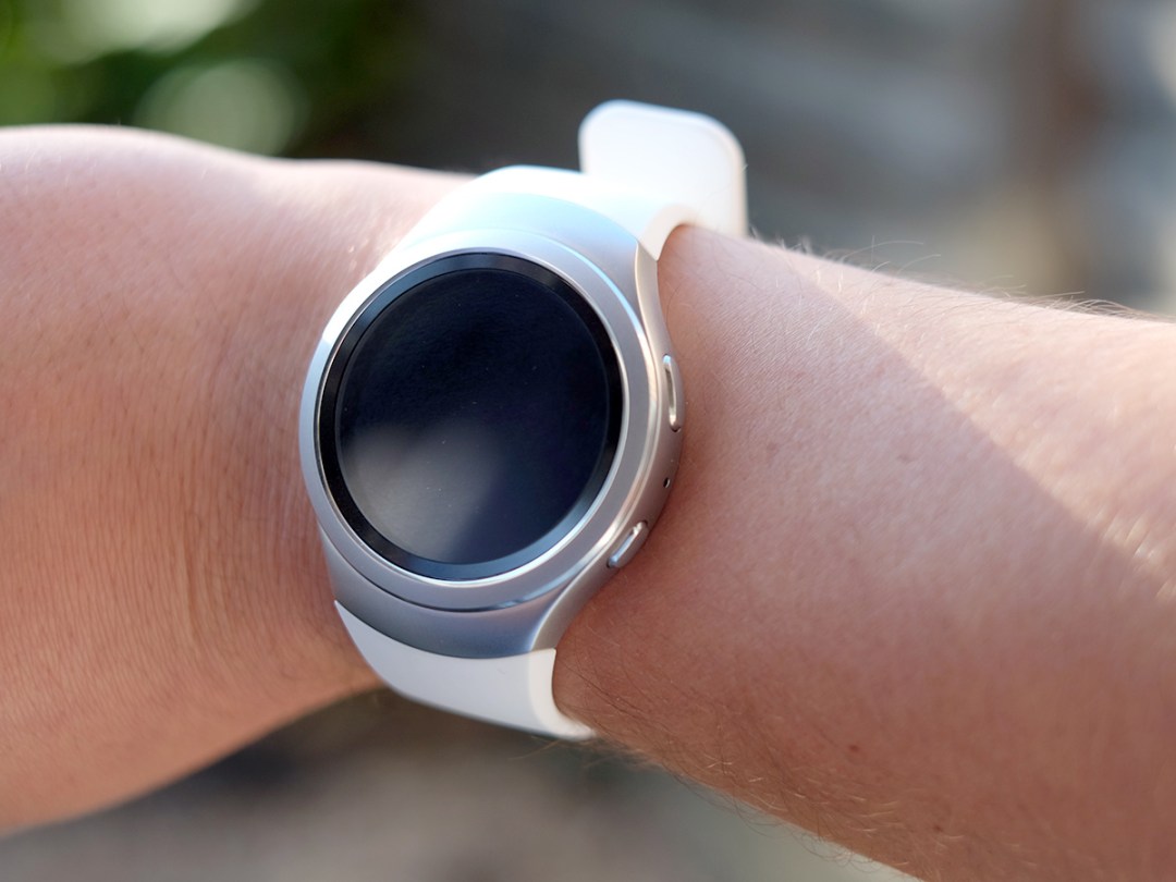
Samsung is the king of Android. However, it’s not married to the little green guy. Its latest smartwatch, the Samsung Gear S2, ditches Google’s Android Wear OS altogether, using Samsung’s very own Tizen interface instead.
While this might seem like madness, it’s kind of refreshing. Few of the new Android Wear watches have set our world alight and the Gear S2 is at least something very different. Smart design and better-than-average battery life make this one of the better watches if you’re after a watch with the gadget factor.
Trouble is, the Samsung Tizen watch platform has about two worthwhile apps in its entire library – so its £300 price is about as easy to swallow as a scouring pad.
You spin me right round
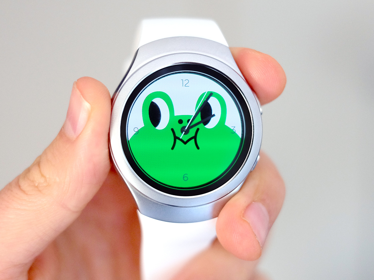
What the Samsung Gear S2 really nails is its hardware. This thing has the coolest control interface on any smartwatch to date. Its watch face bezel actually turns around, acting as the main way to dart through the software. I’ve idly turned the thing, like part of some sort of stress-reducing tick, at least 10,000 times while writing this review.
In the version I’m using, there’s no indication that it swivels. The bezel is not oversized, doesn’t have any weird markings on it. It just turns, and feels great doing so. There’s a little soft click to the Gear S2’s dial every few millimetres of travel, and as it’s made of stainless steel it seems fancy too.
I don’t think the white-strap version I have here is actually among the best-looking smartwatches, though. While far less odd than the original curved Gear S, the Gear S2 does seem tad utilitarian next to the altogether more stylish Motorola Moto 360. It’s something to do with how strap meets screen, as if whatever style bible Samsung subscribes to is just a bit out of date.
As with almost all smartwatches the Gear S2 is a little thick too. However, I’m so used to the thickness of the things that I barely notice any more. Neither will you after living with the watch for a week.
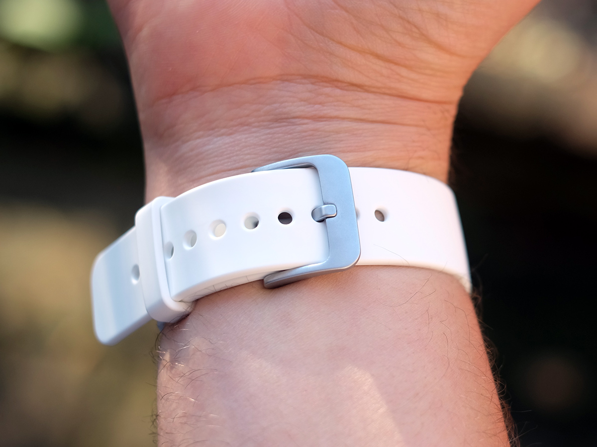
The Gear S2’s design also means you don’t get the flexible strap feel of a normal watch either. I found it reasonably comfortable, though, and replacing the strap is incredibly easy. You simply pull at a tab on the underside, then yank each half of the strap out. Want an even more watch-like look? The £350 S2 Classic has a more traditional 20mm standard strap (which I like) and a notchy watch bezel (which I’m less keen on).
Competition in the round › Moto 360 (2015) review
Control freak
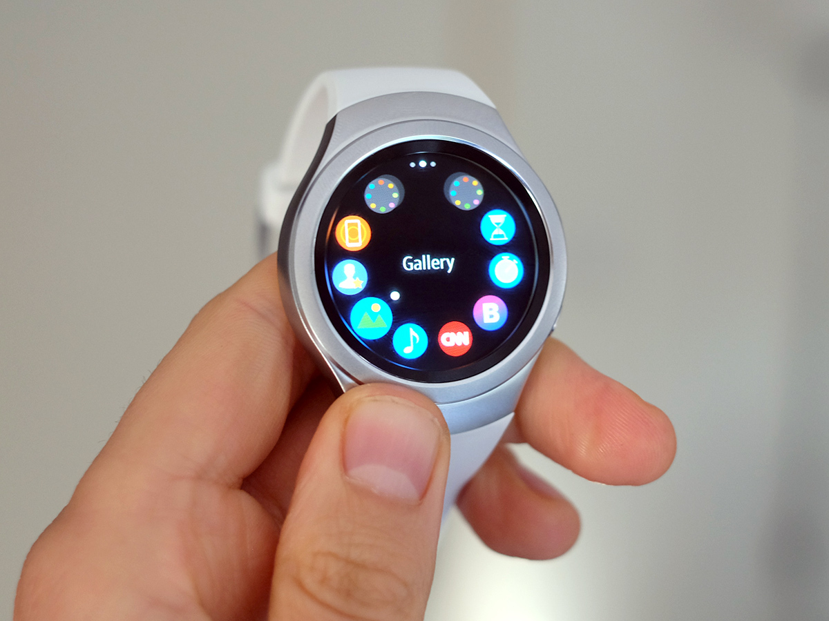
Whatever your reaction to the design, get your fingers on that bezel and you can’t help but think it’s neat. However, the watch face doesn’t control everything. And, unfortunately, it can’t select things either. If it could depress the bezel slightly so you could do pretty much everything with dial alone, the Samsung Gear S2 would earn an extra 10 intuitiveness points.
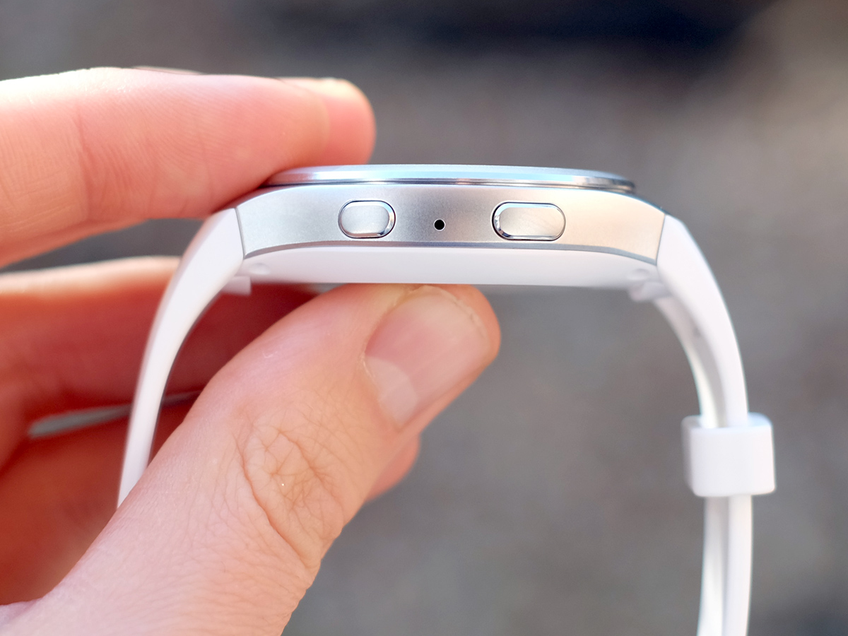
As it stands, you still select things by tapping on the screen. And there are an extra two buttons on the Gear S2’s sides. One takes you right to the watch face, the other acts as ‘back’.
Outside of the bezel, the Gear S2’s hardware is fairly conventional. The screen is 1.2in across and 360 x 360 pixel resolution. Like the top Android Wear watches, it’s sharp but not as sharp as a top-end phone.
As with most Samsungs, it’s an OLED screen. That means ultra-deep blacks and vivid colour. It’s a decent display.
Fresh out of the box, the Gear S2’s display times out pretty quickly, turning off entirely. I’m not a big fan of having to prod a watch just to see the time. It’s a bit silly, isn’t it? Turning the screen on requires a press or a pretty aggressive wrist jangle. There is an always-on screen mode, though.
Use this and the Gear S2 dims down to a super-simple monochrome analogue or digital watch face when not in use. Both look decent enough.
However, using the standard mode is the only way to get those to the upper reaches of the Gear S2’s quoted 2-3 day battery life. Even before without turning on the always on screen feature, I only squeezed out two days between charges.
It lasts far longer than the new Moto 360, but you certainly aren’t getting anything like Pebble Time Steel’s 10 day stamina here. To charge the Gear S2, you just rest the little guy in a wireless charge dock.
The features set
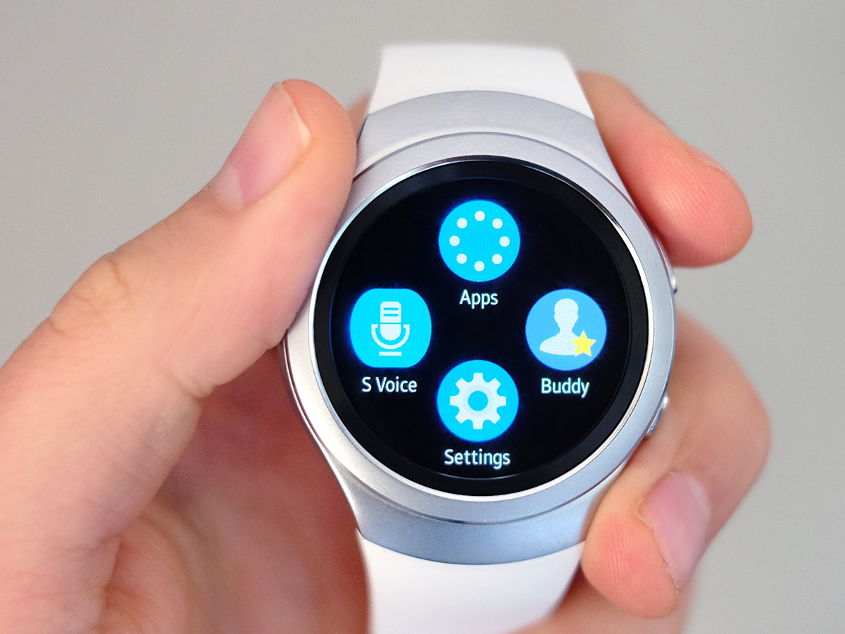
The big question is whether the Gear S2 gets you smarts worth charging every other day for. On the positive side, it makes a pretty decent notifications tool. While there’s no speaker in the S2, there is a little vibration motor inside. It’s not as nuanced as the Apple Watch‘s taptic nonsense, but it does make it pretty obvious when you receive any messages or emails. You can choose which apps’ notifications come through to the watch, and whether they cause the screen to light up or not.
Samsung has really gone all-in with the rotating bezel too, and it makes the interface pretty intuitive. There are essentially two levels to the software.
On the top level, which is where the clock face lives, there’s a whole bunch of what amount to homescreen widgets. Rotate the bezel and screens for notifications, your calendar, alerts, the pedometer, weather and so on will flick by.
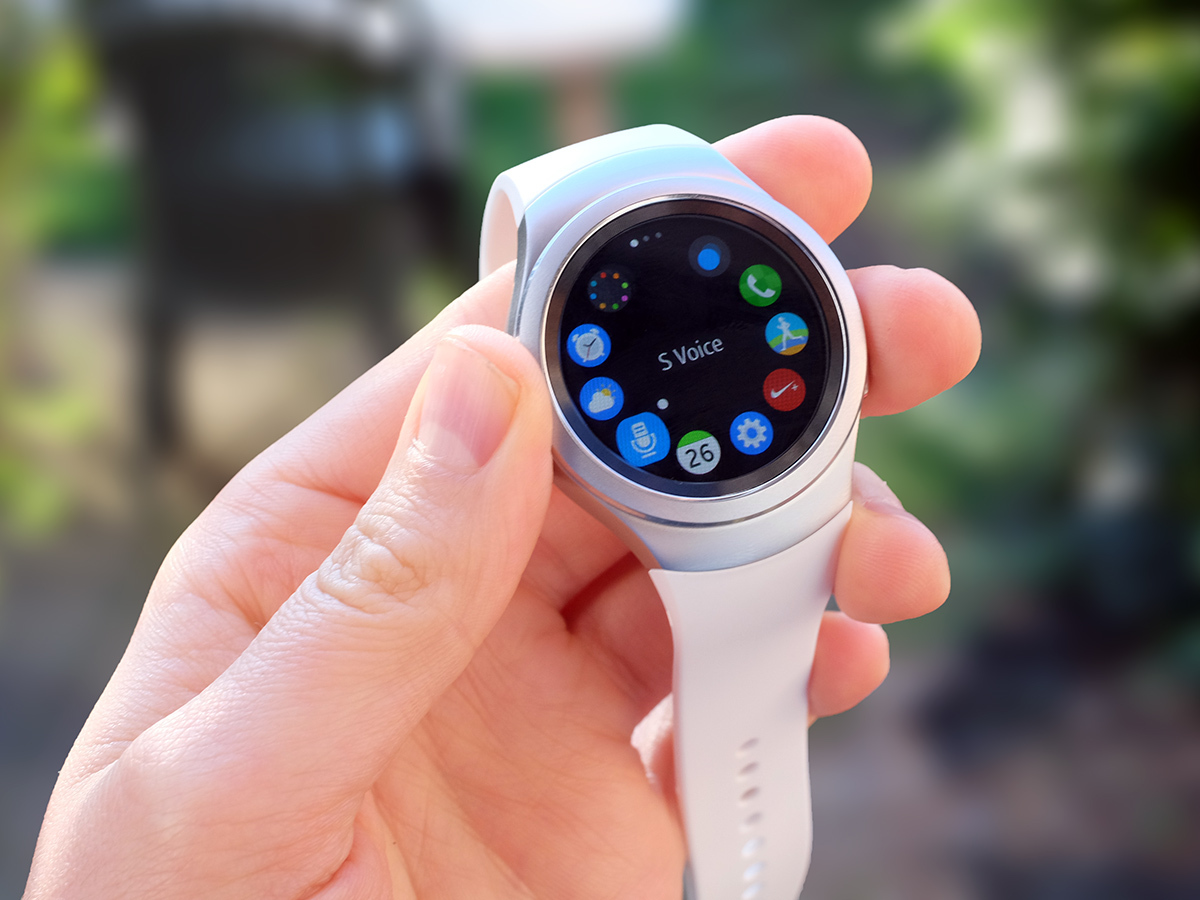
It feels quick and fluid, and you can choose what goes in here. What you really want to do is to fine-tune the order of these screens so you basically never need to use the second layer, which is your apps menu – a bunch of pages packed with dinky little app icons.
You can also talk to the Gear S2, much like an Apple Watch or Android Wear watch. You setup a special keyword that summons the S Voice butler. I chose ‘Gear’. He’s a bit slow to both appear and react, and can only really handle basic requests like calling people and checking the weather. But it’s not something I can honestly imagine using much day-to-day anyway. Using the bezel feels good. Using the voice commands doesn’t.
Modular movement › Blocks’ build-your-own smartwatch
App fail
Compared to other smartwatches, the Gear S2 comes with a fair bit of pre-installed guff. As well as things like the S Health fitness tracker, the music controls and the weather app, there are a few third-party ones too. There are CNN, Bloomberg and Nike+ running apps here. I get the feeling this is to make the S2 seem more app-rich that it really is.
You see, the Gear S2’s app selection is dreadful. Samsung says over 1,000 apps are available from the Gear store, which is part of the Gear phone app. However, the vast majority seem to be watch faces. I scoured through the entire store (which took about four minutes) and found two that actually appeal: Yelp and News Briefing, which is a watch version of Flipboard.
Compared to Apple Watch, Android Wear and even Pebble OS, the apps selection is pathetic. The worrying thing is that this is where we’re at a year after the Gear Tizen platform appeared. It ain’t brand new. So while the hardware feels a step forwards, it ends up feeling like hollow progress.
There are a few built-in features that are neat, though. Like the maps app. Using the bezel to zoom in and out feels good, and it uses Here Maps, which we used to know as Nokia Maps. S Health is good too. This is Samsung’s fitness app, and the watch UI works pretty well, showing you how your activity level pans out throughout the day rather than just how many steps you’ve taken.
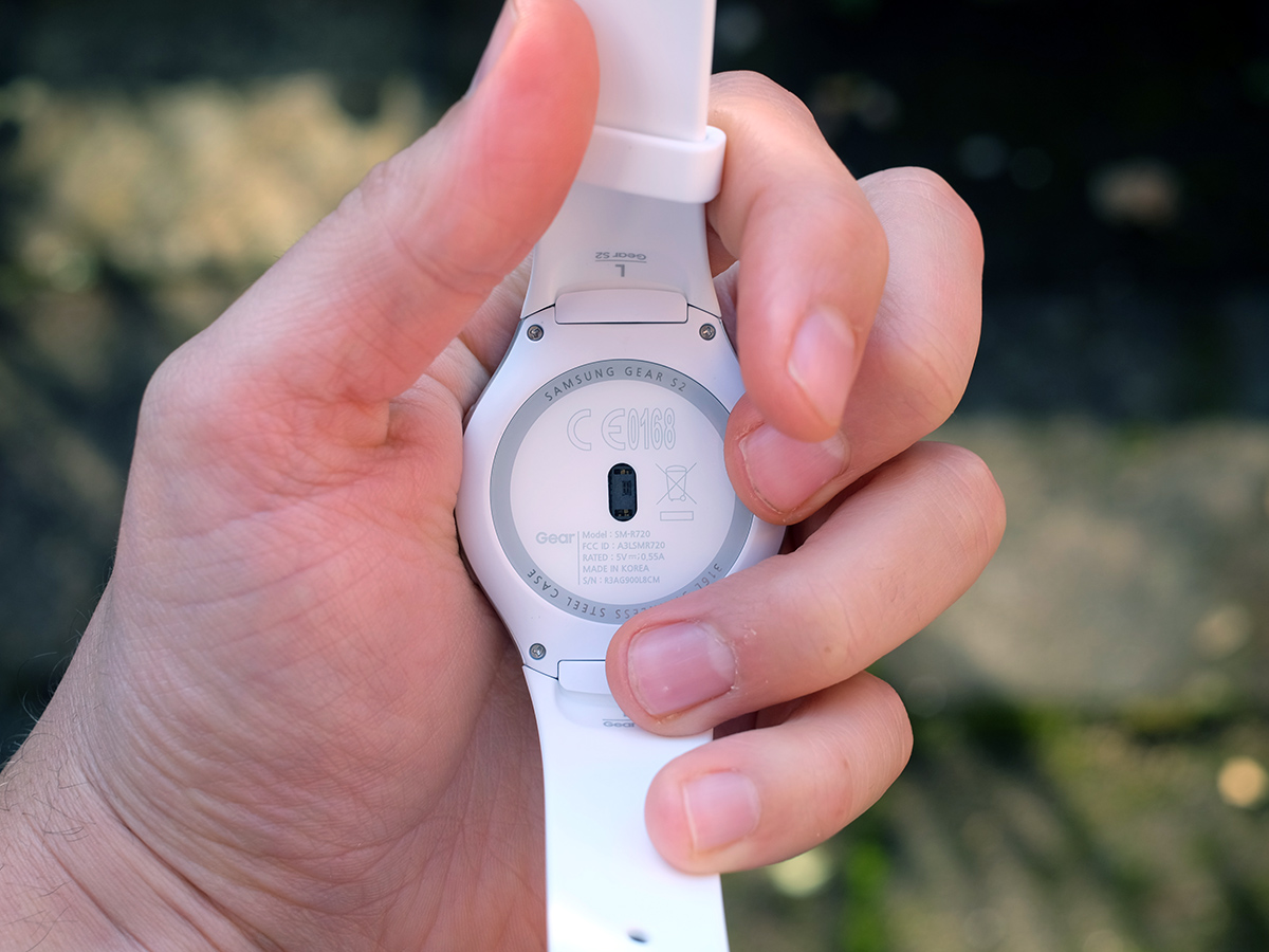
There’s a heart rate scanner too, although as with virtually every smartwatch apart from the Apple Watch, it’s only really good for measuring your resting heart rate. It just can’t cope with movement. The Gear S2 also lacks GPS, meaning it’s only ready for casual tracking unless you have your phone with you.
It’s a good job the Nike+ app is here too. This lets you use the S2 as a second screen for the Nike+ running app, turning it into a sort-of tethered Garmin Forerunner.
There’s no Runkeeper, no Strava, no Endomondo on the Gear app store, so you’d better not hate Nike+. Other platforms are way better-stocked than this one. People accuse the Pebble watches of not being able to do much, but this one is on a whole other super-limited level. The original Gear S is far more feature-packed, being basically a phone squished into a watch’s body.
One year on
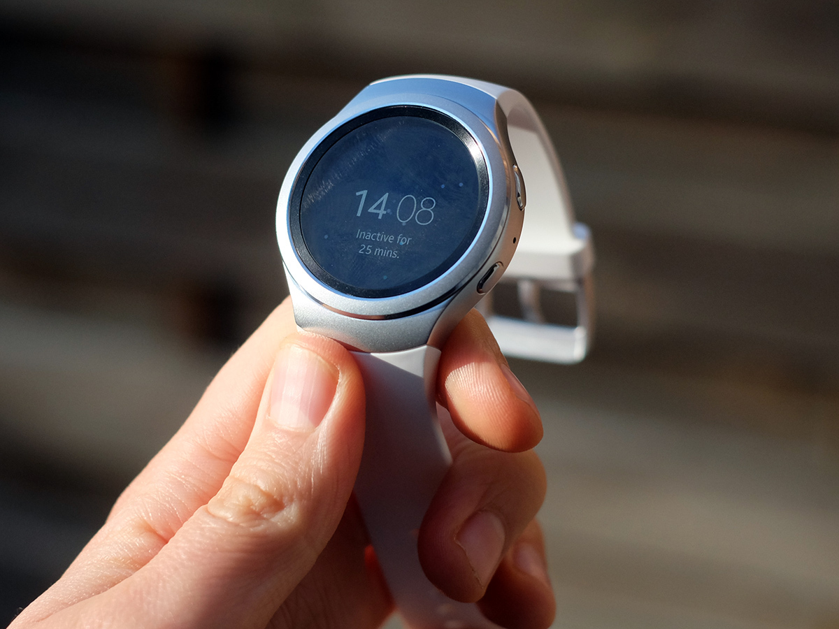
That’s right, the standard version of the Gear S2 is actually a step back in functionality terms given it lacks GPS and the ability to make calls itself – instead it just passes them onto your smartphone. There’s a 3G version of the S2 as well, but I doubt whether it’ll be easy to get hold of in the UK.
The one extra the normal Gear S2 does get is NFC, designed for use with the Samsung Pay. That’s nice and all, but isn’t much use when Samsung Pay hasn’t launched in the UK yet.
It’s no great surprise that the Gear S2 isn’t as pristine, well-supported a package in some areas as the Apple Watch. Oh, and you can’t come in if you own an iPhone either as the watch only supports Androids. Given I imagine the original Gear S sales dried up pretty sharpish after its initial 10,000 orders, I doubt Apple’s too bothered.
Go Urbane › LG’s second-iteration Android Wear watch
Samsung Gear S2 Verdict
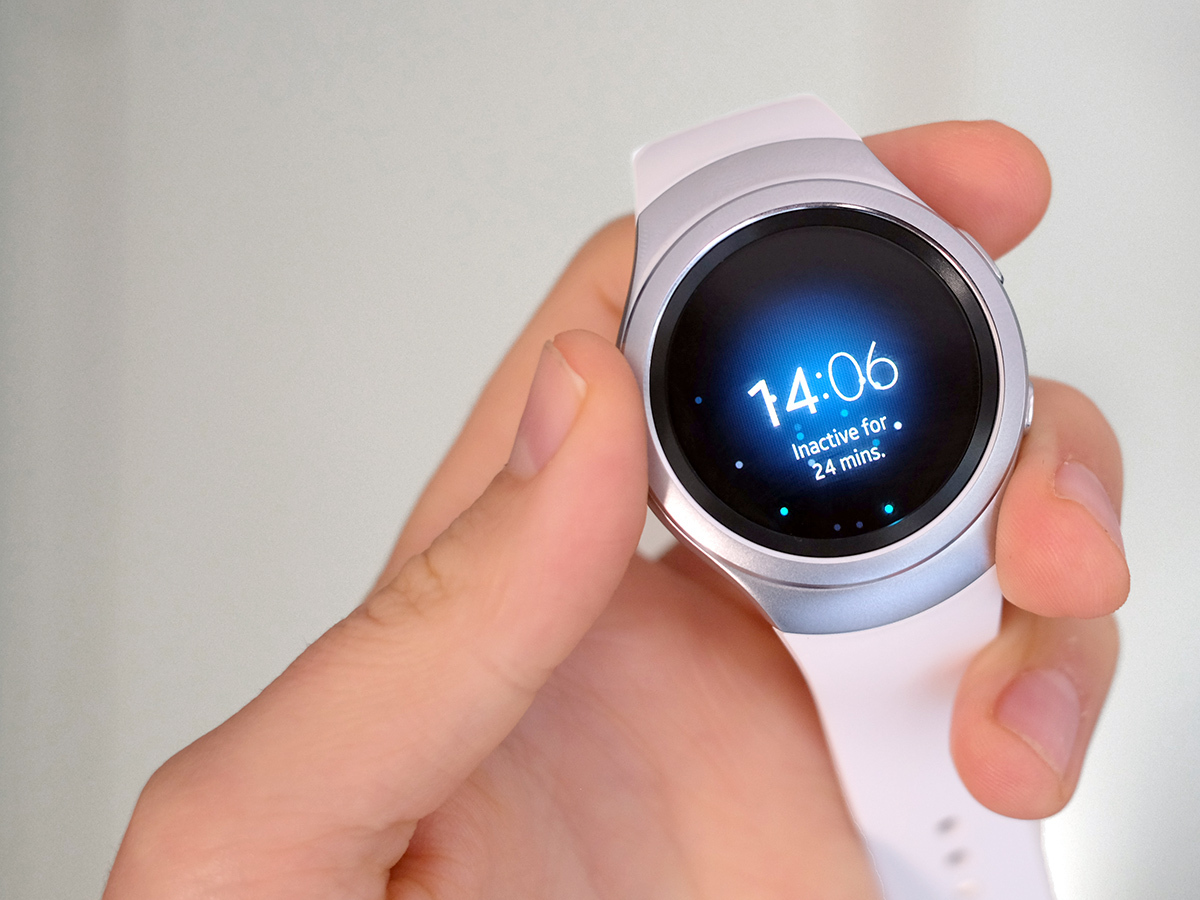
The Samsung Gear S2 is a nice enough watch. Its rotating bezel is genius and runs the show, having been near-on fully integrated into the software.
However, as a platform Gear’s Tizen feels like a dead zone. It’s caught in a vicious circle: why would devs spend bags of cash making apps for a platform with few fans, but how can it get a following when apps-wise it’s a poor relation to Pebble OS, Wear and Watch OS? It’s all rocks and hard places.
The Samsung Gear S2 has a neat shiny surface, but underneath it there’s too much hollow space for something that costs an eye-watering £300. That price really isn’t going to help the Tizen platform hit the big time either.
Buy the Gear S2 here from Samsung
Wrist assessment › The top 10 smartwatches in the world right now
Tech specs
| Software | Tizen |
| Dimensions | 49.8 x 42.3 x 11.4mm |
| Weight | 47g |
| Screen | 1.2in 360 x 360 Super AMOLED |
| CPU | Dual-core 1GHz Exynos 3250 |
| Storage | 4GB |
Stuff Says…
Elements of hardware design genius sit atop refreshing but ultimately very limiting software
Good Stuff
Rotating bezel feels great
Well-made
Interesting, fairly intuitive UI
Bad Stuff
Very expensive
Very poor apps selection
Battery life just OK with always-on screen
Slow voice commands
No iPhone support
