Sony Xperia Z3+ review
The phone that isn’t the Xperia Z4 (but is really)

As a society we’re in thrall to the thrill of the new.
We expect our phones to arrive touting amazing new features and when they don’t – as is the case with the Sony Xperia Z3+ – our natural reaction is to be disappointed.
In some ways that’s a little unfair. After all, the Z3 was a mighty fine phone that really didn’t need much improving. Maybe giving it a bigger battery, slightly new design and new processor was all Sony needed to do?
Problem is, this year’s already welcomed a couple of fantastic new phones in the form of the Samsung Galaxy S6 and S6 Edge and the LG G4. And in that company, a minor upgrade was always going to be a hard sell.
Return of the box

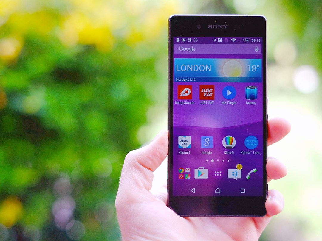
If you are looking for something truly different about the Xperia Z3+ you won’t find it in its design.
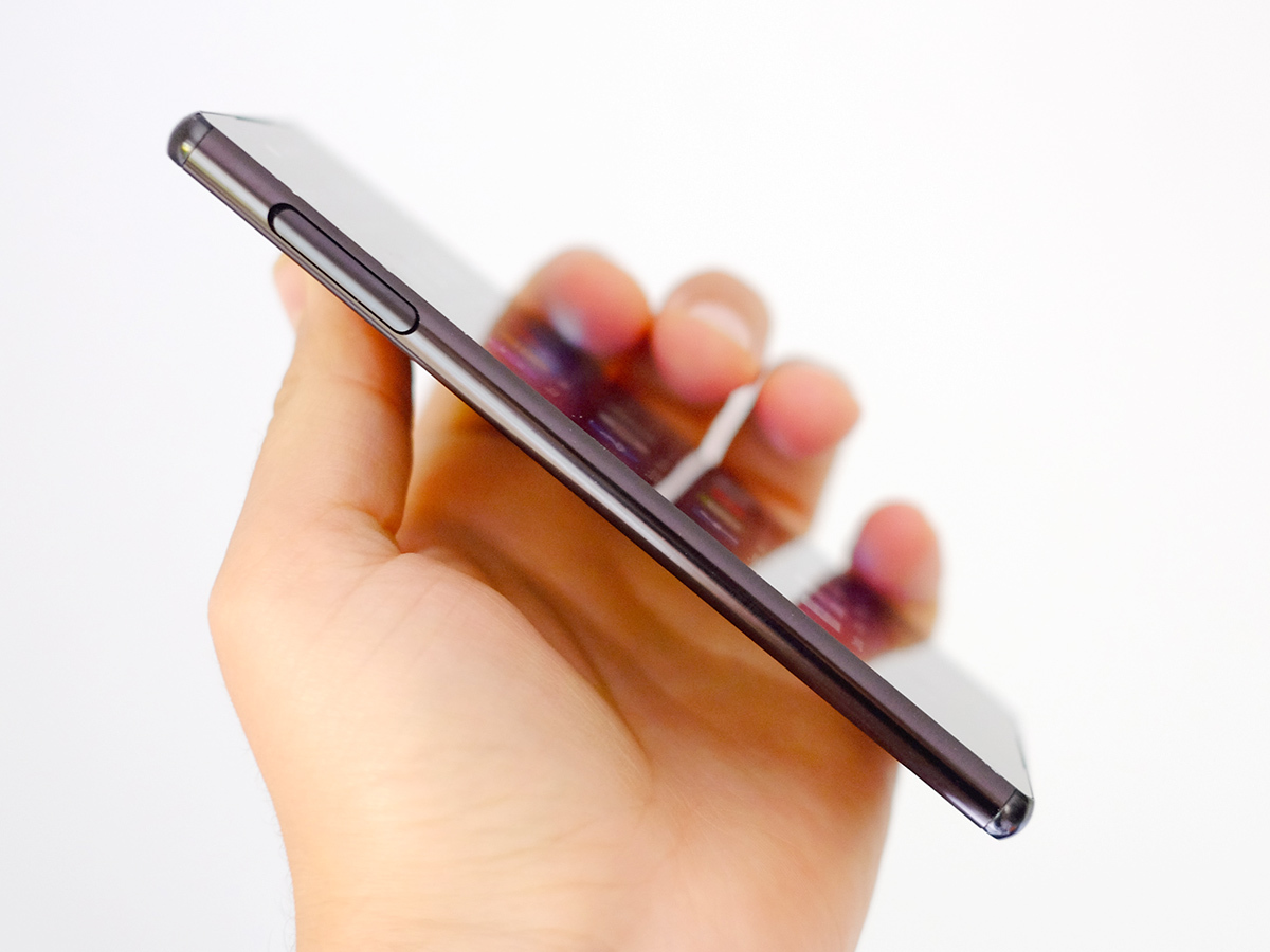
The Z3+ is instead best described as a further refinement of the series’ classic style. It’s skinny, but has a boxy, rectangular shape that stops it from feeling as wafer-thin as it is.
Compared to the Xperia Z3 it has lost a bit of bulk in every direction, but the notable changes aren’t about millimetre-measuring. Sony has really cut the Sony Xperia Z3+ style back, making it as pure and simple as possible. I got to compare it side-by-side with the Xperia Z2, and the Z3+ really makes that older phone look a bit of a mess.
There are no longer any weird dock ports, and the sides are simple, smooth curves that only have interruptions when they’re strictly needed. And the best bit is that while the Sony Xperia Z3+ is still water resistant, it no longer needs any flaps other than the one that stoppers the SIM/microSD slot. The one you’ll never have to move, in other words.
The loss of those flaps is because the Z3+ has treated microUSB and headphone jack sockets that don’t let in water. This is what you want: waterproofing without the inconvenience. It’s still IP65/68 certified too, meaning it can be dunked in water for 30 minutes, no problem.
Lots of people seem to be a bit disappointed with the Sony Xperia Z3+’s lack of jazz-hands extras, but I find its design to be solid. The edges are still a mite sharp, but you get used to that after about five minutes.
The sides are also incredibly shiny, which risks them looking a bit like glossy plastic, but be assured that they’re actually coated metal. There’s Gorilla Glass on the front and back and although the corner bits are plastic, that’s likely because plastic absorbs shock more readily. This is a “whatever happens, don’t let the glass smash” measure.
Overall, it’s the best looking phone in the Z series so far.
Read more › LG G4 review
Global hypercolour

As with its design, the Xperia Z3+’s screen has undergone a few changes without exactly being reinvented.
To that end, it still has the exact same specs as those of the Z3: it’s a 5.2in LCD display of 1920 x 1080 resolution. Like the HTC One M9, Sony hasn’t made the leap to QHD. But with 424 pixels packed into each inch of screen, it’s still very sharp.
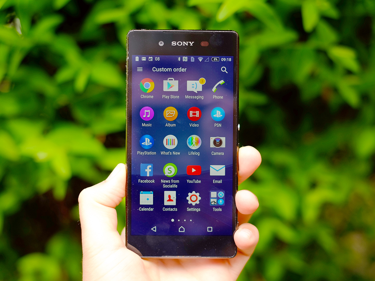
What really defines the display on the Xperia Z3+ though is colour.
This screen is incredibly vivid and though the white balance tends to the blue end of the spectrum to start with, you can easily warm things up by tweaking the white balance controls in the settings menu.
It’s a shame you can’t do the same for colour saturation – it seemingly uses the same standards as Willy Wonka’s chocolate factory. Again, careful calibration keeps it looking good (if not by any means accurate), but we’d prefer the option of a mode that would do it for us with one click.
Still, overall Sony has absolutely achieved the lively and punchy look it’s going for.


