T-Mobile Sidekick Slide review
The Sidekick remains the BlackBerry messaging device for the cooler mySpace brigade. But can the new Slide model still keep it real with the young’uns?

The Sidekick may be hotter than Paris Hilton wearing a skimpy Sailor’s uniform in the States but over here in Blighty it remains a cult ‘young persons’ mobile push emailer device.
Gossip page hellraisers like Mizz Hilton and that foxy Cheerleader from TV series Heroes have done their best to raise its profile but now a slick new model called the Slide is here to break the UK.
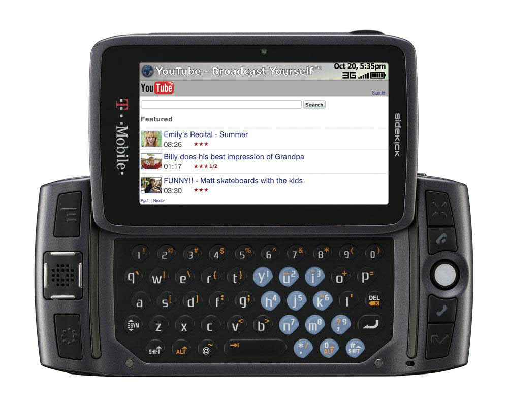
Danger Inc has turned to Motorola for inspiration on the Slide. It’s proved a canny move. Gone is the toy town feel of the Sidekick III, replaced by a sleeker more compact chassis that’s expertly crafted and swathed in a tactile soft paint finish.
Slide into action
Another more notable renovation is the standard slider action. Moto may have ditched the Sidekick’s signature swivel mechanism that’s entertained us for hours on end, but the new skater action sports a firm and spring assisted glide that’s equally impressive.
It’s well documented the display quality on previous Sidekick’s has been shockingly poor and this fuzz-fest has fortunately been seriously cleaned up by Moto. The QVGA-style 2.5-inch screen is now pin sharp and vibrant and more in tune with today’s standards.
The Slide preserves the Sidekick’s ease-of-use rep and the combination of the BlackBerry’s style TrackBall, four-way joypad and jump menu key makes it seamless to handle. Similarly setting up your web-based and home email accounts is embarrassingly kid simple, taking seconds to initiate while the spacious, accommodating and responsive QWERTY keyboard makes writing messages painless.
Depending on your level of patience, full fat web browsing is a contentious issue with only sluggish GPRS/EDGE downloads speeds at your disposal (undoubtedly dictated by T-Mobile U.S. lacking a 3G network). It took a good 50 seconds for us to load Stuff.tv and for some this may cause Basil Fawlty-esque wig outs. You can reduce times by setting the browser to bypass images.
Snap unhappy
The built-in 1.3-megapixel camera fells woefully dated and pretty basic with only a two setting Exposure mode to tinker with. The argument for such a low-quality lens is to keep the file size down for emailing your photos but we at expected at least two-megapixel snapper to show some progression.
With the target audience of 18-25 dabbling heavily in the likes of YouTube et al, we also find it weird that the Slide has no video recording or playback abilities. While we’re assured future generation Sidekick’s will be video capable, it feels like a missed opportunity.
Your PC will recognise the Slide as mass storage device when transferring your MP3 music files via USB and you just drag and drop into the microSD card’s audio folder. The music player is rudimentary with no fidelity enhancements but it nevertheless sounds quite lively.
Elsewhere, the Bluetooth profile is disappointingly set for only headset hook up and transferring vCards, a Yahoo! Instant Messaging app is embedded for users to get chatting quicksmart while Danger Inc automatically backs up all your phone data online, so lose your Slide and everything is still safe and ready to upload to your replacement device.
Despite the slinky new Motorola makeover, the Slide hasn’t really evolved enough from its Sidekick III predecessor. But even with this stunted feature set, the Slide won us over with its astounding user-friendliness and messaging prowess. And surely that’s just as important as the bells and whistles for the Bebo brotherhood.


