Timex IQ+ Move review
This handsome ticker has secret fitness tracking powers...
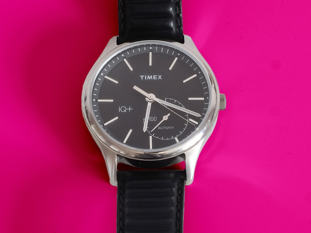
Shock horror: Vogue magazine just put wearable tech on its list of trends on the way out. If you want to obey the word of fashion’s bible but don’t want to flush away your tech, check out the Timex IQ+ Move.
On the surface it looks just like your average analogue watch, but also offers step tracking, alarms and basic timer alerts. It’s like a Withings Activité, but with an even more convincing non-smart watch cloak.
Sure, it doesn’t do much, but that’s kinda the whole point of this £150 watch.
Design: everyday minimalism
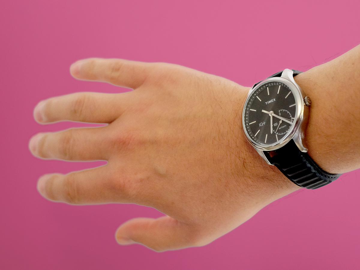
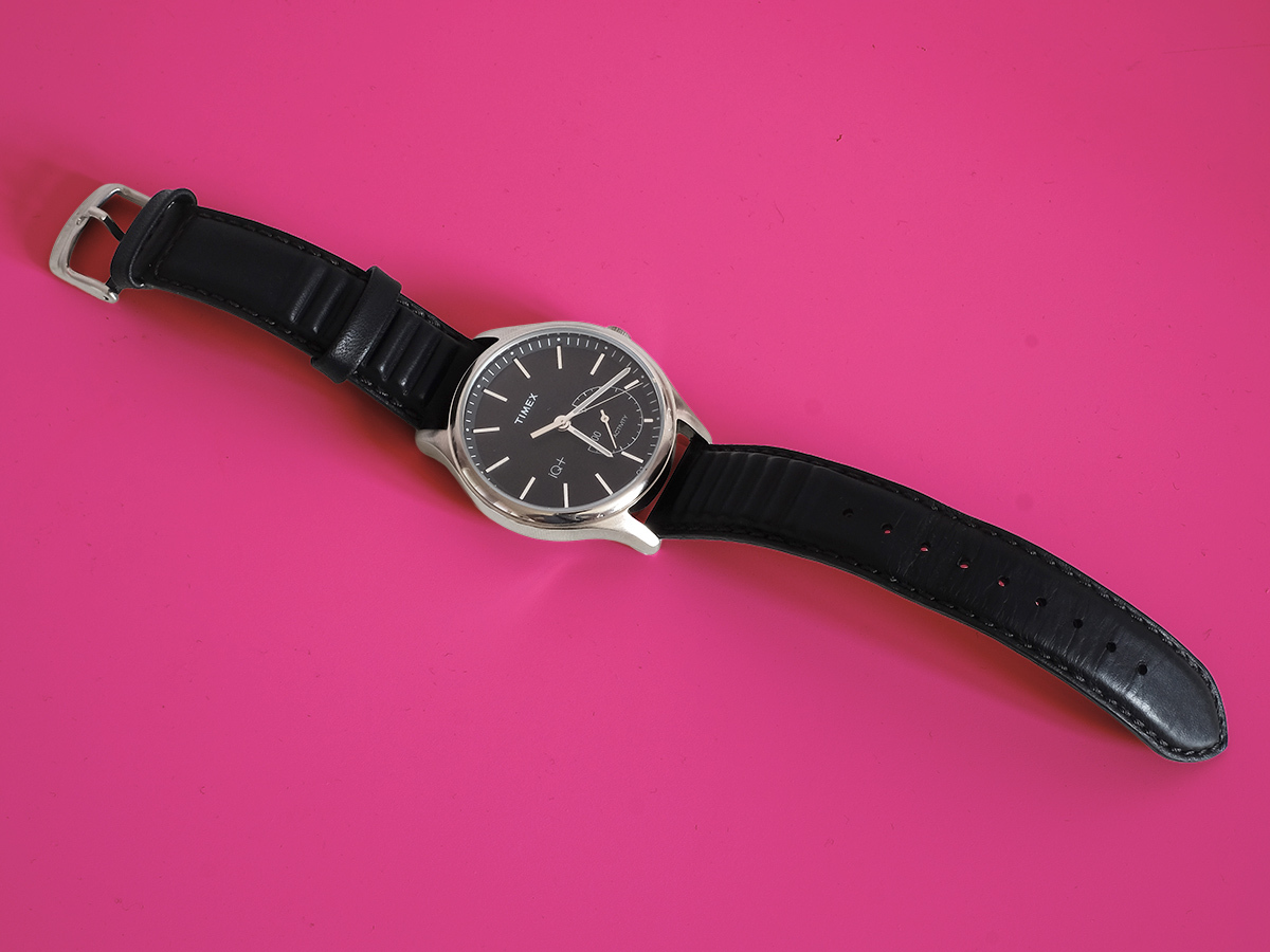
The Timex IQ+ Move has the same tasteful minimalist style as other normal Timex watches.
There are no more dials than required, as few characters on its face as Timex can get away with and, in this model at least, the most exciting colour is grey.
This is a watch I’d happily wear every day. And I haven’t regularly worn a normal watch in more than 10 years. If you must have a bit of colour, Timex makes Move watches with green and blue hands, and there’s a busier, bulkier Metro model too.
The Timex IQ+ Move’s casing is stainless steel, with lightly curved mineral glass on top. It’s a smart look, and the watch is water resistant to 50 metres, matching the second-gen Apple Watch.
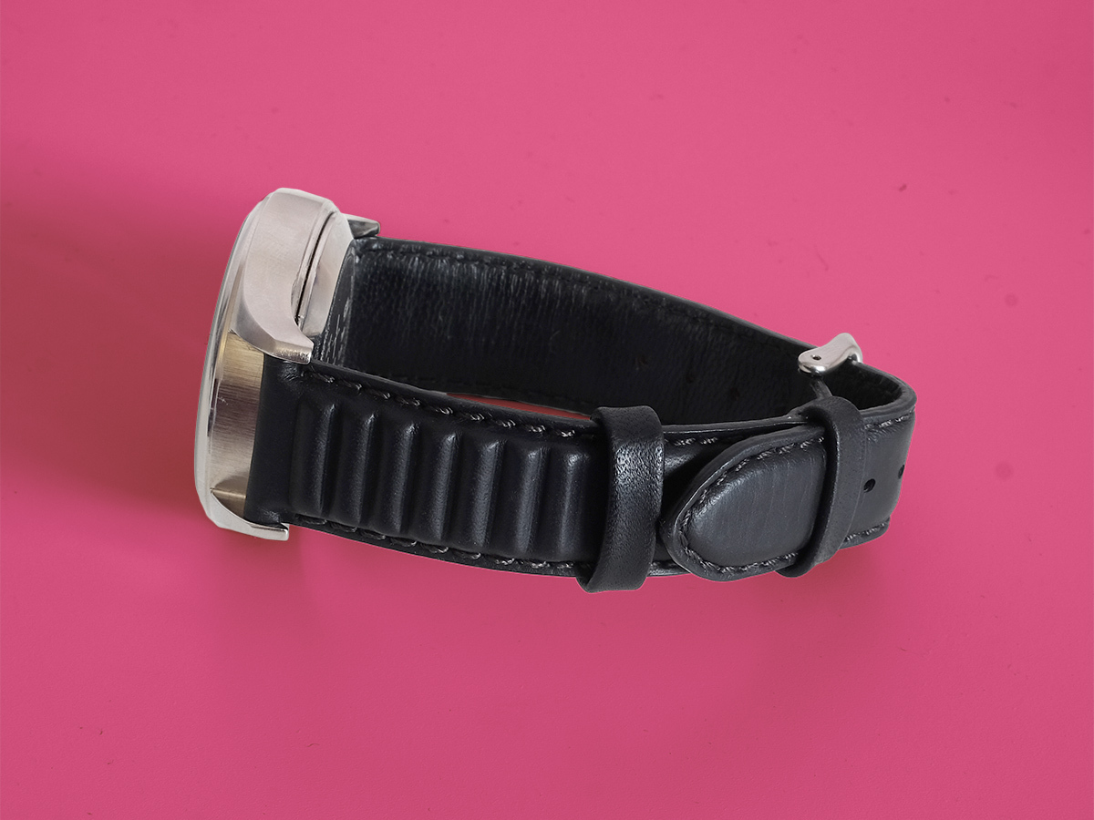
Timex makes the IQ+ Move with either a leather or silicone strap. Ours is the leather one, and as you can see it has a sort of corrugated finish across about half of its length.
It’s not a design choice I really ‘get’, and it makes the strap thicker. But if you hate it you can always swap it out as the Time IQ+ Move uses a totally standard strap fixture.
Features: barebones fitness tracking
So it’s a watch then, in look and feel. What it does over and above a standard £80 Timex is step and distance counting and stopwatch or timer alerts. If you’re after phone notifications, apps or GPS tracking, that’s not the Timex IQ+ Move’s bag.
When you boot-up the Timex app you get to choose whether the little extra dial displays how close you are to either reaching your distance or steps goal for the day. The seconds hand can take on the same task if you don’t need the time to the second, and it can display the date too.
Look carefully and you’ll see a little “1” just after the 12 o’ clock mark and a “31” just after the 6 o’ clock spot, denoting the days of the month. Subtle, right? Sure, in tech terms this is about as flashy as an abacus, but you have to appreciate how low-key it all is. You get a fitness tracker geek-out on the sly.
Another neat hidden feature is the night light. Press the crown for a second and the whole screen glows blue thanks to some hidden LEDs behind it. You won’t be able to see the effects in daylight, but it means you can at least see the time in the dark. As with any fitness tracker worn on your wrist, you’re not going to judge your marathon training off the Timex IQ+ Move’s step counts.
But if you find its readings way off you can set the app to nudge the totals up and down. That said, it’s been within perfectly normal reading bounds for me, so if you have an issue it may be because your gesticulate wildly with every syllable you speak.
The app: keeping things basic
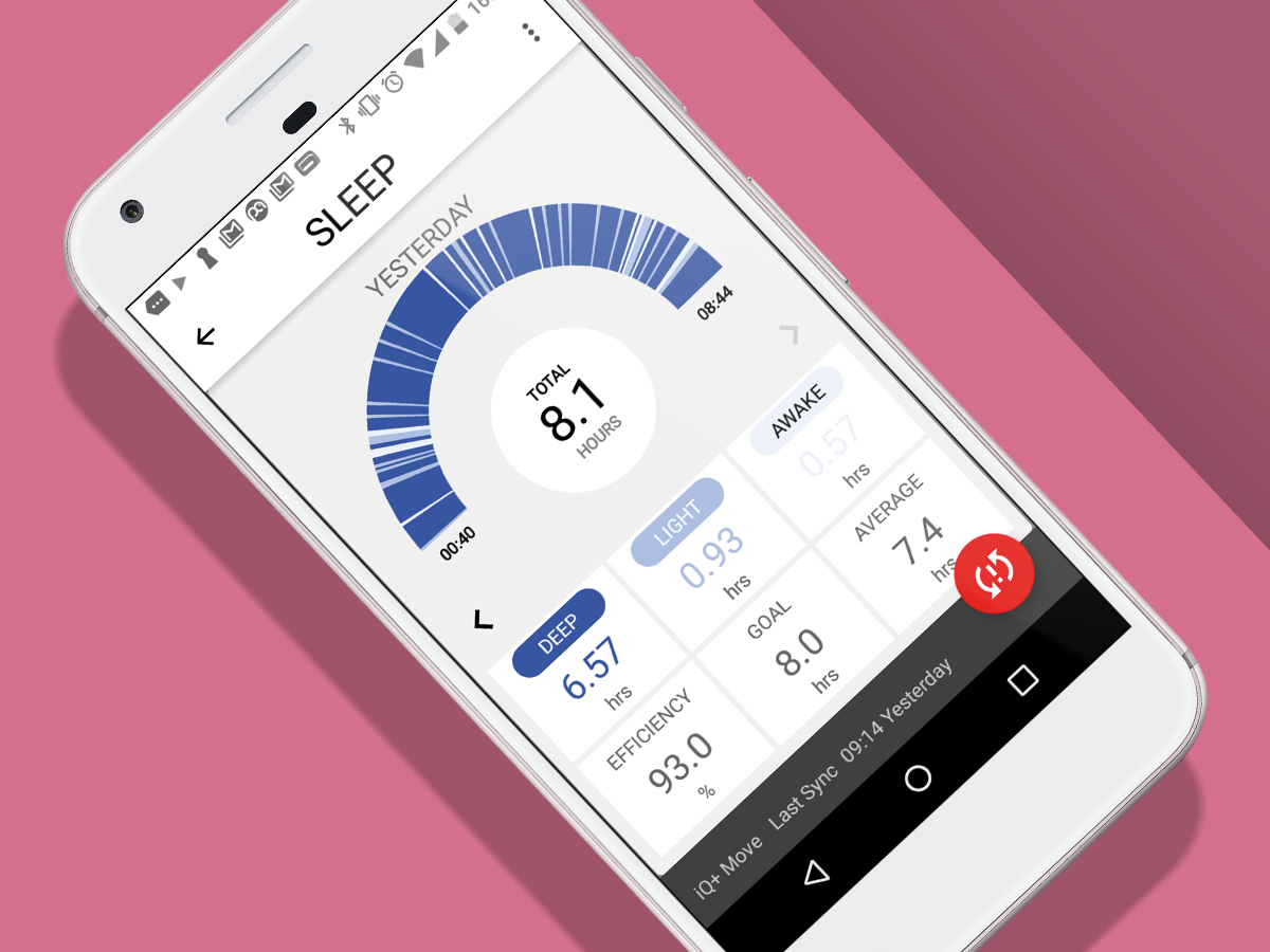
Aside from this tweak, the Timex Connect app is as basic as they come, with read-outs of your steps, distance travelled, calories walked off and how much you slept last night.
You can dig into these to get an hour-by-hour (or week/month by week/month) graph view. There are no social challenges, no buzzes when you’ve been sat on your backside for too long. The IQ+ Move can’t vibrate at all, actually, just a let out a pretty pathetic bleat for a few seconds if you set a timer in the app.
As such, your phone is probably still a better alarm clock. If you want an advanced tracker, the Timex IQ+ Move isn’t for you.
Still, after living with this dashing chap for a while there’s only one thing that grates. To sync with your phone you have to press down on the crown for five seconds, a gesture so long it feels like you might be factory resetting the watch. Sync’ing is fairly slow and a bit unreliable.
On several occasions I had to restart our test phone’s Bluetooth to get it to work. The watch is the star, the smarts are an add-on. The lo-fi approach does, though, get you battery life of up to a year, which may be just what you’re after if daily smartwatch charging has made you want to go and live Twitter-free in a Yurt in the middle of nowhere.
Timex IQ+ Move verdict
Whether you should buy the Timex IQ+ Move depends on how much you like its design. You’re not buying a smartwatch or fitness tracker, but a watch that can also count your steps.
It doesn’t do a great deal, and the app doesn’t go the extra mile to make getting off your backside more fun. But it’s a lovely-looking thing, the battery lasts for ages and you still get the satisfaction of seeing the activity dial tick around as you move.
And that’s all some of us are really after from a tracker anyway.
Stuff Says…
One of the classiest ways to track your steps. Just don’t expect smartwatch features
Good Stuff
Smart and classy
Has a motivational activity dial
One-year battery
Bad Stuff
No vibration alerts
Limited smarts
Basic app
Flaky syncing


