Vector Luna smartwatch hands-on review
Our wrists say hello to the smartwatch that promises a staggering 30-day battery life
Our wrists have tussled with a lot of smartwatches over the past five months, and the one we’ve just had the pleasure of trying out is looking very promising indeed. And you’ve (probably) never heard if it.
Announced back in March, the Vector smartwatch caught our attention with its promised Pebble-beating 30-day battery life, which absolutely destroys the stamina of its Apple Watch and Android Wear rivals.
We were lucky enough to have a chat with Vector CEO Joe Santana and spend some hands-on time with the watch itself, so scroll on through for our first impressions, ahead of our final in-depth review.
A watch you’ll be proud to wear
The Vector will be available in two versions – the circular Luna model, and a cheaper square version called the Meridian. Both versions will be available in rose gold, black and silver, along with silicon, leather and metal band options.
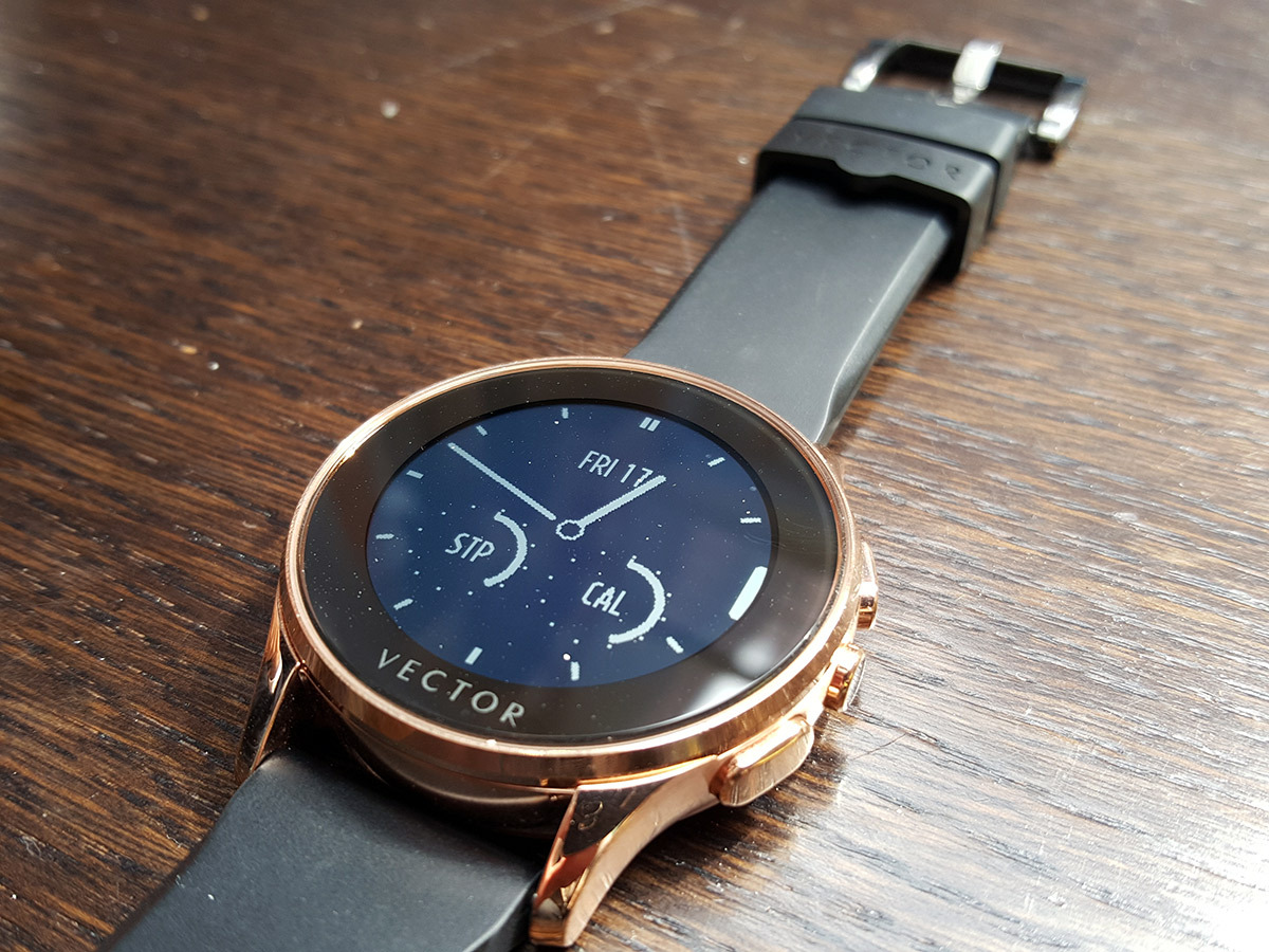
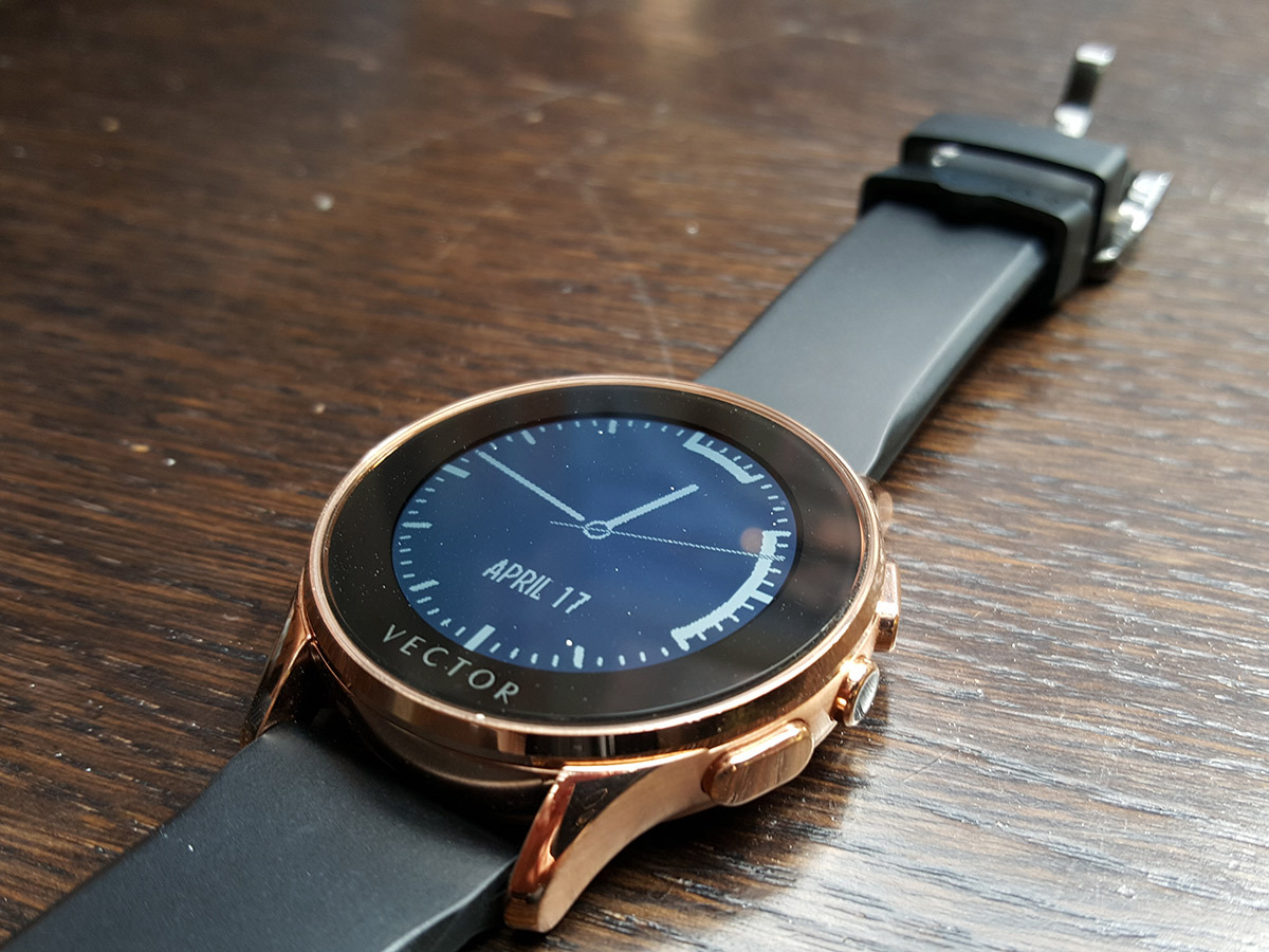
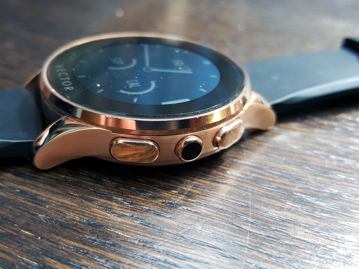
The model we saw was a rose gold variant of the Luna. Its stainless steel body feels sturdy and premium in the hands, with just enough heft to make that £300 price tag feel worth it.
Read more › Apple Watch review
Its silicon strap does lets the premium look down a little bit, although we were informed that it was a prototype strap and not the final model. It’s comfortable on the wrist however, and looks like a good strap option for running and exercise.
Like the LG G Watch R, the Vector supports any standard-width watch strap too, so you can mix and match different options with whatever you fancy.
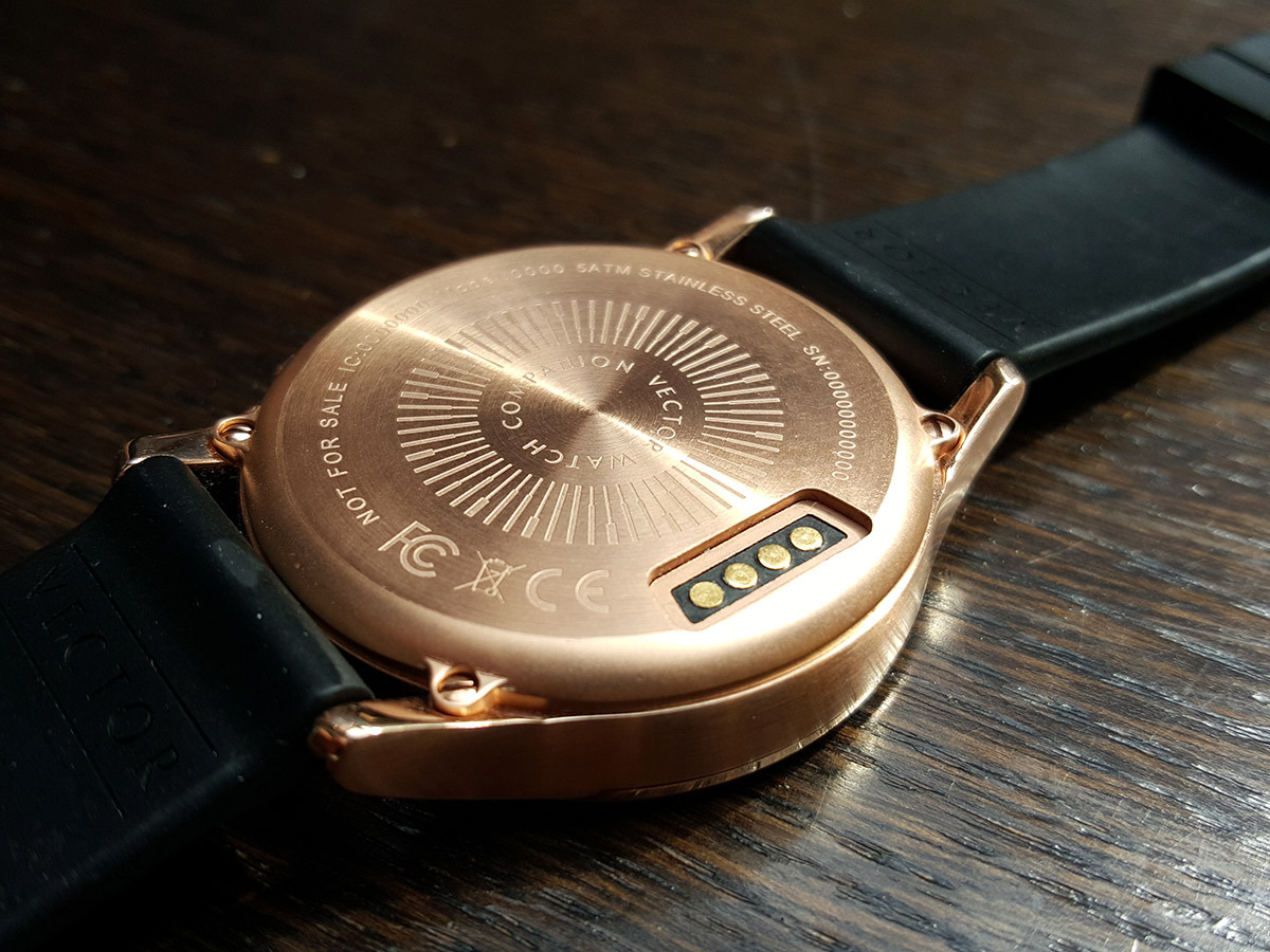
The rear of the Vector is also encased in stainless steel, stamped with its 50 metre waterproof credentials.
Unlike the Moto 360, the Vector lacks a heart rate sensor, and it’ll need a special charging dock for its rear pins, taking a leaf out of the G Watch R’s book.
Read more › Motorola Moto 360 review
Impressive screen
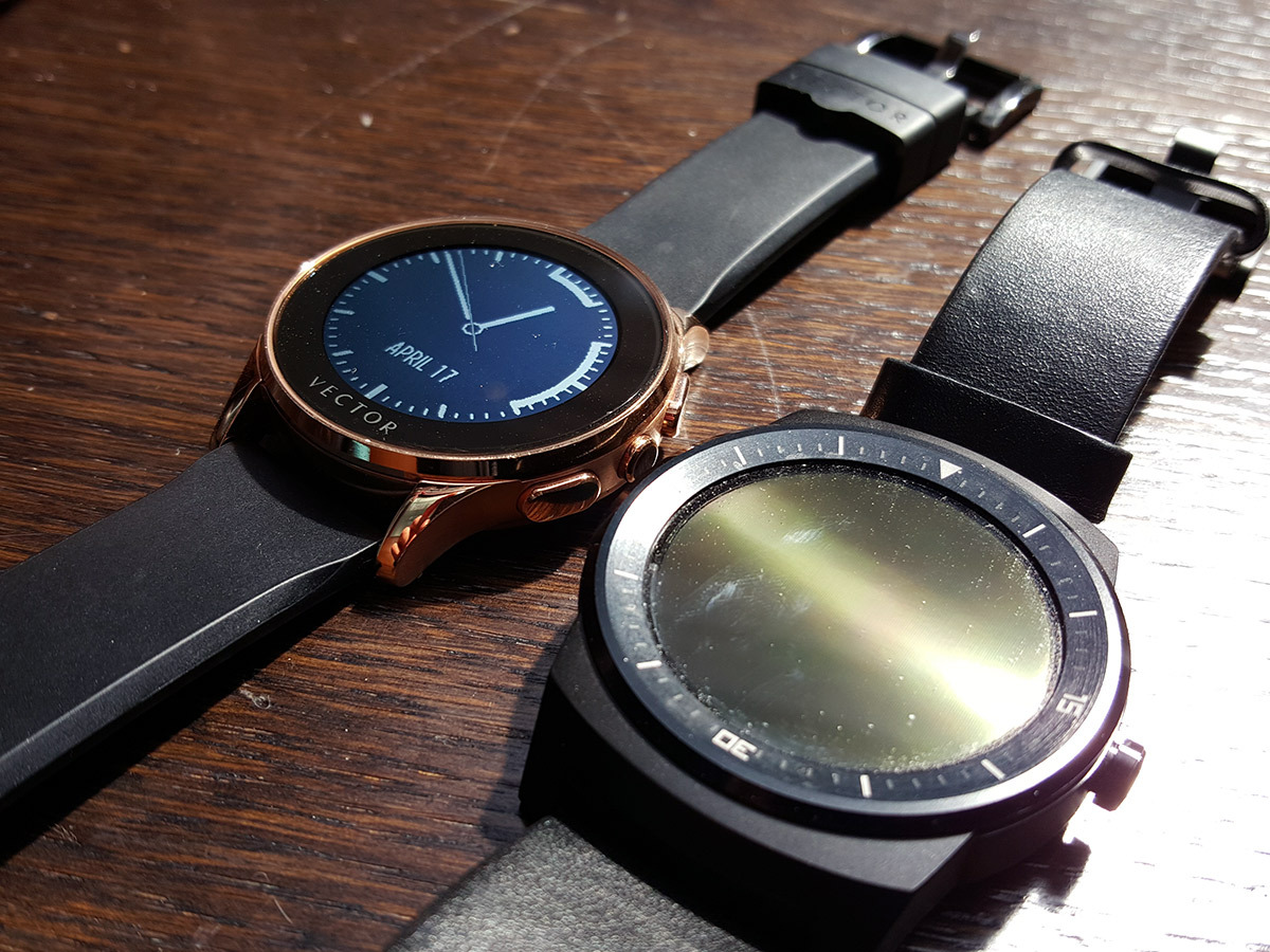
The Vector’s black and white LCD display won’t win awards for sharpness, but then again, neither will any of the smartwatches currently available.
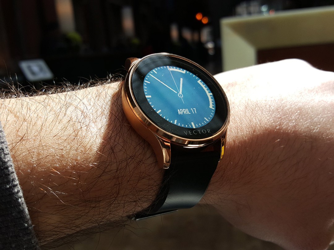
Its visibility even in bright, direct sunlight, however, is extremely impressive. It totally outshines the G Watch R when faced with the sun’s luminous wrath, which is a massive plus. There’s no point having a watch you can’t read, after all.
Like the Moto 360, it’s got a built-in ambient light sensor too, which automatically adjusts the brightness, saving you from having to manually tweak the brightness settings.
It would be nice if the screen was a little larger with a little less bezel, and, if we’re being really greedy, pure OLED blacks would be even better, but for a first-gen product, we definitely like what I’ve seen so far.
Read more › LG G Watch R review
Watch first, brains second
Vector’s CEO Joe Santana was formally head of Timex, and he tells us that this background was a "hugely significant help when it came to understanding how consumers react to wrist devices". Throughout our hands-on session, Santana continuously reminds us that the Vector was designed as a watch first and foremost.
The outcome of this philosophy is a smartwatch that’s designed for as little interaction as possible. You wouldn’t spend time tapping and swiping away on a real watch, and if you’ve already got a smartphone with a large, comfortable screen, it makes sense to make that the primary source of interaction, Santana tells us.
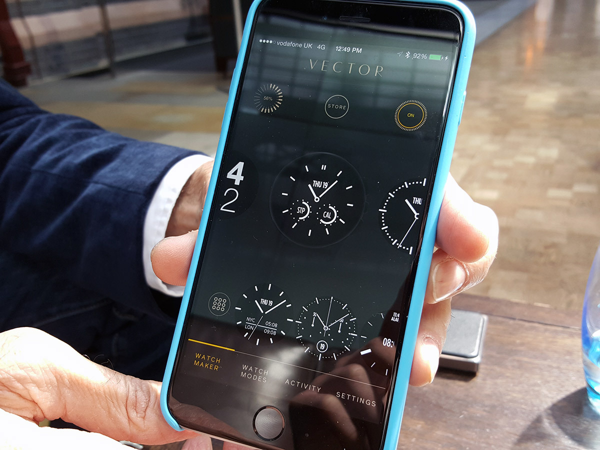
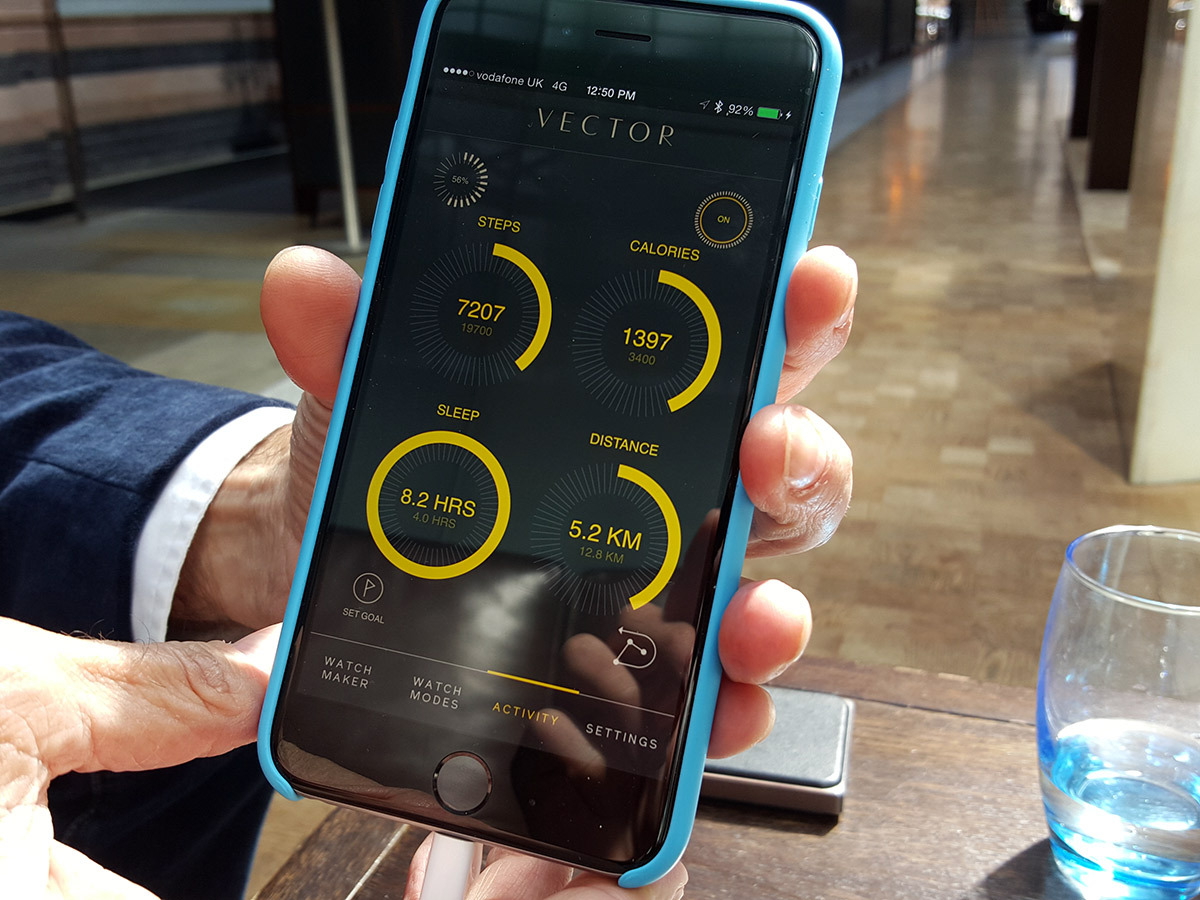
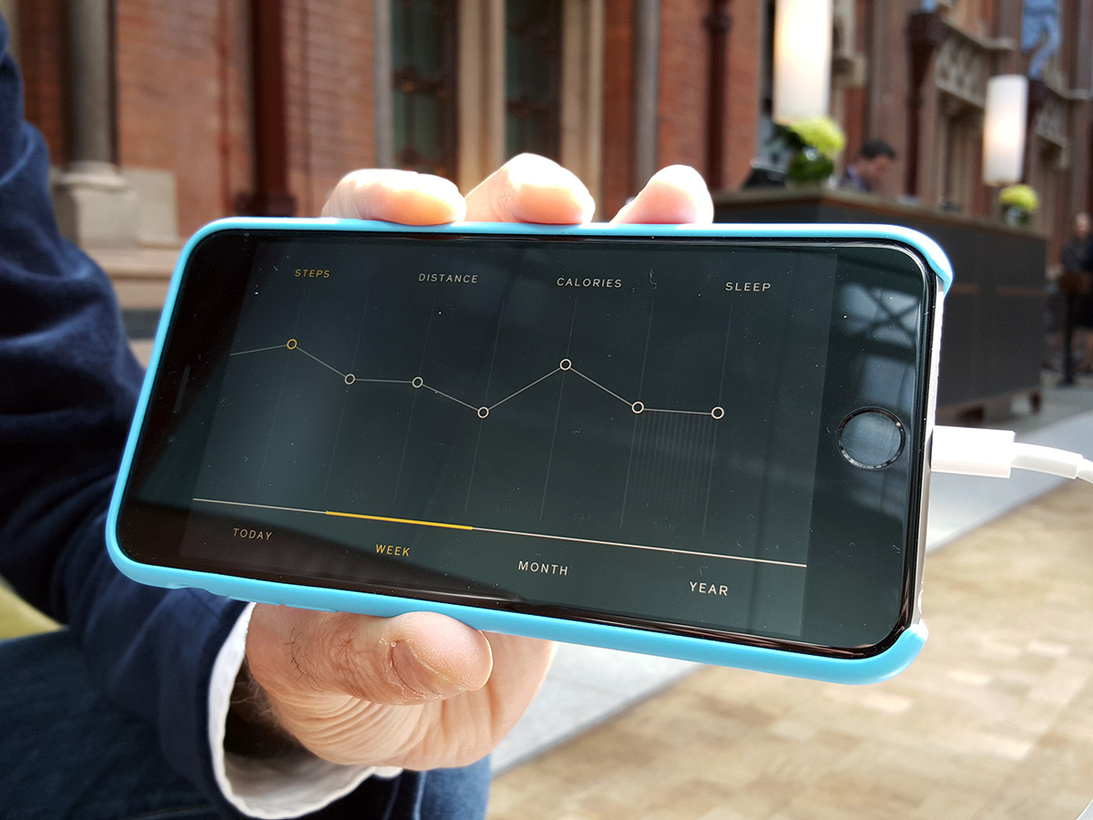
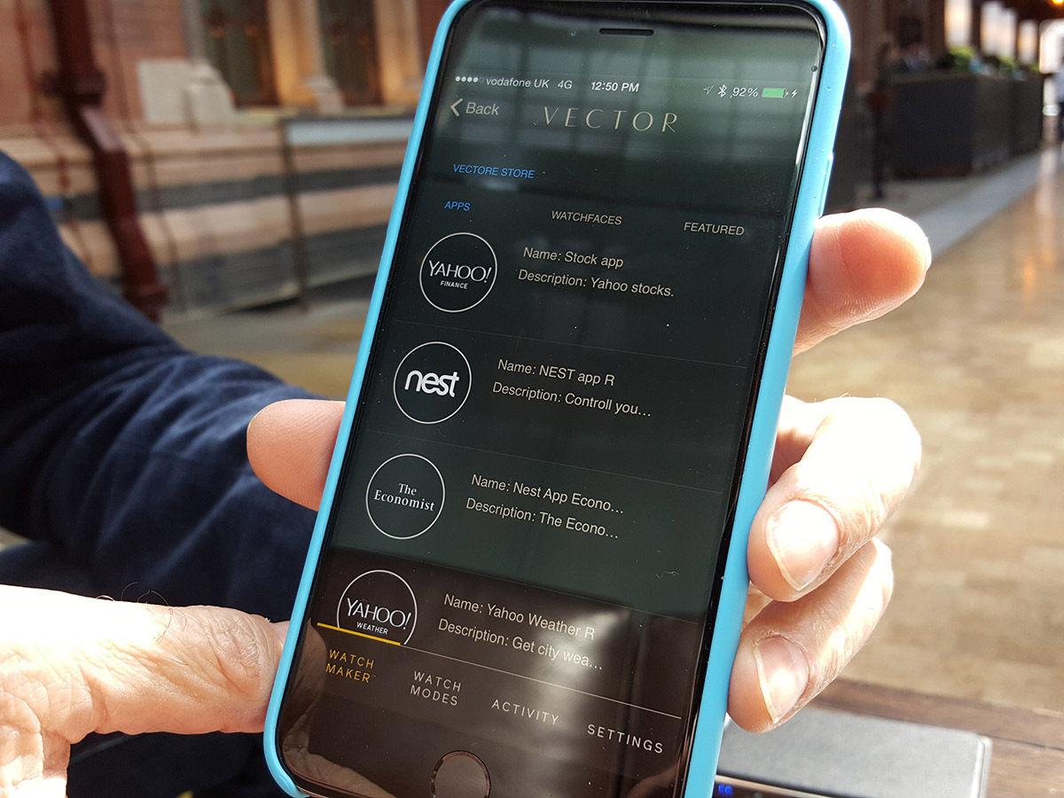
That’s where the Vector app comes in. It lets you tweak everything from watch faces to alarm times, as well serving as a portal to Vector apps. Its sleek and smooth appearance reminds us of something Apple might have produced, which is a testament to the quality of its design.
Swapping out watch faces is a simple drag and drop affair, and the change is instant. You can also have multiple watch faces loaded up simultaneously, using the Vector’s up and down control buttons to cycle through them.
Currently the Vector has a decent selection of faces, including a handy multi-timezone face for travellers, with the ability to change what cities are displayed, within the app itself.
There’s also a fitness-orientated face, which shows off the completion of fitness goals on smaller dials, Withings Activité-style.
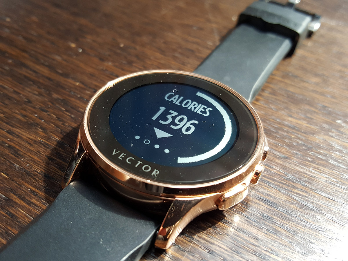
You can track your steps, distance and calories burned on the watch itself, or view it all in greater detail on the app.
The store currently has apps from the likes of Yahoo and Nest, but Santanta tells us that the Vector OS will be opened up to developers in the very near future, encouraging the number of apps and watch faces to increase.
Given that the Vector will work across iOS, Android and Windows Phone, there should be a large enough pool of talent out there to bring out a healthy selection of apps at launch.
What makes it a smartwatch?
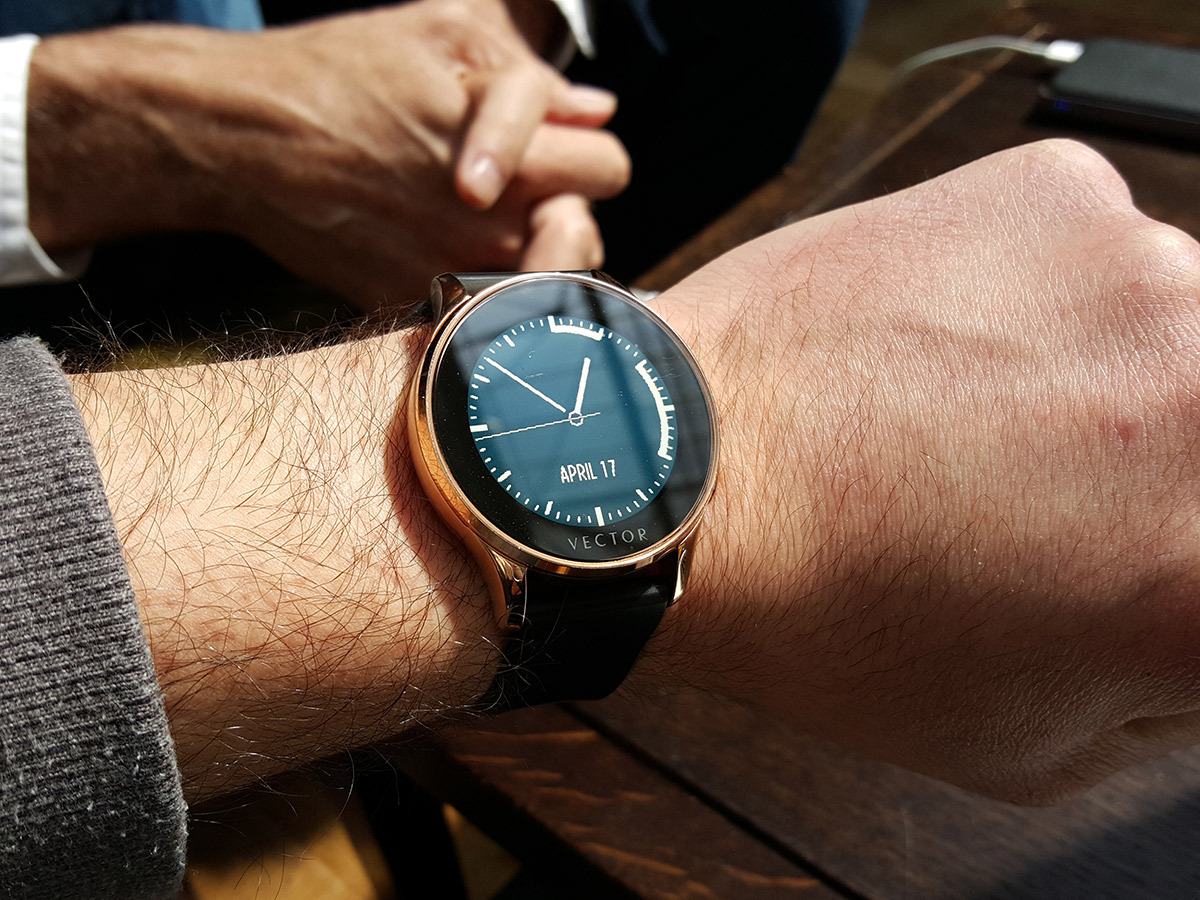
Despite the ‘watch-first’ mantra, the Vector does justify its smart moniker. It supports notifications, but in a rather pleasant, subtle way.
If you get a notification, the Vector will vibrate, but the message itself won’t actually pop up on your screen unless you tilt your wrist to face its screen towards you. The idea behind this is to ensure that potentially private messages aren’t displayed for the whole world to see, and it’s a nice touch.
Calendar entries are equally subtle. White blocks of time are displayed on the edge of the watch face, representing all the appointments that you’ve got that day. At a glance you can see when you’ll be busy, and how much time you’ve got in between meetings and appointments.
One feature that’s currently lacking is the ability to control music, but this is a feature that could, we are told, be added in a future software update.
Read more › Pebble steel review
So, about that battery life…
Santana assures us that the Vector’s incredible 30-day battery life is no joke, but the exact methods taken to achieve this industry-leading longevity, remain a secret.
We don’t yet know how large the Vector’s battery is, but we are told that the OS plays a very important role in squeezing out as much battery life as possible.
The details on the Vector’s OS are scarce, but it’s been in development for over a year, with the aim of being as efficient as possible.
Like Apple, Vector has the advantage of tailoring its OS to its own hardware, which greatly helps with performance and overall efficiency.
The lack of a heart-rate monitor, GPS and other stripped down features should also help contribute to that one-month battery life, but we’ll have to wait and see if it delivers once we receive our final review sample.
Initial Verdict

We’re very impressed with what we’ve seen so far.
The Vector isn’t miniature smartphone for your wrist. It doesn’t have all the software bells and whistles of its Apple and Android rivals, but it was never supposed to.
It’s lean, it’s handsome, and if it can deliver on that incredible battery life, it will be a very tempting option for those gadgeteers who are looking for something to compliment, rather than replace their smartphone.
We’re looking forward to putting it through its real-world paces ahead of its launch this summer, so stay tuned for our full review.
Cream of the crop › These are the top 10 best smartwatches in the world
