Samsung Galaxy Tab S hands-on review
We wrap our hands around Samsung's super-slim slates, right here in New York City
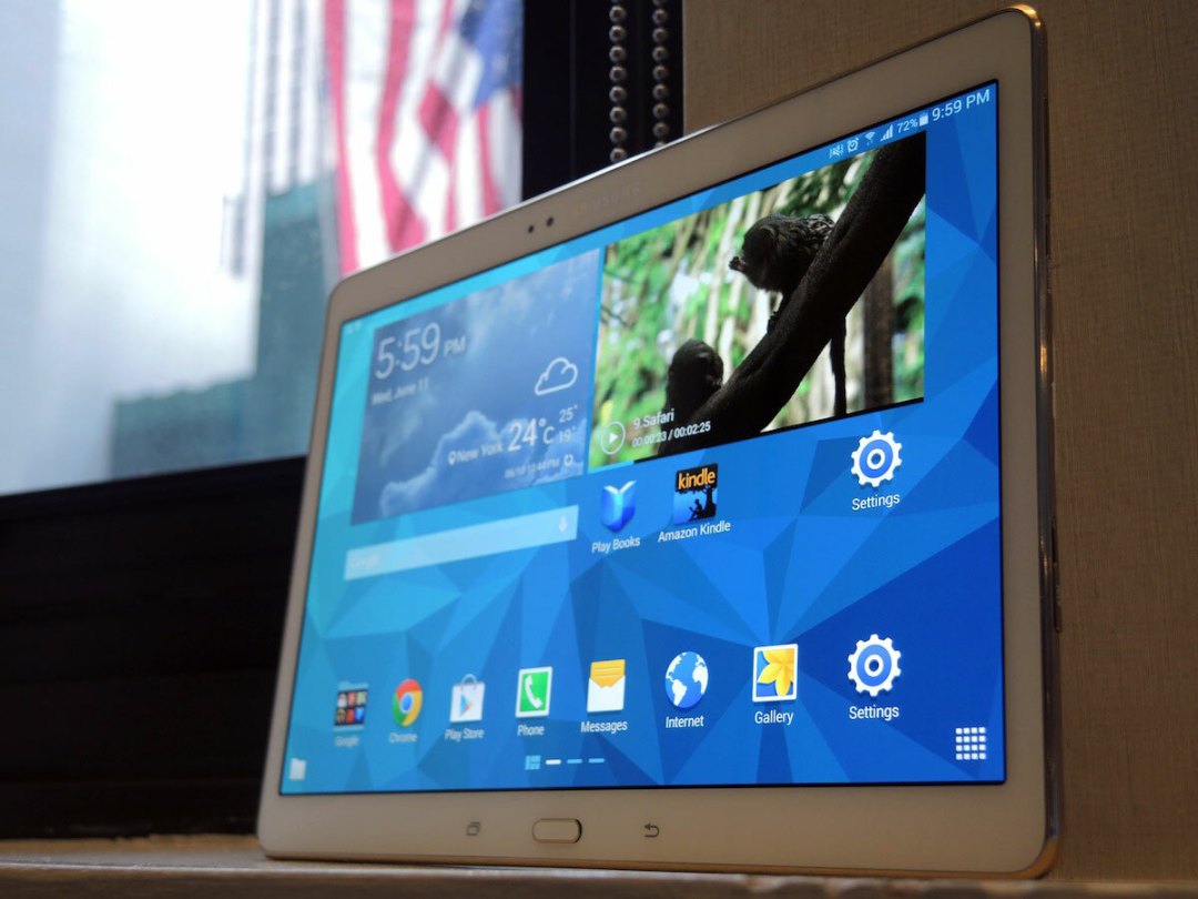
Samsung’s freshly unveiled Galaxy Tab S tablets strutted their stuff on stage here at Madison Square Gardens, showing off their pixel-packed screens and wafer-thin design to thousands of gadgeteers.
We spent some time with both of Samsung’s flagship 10.5in and 8.4in Galaxy Tab S models. Here’s what we made of them:
Super-slim and premium(ish)
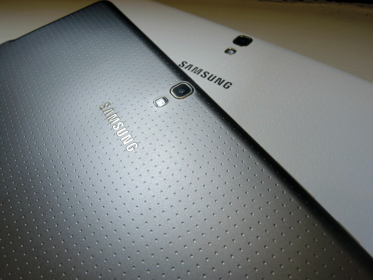
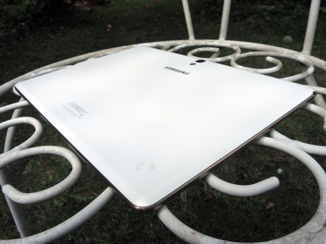
The Galaxy Tab S has the same design theme as the Galaxy S5, which is apparently called ‘modern flash’. While we’ve got no idea what that is exactly, we do know that the perforated plastic back of the Galaxy S5 is back and bigger than ever, gracing the rear of both Galaxy Tab S models in two colours – Titanium Bronze or Dazzling White.
While the S5 has been criticised for its less premium build, the Galaxy Tab S actually feels better in the hands than its smartphone cousin and its build is rock solid – rigid with no flexes or creaks to be found.
The back offers reassuring grip without feeling rubbery, and its faux brushed metal banding which surrounds the body managed to fool both our fingers and eyes.
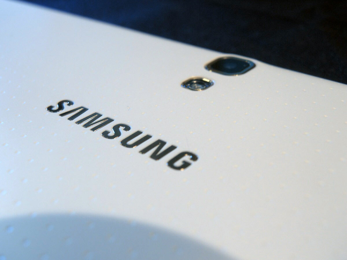
It still doesn’t match the build quality of the iPad Air or Xperia Tablet Z2, mind, but it’s a solid step forward nonetheless.
Both Tab S devices are incredibly thin at 6.6mm – no thicker than five stacked credit cards Samsung tells us – and coupled with their featherlight weight, result in tablets that are very comfortable to hold.
The sides of the Galaxy Tab S are home to the microSD and SIM slots, although the latter will only be present in the 4G LTE versions.
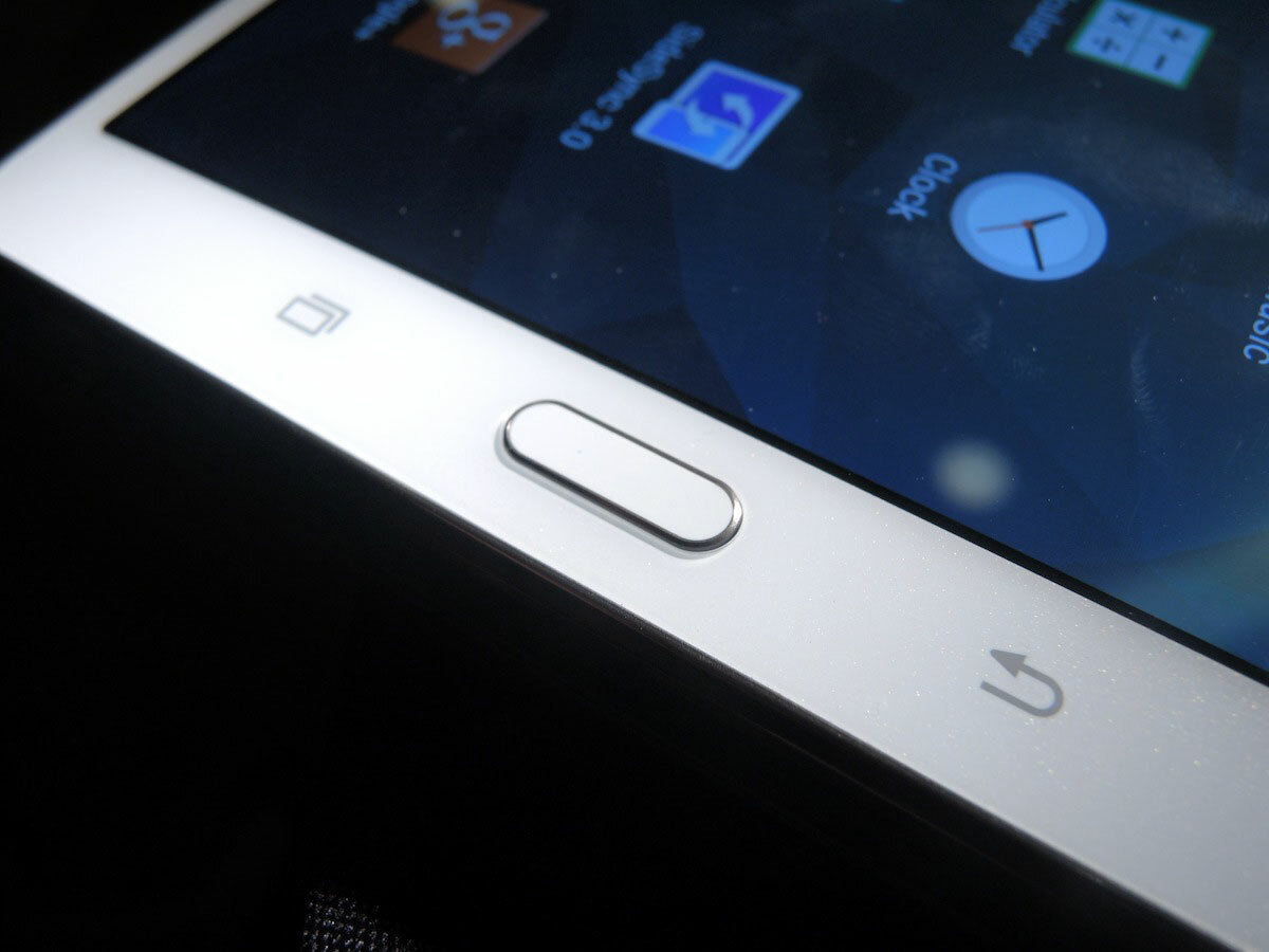
Samsung has unsurprisingly stuck to using capacitive apps and back buttons, which flank a physical home button. The home button also bestows the Galaxy Tab S with fingerprint-scanning powers – the first for any Samsung Tablet.
Up to three fingers per user are supported, and multiple users can log on with a quick swipe of a finger, as well as quickly paying for items online with PayPal.
A screen that’s bursting with colour
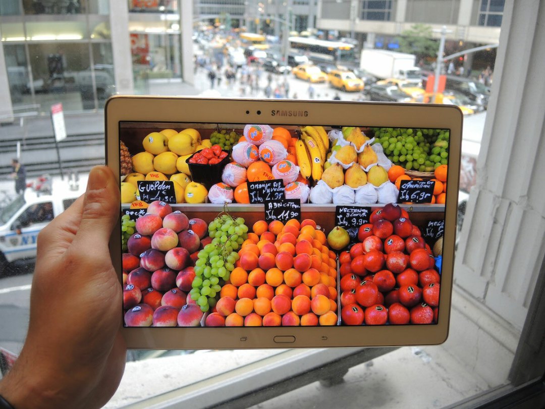

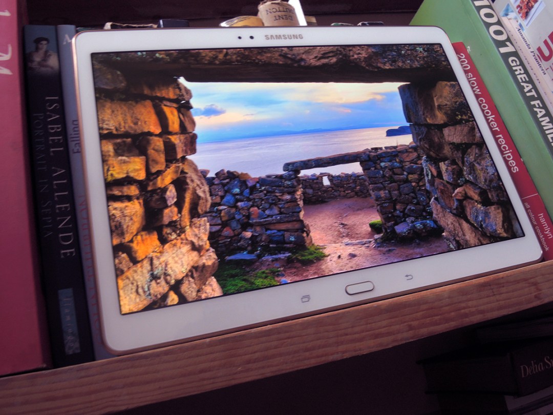
Both the 10.5in and 8.4in Galaxy Tab S models sport the world’s first made-for-tablet Super AMOLED displays, and Samsung has gone to great lengths to emphasise the benefits of AMOLED over traditional LCD tablet screens.
In person, both screens look sharp and detailed, thanks to a pixel-packed 2560 x 1600 resolution, and thanks to their AMOLED DNA, blacks were deep, rich and pure. The blacks on an LCD screen look washed out in comparison. The difference really is night and day.
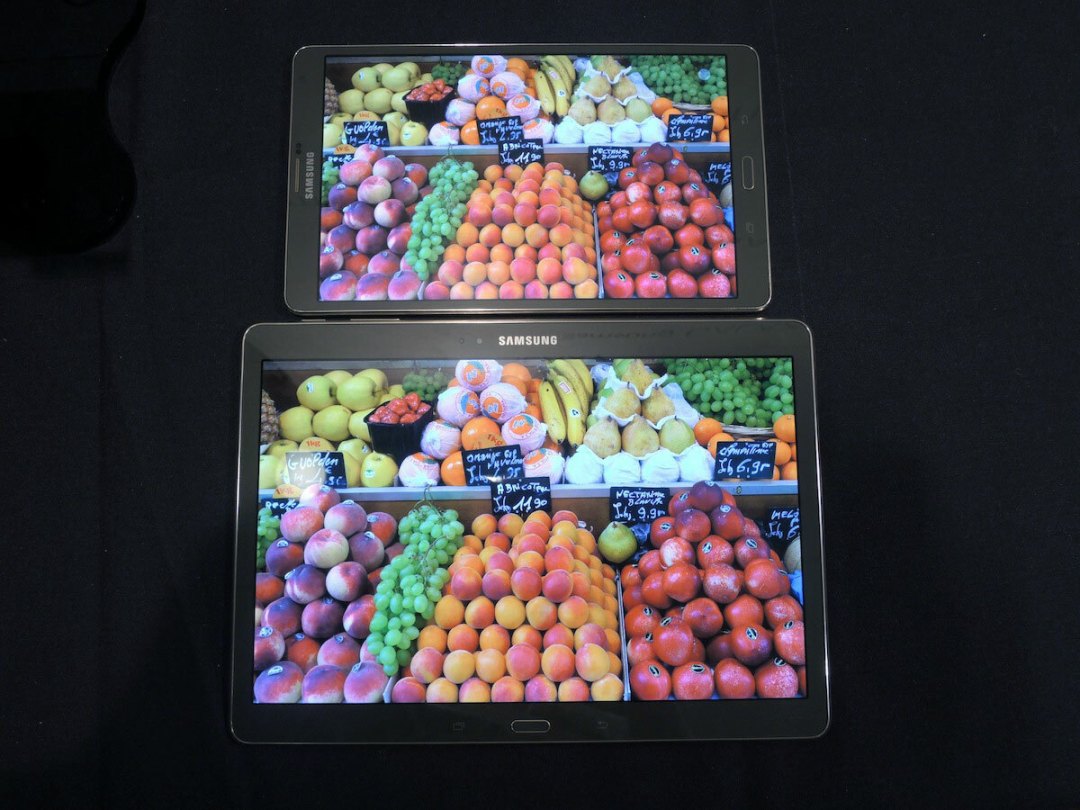
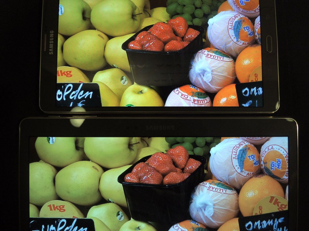
The Tab S’ colour reproduction is more open to question. Samsung believes that the richer colours found on an AMOLED display are actually more accurate, but our experience doesn’t bear that out.
There’s no denying the richness of colours on the display of both Galaxy Tab S models. Coupled with the huge contrast offered by AMOLED technology, and the high resolution of the panels, the stills of fruit in the demos made us want to lick the screen.
We resisted, don’t worry.
However, some will find the colours on the Tab S screens to be over-saturated. Sure, glowing fruit looks juicy and delicious, but if you prefer a more realistic representation of the world, the natural tones of a good LCD will be more up your street.
Thankfully, you can change the display mode in the settings to mute the screen’s excesses, and if you’re a colour purist, the Basic mode will sort you. It‘s all subjective in any case, and the fact that you can adjust the display to suit your taste means that everybody wins.
In short then: killer screen.
The Galaxy Tab S uses an Adaptive Display mode which automatically adjusts to your surroundings. In normal use, it leans towards the over-saturated side, but it will come in handy in odd lighting conditions as it automatically adjusts the white balance of the display, depending on the ambient light.
If you’re in a coffee shop with overly warm yellow light for example, the Tab S automatically adjusts to a cooler, bluer white to compensate for it. The demo above shows the difference between the white levels under warm and cool lighting conditions.

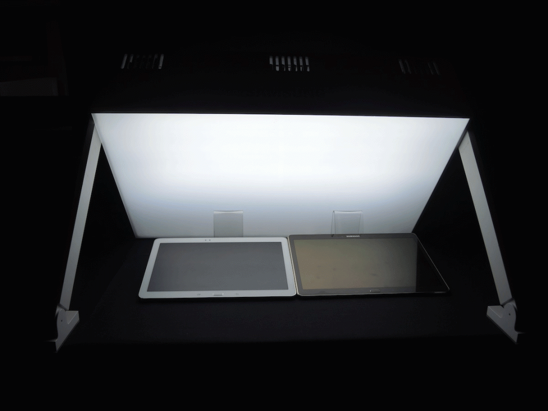
One benefit AMOLED displays offer over their LCD counterparts is better readability in sunlight.
Samsung set up a demo where a light box (brighter than the light of a thousand suns which painfully seared our retinas) shone over AMOLED and LCD displays.
The differences are vast, and this will be a big plus for users who are tapping away on their screens outside or under bright light.
Power, camera, and other extras
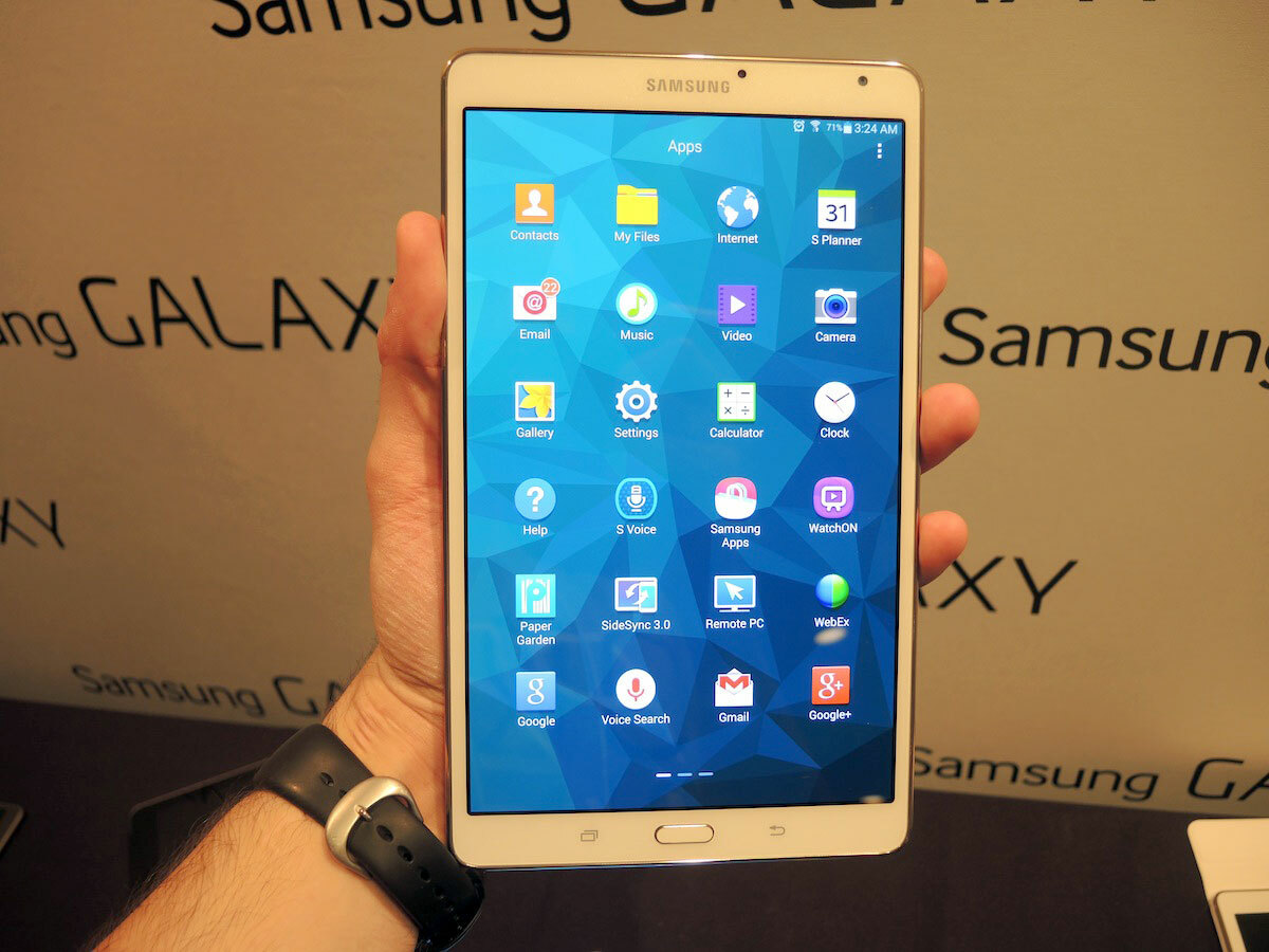
We weren’t able to test out the power of the Galaxy Tab S models during our brief time with them, but opening apps and menu transitions seemed fast and fluid. The Galaxy Tab variants will land either with Samsung’s own Exynos 5 processor or Qualcomm’s Snapdragon 800 offering. We’ll have to wait for our full review to put them through their paces, but first impressions are promising.
We couldn’t put the 8MP camera through its paces properly either, but the few quick photos we did take looked a little grainy. Given that cameras are a very low priority for tablet users (or at least, they absolutely should be), this shouldn’t be anything to worry about.
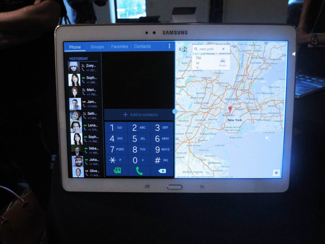
Android KitKat 4.4 is of course skinned with TouchWiz on both tablets, and it brings with Samsung’s software tweaks, including a newer multi-window function which lets you drag and drop data from one window into another.
Samsung demoed dragging Google Maps directions directly into a live phone call, which is a genuinely useful feature that we’d love to see other manufacturers adopt.
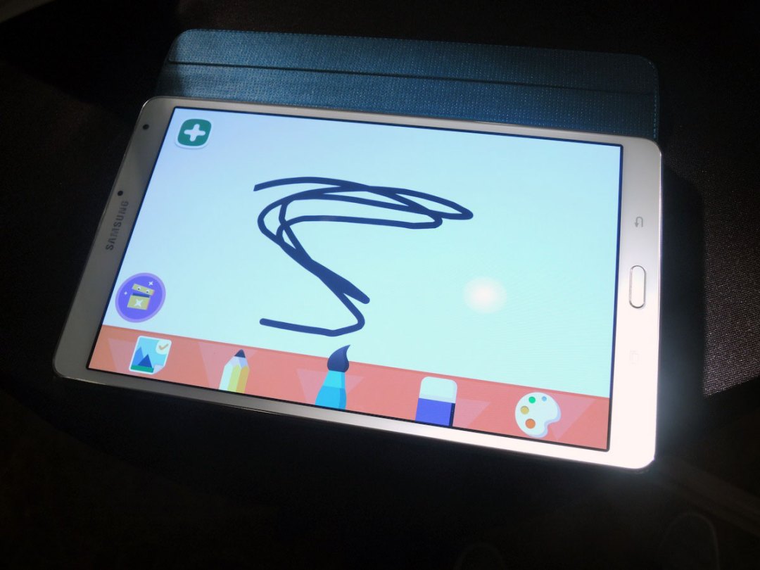
We also briefly played around with Kids Mode, a youngster-friendly interface with various apps to keep little hell raisers out of trouble, for at least a few minutes.
One incredibly useful feature that we sadly didn’t have time to test was SideSync 3.0, which lets you play games installed on your smartphone on the larger Tab S screen. You can also answer calls on your Tab S, even if your phone is charging in another room.
The only downside is that this only works with Samsung’s own Galaxy devices. Boo.
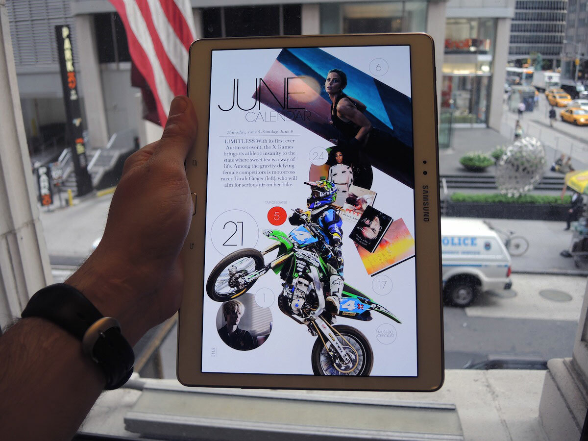
Samsung is also launching Papergarden – an app with quality interactive magazines on offer, optimised to fit the display of the Tab S.
Accessories
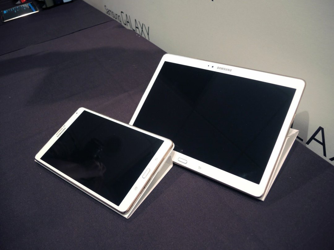
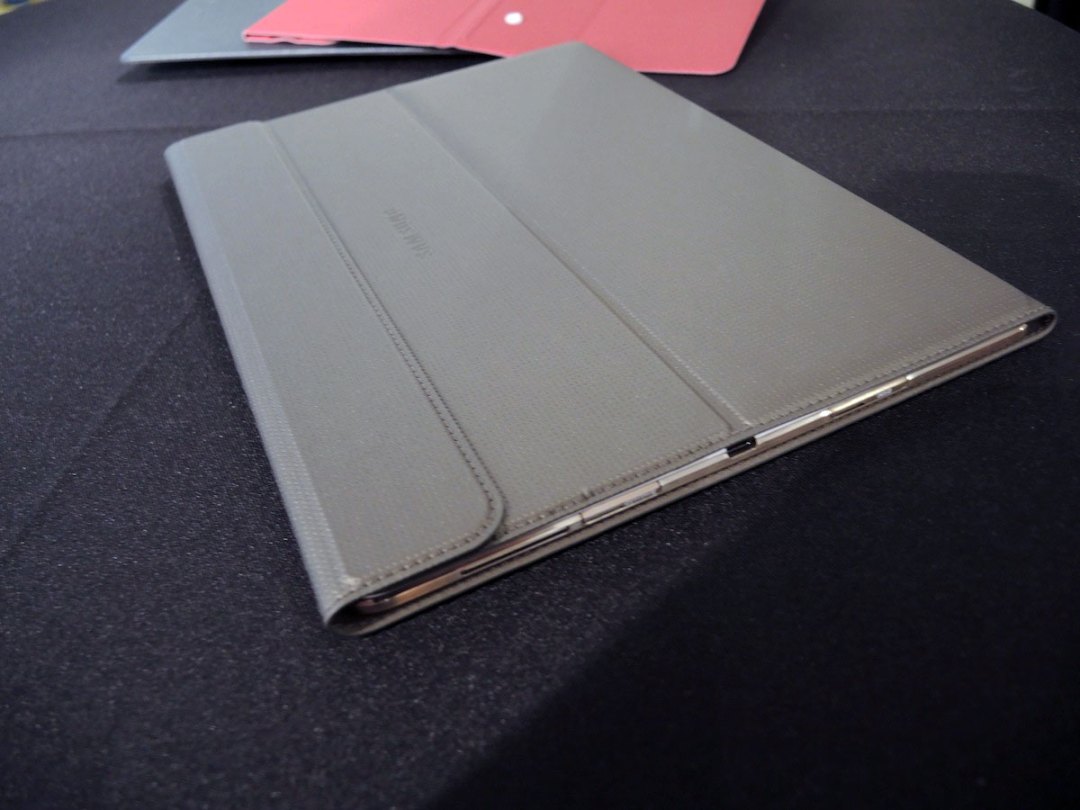
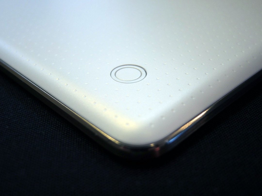
The Tab S tablets have three cases, all of which click into two circular rear click locks, called ‘Simple Clickers’. It’s Samsung’s answer to magnetic covers, and while a little fiddly, it does offer a stronger connection.
The Book Cover is a thin faux leather/suede cover which wraps around the Galaxy Tab S tablets and lets you prop them up in three different viewing modes – Touch mode for flat surfaces, an angles Typing mode and a Viewing mode for watching videos.
The Simple cover sports a similar design, but only protects the screen, making it an even thinner choice.
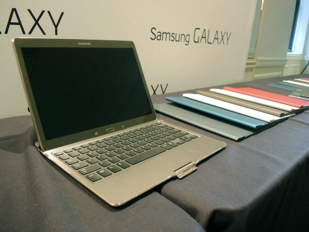

The Bluetooth Keyboard accessory will appeal to you if you’re looking to squeeze a little productivity out of your tablet. It props the 10.5in Tab S in place and securely clips it shut to protect it when not in use.
The dummy unit we saw didn’t have real keys so we can’t vouch for the typing experience, but it seemed large enough to be comfortable.
Initial Verdict
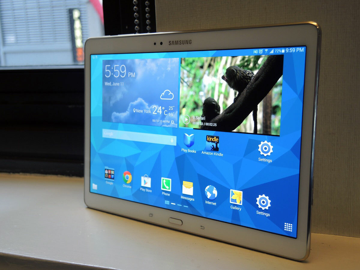
The Galaxy Tab S is Samsung’s flagship tablet, at least until the inevitable new AMOLED Note 10.1 comes along, and our initial impressions are positive.
The build isn’t as premium as many would like, but it’s definitely an improvement. It’s solid and well-built, and its screen offers deliciously deep blacks and punchy colours, along with the option to tweak it to your own taste.
Stay tuned for Stuff’s full in-depth review of the Galaxy Tab S to see if it’s got what it takes to be the best tablet in the world.


