Samsung Galaxy Note Edge review
Samsung’s edgy new design makes curves work in new and interesting ways
“Guys, we’ve got to do something,” begins Samsung boss Jong-Kyun Shin in the totally fictional smoke-filled board meeting we’ve made up just now.
“People are bored of smartphones. They say they’re all the same, that we don’t innovate anymore. And our arch rivals at LG are higher up the Stuff Smartphones Top 10 for heaven’s sake! That cannot stand. We need something new and exciting. We need a device befitting of the glorious Samsung Galaxy name!”
After hours of sifting through ideas and almost deciding to make a corduroy phone with an integrated cigarette lighter, Shin finally settles on a plan by ceremonially stubbing out his Romeo y Julieta cigar on its design document. The room erupts into applause, Samsung’s future success secured.
At least that’s how we imagine the Note Edge being conceived. Maybe it was a lot more boring than that but that would be a shame – because this curvy-edged Galaxy is really quite interesting.
Edgy by name, more curvy by nature
Some suggest that the design of the Samsung Galaxy Note Edge is a test run, a demo of the sort of designs we’ll see in other top Samsung phones of 2015 if it proves successful.
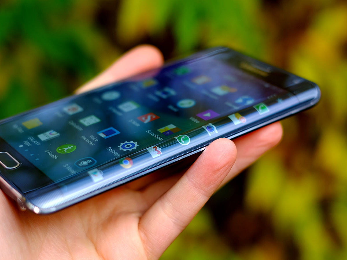
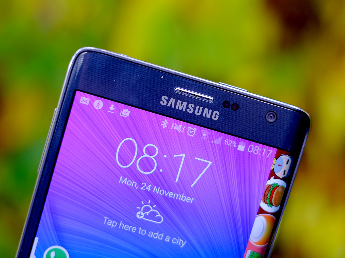
It has a curved glass screen. Most of the display is completely flat, completely normal, but the last inch of the right edge curves around to almost 90 degrees. Curves are everywhere in tech – concave TVs are all the rage and even phones such as the Galaxy Round and LG G Flex have gone with interestingly bent displays.
This is one of the most severe curves ever seen in a screen, but in not spanning across the whole display, it gives the Galaxy Note Edge a chance of being more than just an attention-grabbing gimmick.
The crucial question is: is the curve useful?
The answer: sort of.
Caress the curve
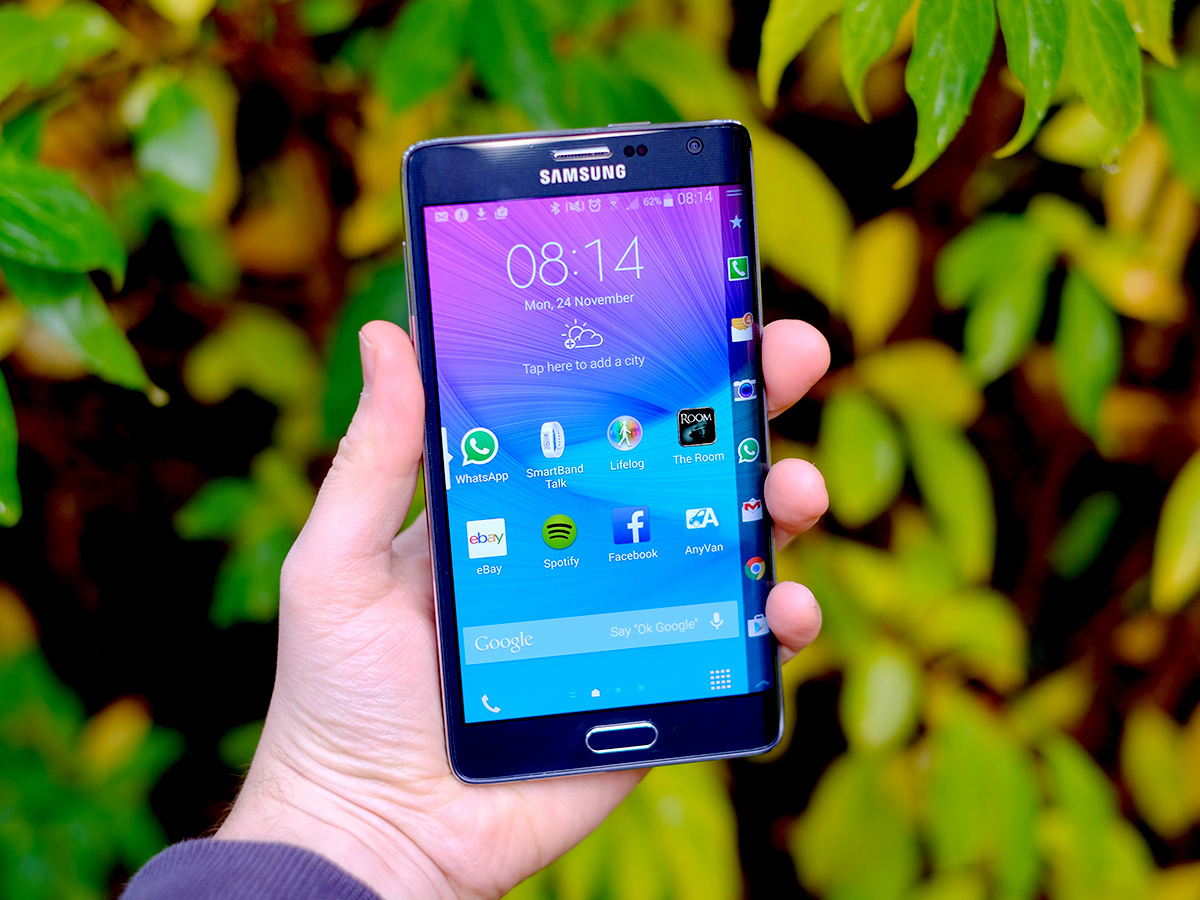
In most respects the Samsung Galaxy Note Edge is quite a lot like the Galaxy Note 4. It’s a large phone with a large screen, and it offers power user features such as a digitiser stylus.
The curve doesn’t make the Note Edge better for games, or drawing, or anything like that. However, it does help you deal with the practical issues that come with a phone that really fills palms and pockets.
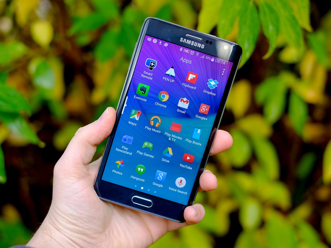
The default display of the curve is a list of app shortcuts, the kind you’d normally see at the bottom of the display of any other Android homescreen. As it’s so big, reaching to the opposite end of the screen with a thumb is a right pain, but thumbing the icons laid along the curvy side is easy. That your thumb already faces the right direction is what validates the bend. At least in part.
It also makes the Samsung Galaxy Note Edge absurdly right-hander-centric, though. If you naturally hold a phone in your left hand, there seems virtually no benefit to the curve’s spot on the phone.
We’ll cover more on what the curve can do software-wise in a bit, but how’s the design otherwise?
A big boy
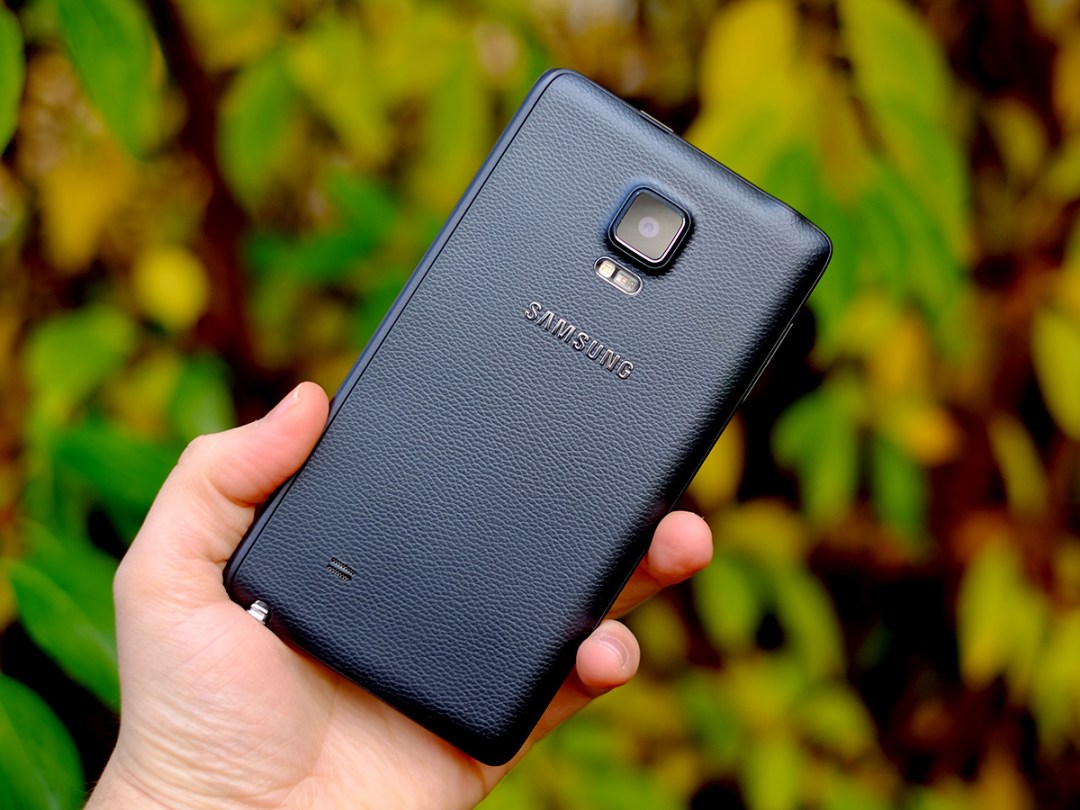
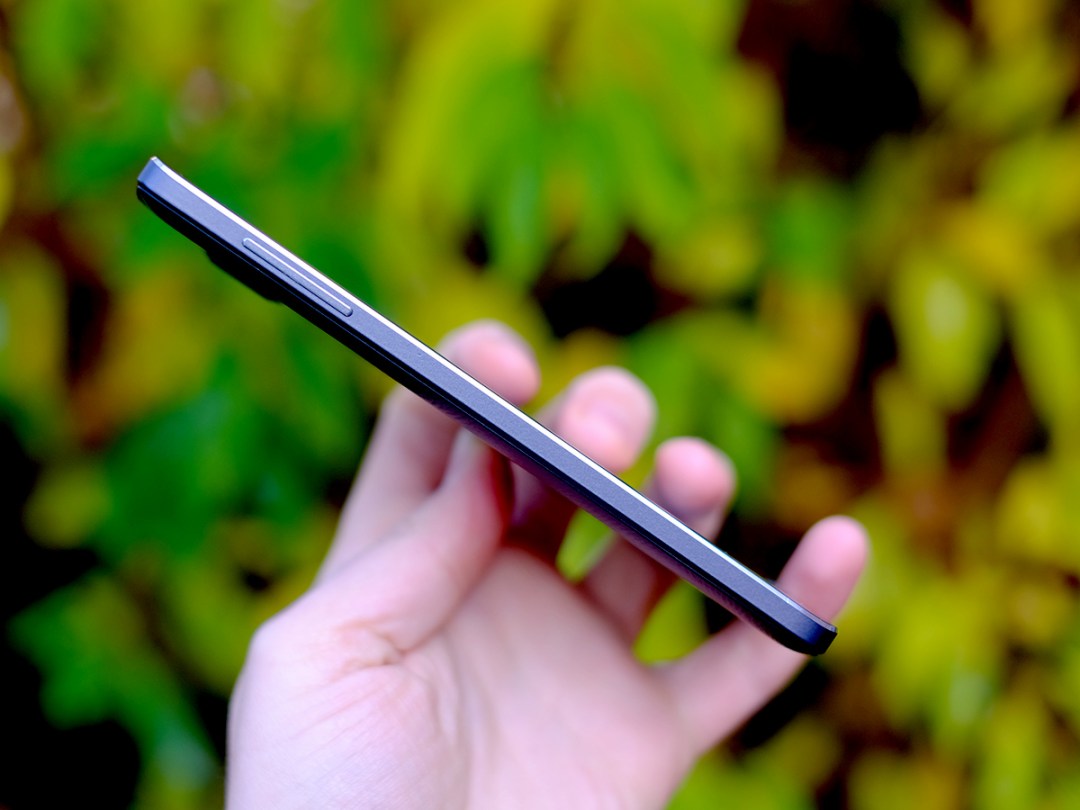
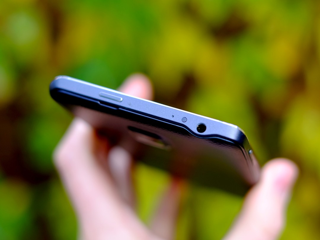
The Note Edge takes its core style from the Note 4. A band of aluminium runs around the sides while the back is a thin plate of leather-effect plastic. Many people complain about the plastic feel of Samsung’s phone rears, but moaning about it at this stage seems a bit pointless. It’s the way Samsung rolls, at least for now, and it is somewhat offset by having the metal sides and an almost entirely glass front.
There’s impressive technical precision to the curve too. It’s incredibly smooth, and the actual display swoops around with the top glass layer as if they’re the same entity. Whether you agree with the curve or not, you can’t help but conclude Samsung has aced its execution from an engineering perspective.
While the curve provides some practical benefits as well as being as eye-catching as Ziggy Stardust walking around Tescos, the design also has its downside – the Note Edge is an extremely wide phone. At 82.4mm wide it’s almost a half-centimetre wider than the already-massive Note 4.
Full-size adult man-hands will find this phone a handful and trying to type on one single-handed is a nightmare of “I’m in a maths exam and am also naked” proportions. This is a phone to use with two hands, or at least one hand and a pen.
Writing on the touchscreen
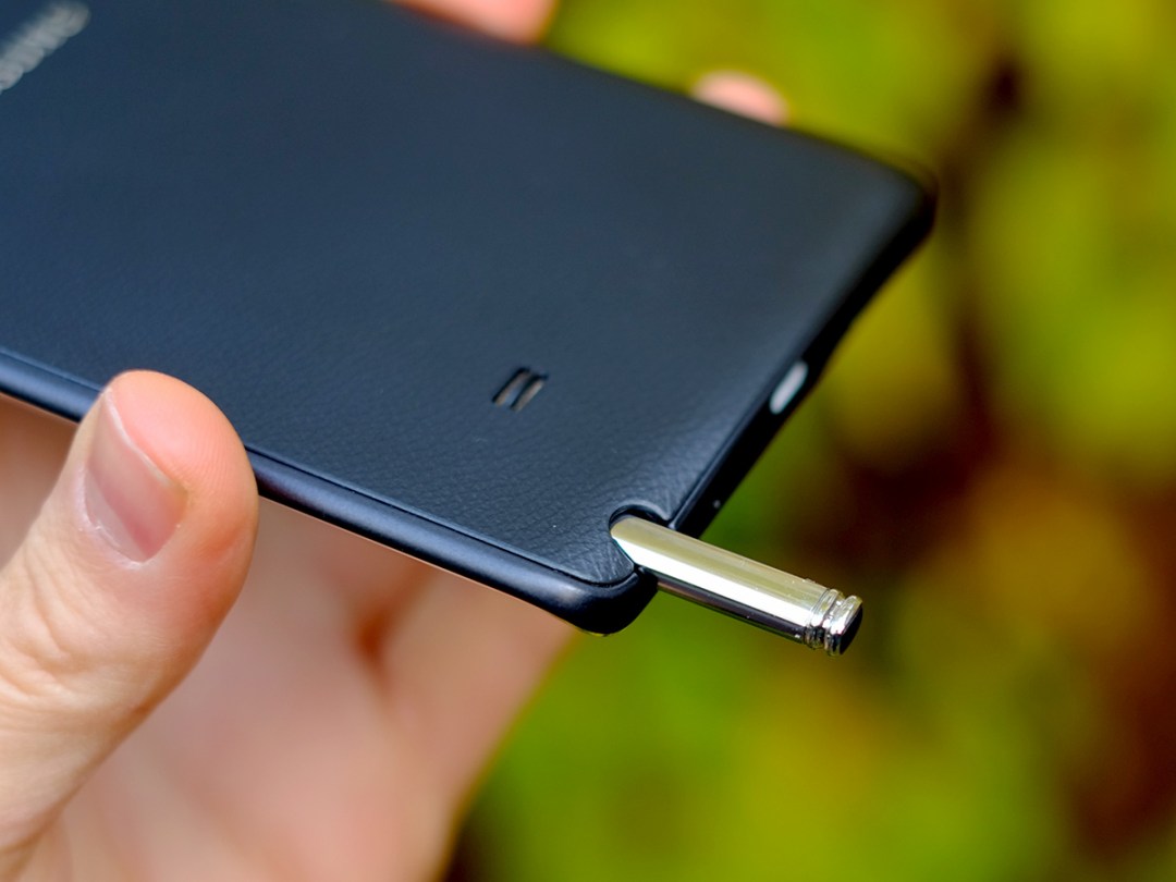
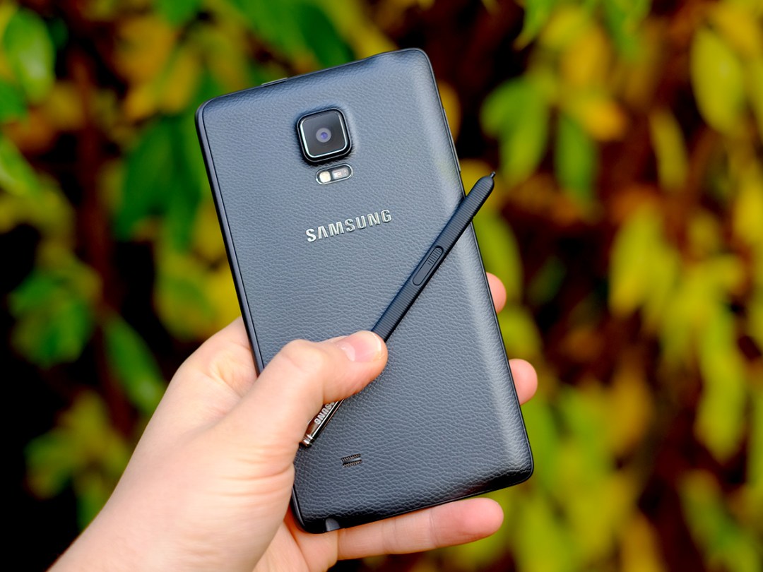

Like the Note 4, the Note Edge uses an S Pen stylus that slots into the bottom of the phone. And, as ever, it’s great if you’re into that kind of thing.
It’s fully pressure sensitive, getting you the sort of stylus experience on offer in a graphics tablet, rather than the kind of capacitive pen you can buy in PoundLand these days. The phone can be fully operated with the pen, and pretty great optical character recognition means you can handwrite your text messages and emails rather than tapping away on the keyboard.
The extra bits of stylus-led interface in the Note Edge are pretty similar to what you get in the Note 4, and even Note 3. An Air Command menu pops up when the pen is removed, giving you shortcuts to make notes on the screen, scribble down memos or use the pen to screen grab parts of what’s being displayed.
We found the S Pen far more useful for precision browsing, the odd bit of handwriting and idle drawing, though. Samsung tries hard to justify the pen, but it’s the basics we find it helps out with the most.
Samsung has tried a bit too hard in some other ways, too…
OCD multi-tasking
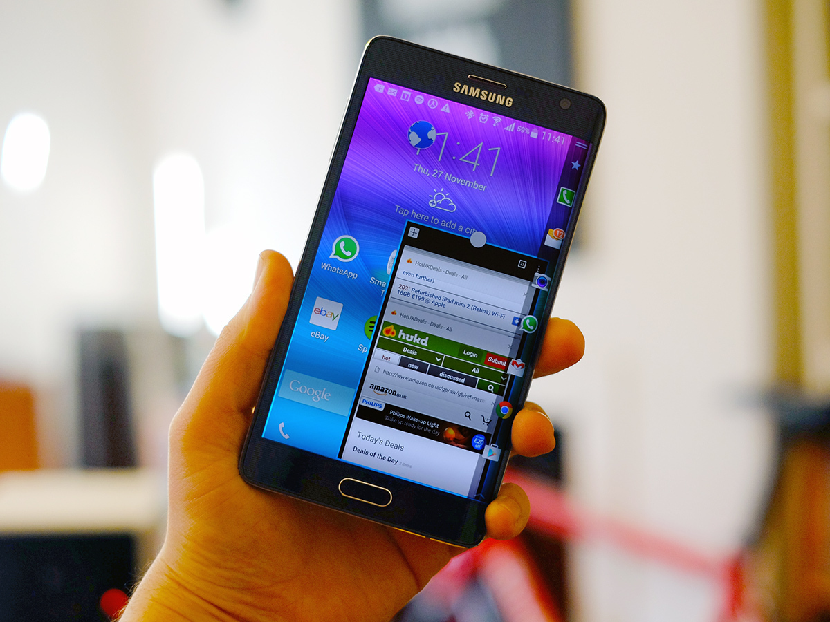
It takes multi-tasking to the next level by letting you open loads of apps as floating widget windows, by dragging down from the top-left of the screen.
But it’s a bit too easy to do this accidentally and end up with a screen littered with little app icons representing the multi-tasking screens you’ve binned. We’re sure some people will appreciate the Note Edge’s multi-tasking, but it won’t be most. It still feels that little bit awkward and bolted-on.
Bright and bendy screen
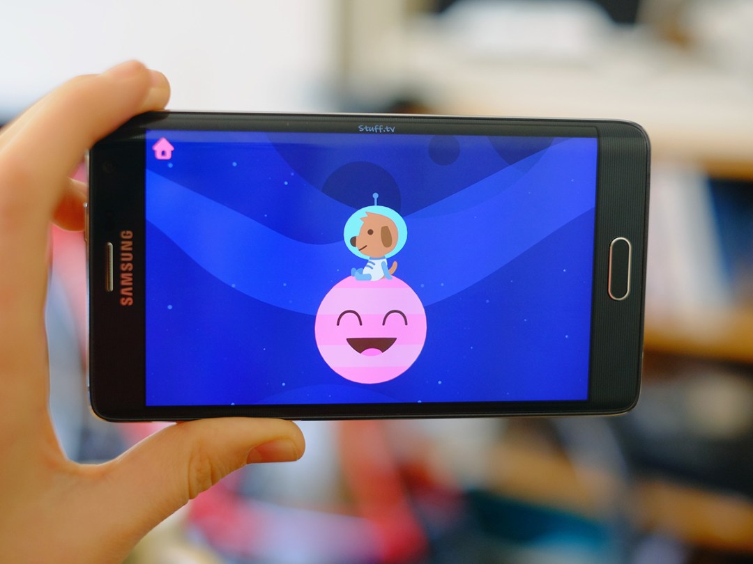
There’s no lack of screen space, though. The Galaxy Note Edge is about as large as it could be without risking being called a tablet by anyone and everyone.
You get a 5.6-inch screen, 0.1 inches smaller than the Note 4, but the comparison isn’t a direct one as the shapes of these displays are slightly different. Thanks to the Note Edge’s curvy bit, its screen is squatter, leaving the main flat bit of the display to offer the widescreen aspect we’re used to.
Display quality is, as has become the norm for Samsung, top notch. You get a Super AMOLED display of 2,560 x 1,600 pixels offering a blisteringly sharp 524ppi density.
Fresh out of the box, the Note Edge’s colours are far too saturated, typical of an over-keen AMOLED screen. But if you don’t like your colours Toxic Crusader-style, there are options in the Settings menu for you to tone them down.
As is the norm with OLED screens, contrast and black levels are fantastic.
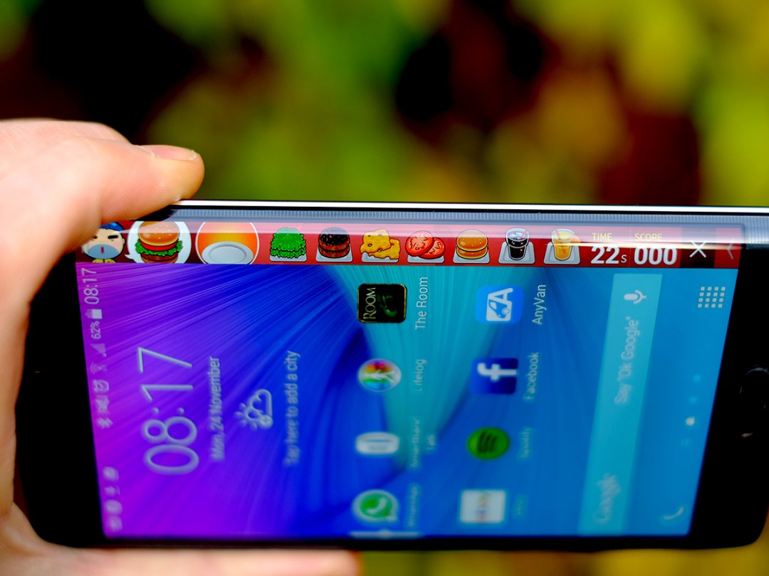
The curvy part of the screen doesn’t really become a distraction when you’re watching films or playing games either, as a lot of the time it’ll revert to being mostly black when running third-party apps, with just a hint of the curvature perceptible.
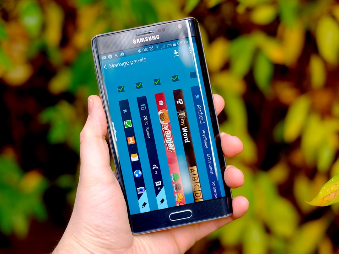
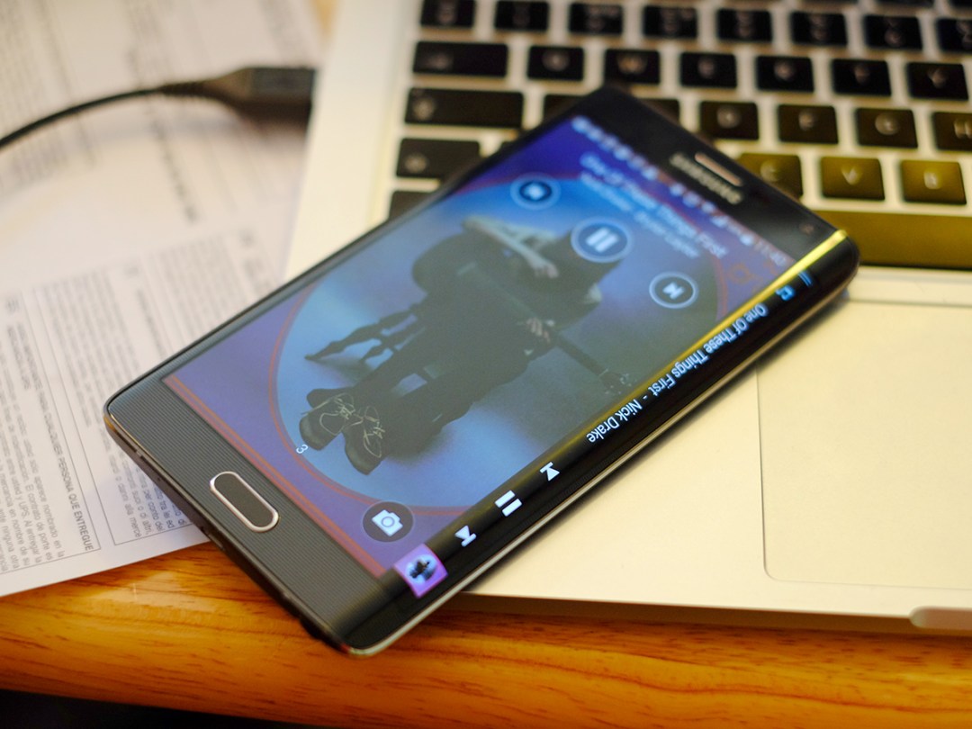
A bit like a notifications bar, you can summon the ‘full’ curve display by swiping at it, bringing up your Note Edge’s panels. These are the interface elements specific to the curved part.
As well as the standard apps shortcuts panel, there are ones for music playback, notifications and weather, stock tickers, health trackers and even games. Naff games, mind. You can choose which to use, and flick through them with a swoosh of your thumb.
At present most panels are Samsung-made, but Yahoo is also on-board. If we see plenty more Samsung phones start to use the screen curve, you can expect loads of other developers to join up and make panels. If the Note Edge ends up being it, the lone curvy phone, getting all that many more people involved seems unlikely. Only time will tell on that one.
We do think there are a few steps to go before the implementation of the curve is perfect. Don’t get us wrong: for a new design, the Note Edge’s curvy bit feels incredibly well-implemented. However, it does leave the TouchWiz home screens looking a little busy.
A Wizzy performance
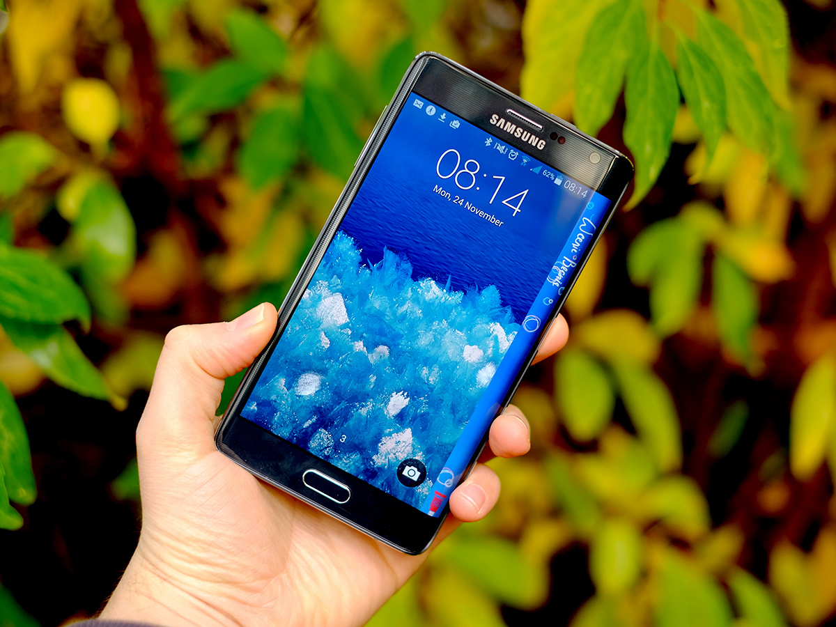
Other than the extra bits given over to the screen curve and the S Pen, TouchWiz still largely looks the same as it did on the Galaxy S5. A few bits such as the multi-tasking menu have been tweaked, but the same design is in place.
Despite the Note Edge’s obvious early adopter appeal, Samsung has also held back installing too many apps on the phone. This isn’t the TouchWiz of the bad old days – instead there are just a few extras, such as S Note, S Health and Smart Remote. The latter uses the IR blaster on the top of the phone so you can use your phone to control your home entertainment gear.
General performance is very good, which you’d obviously expect given the Note Edge’s top-tier specs.
It has 3GB of RAM and the Qualcomm Snapdragon 805 processor, the same used by the Note 4. This is a 32-bit chipset while we’re on the eve of a 64-bit sea change, but by current standards it’s still incredibly powerful. In the Geekbench 3 benchmark we scored 3310 points — a healthy chunk more than the Galaxy S5.
As you’d hope, the Note Edge has no trouble with high-end games, cutting through 3D titles with ease.
One of the great things about the phone is that while it’s an oddball, there’s no real compromise elsewhere. Apart from it being quite wide and, well, the cost of the thing. As with so many early adopter gadgets, it’s damnably expensive.
Edgy snapper
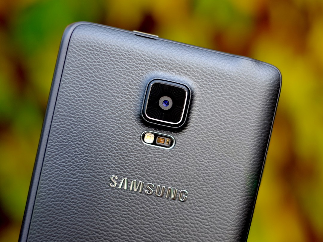
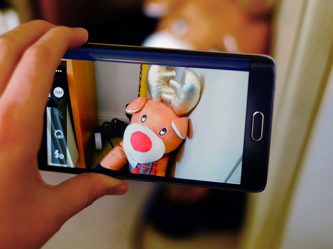
The Note Edge camera is much the same as the Note 4’s. You get a 16-megapixel sensor with image stabilisation, and it’s really rather good.
Sharpness, daylight shooting speed and the punchiness of photos are all great. Exposure metering is good too, making it dead easy to get decent photos out of this phone.
As is common among higher-end Samsung phones, the Note Edge has a ridiculously effective HDR mode that can be used as a pretty good cure-all for any photo issues. Dull-looking foreground? Sunset not ‘popping’ enough? Just switch HDR on, it’s given a top-billing spot in the camera app.


HDR photos can look a little larger-than-life, but when the results often look fantastic regardless, what’s the harm? It can occasionally push pics a little too far into unbelievable territory, but the Note Edge avoids the ‘halo’ effect of lesser HDR modes.
Thanks to OIS low-light shots aren’t too noisy either, although they are still significantly slower-to-take than with the Sony Xperia Z3. Despite stabilisation, you have to stay still for a second or two. Still, that’s not bad for night shots.
There are just two elements of the Note Edge’s photographic performance that we’re not thrilled about, and they have more to do with the app than the actual camera quality.
First, Samsung has desperately tried to involve the edge in the photo-taking process by always putting the shutter button on it, but this doesn’t always work. When shooting landscape photos, it’s just that bit too hard to reach. We’d much rather just use a conventional ‘on-screen’ shutter button.
The preview image when shooting is also weirdly very soft in certain conditions, making it tricky to know whether your images are properly in focus or not. As the focusing is fairly reliable, you just need to have a little faith. But it’d be nice to see the phone’s camera make better use of the Note Edge’s fantastically sharp screen a bit more.
On the other hand, the front camera has a 3.7-megapixel sensor, and from our tests it seems be be better than a lot of the “me too” advanced 5-megapixel front cameras out there. Its photos are bright even with indoors lighting, noise isn’t too bad and good contrast brings a good degree of ‘pop’ to your shots. Nice work, Samsung.
And just as the company has started cutting back on the number of apps it preinstalls on its phone, the number of camera modes shown off is sensible too. As standard there’s Selective Focus, Panorama and Rear-Cam selfie. The rest of the extras can be downloaded and added from the camera app’s settings. Samsung no longer tries to bury you with the things, which is also nice.
Running out of juice
In lots of core respects, the Note Edge matches the Note 4, and that’s a very good thing. However, battery life is one of the big disappointments of the phone.
We’ve been using it for more than a week now and each day we virtually drain the thing by bed time. We haven’t been streaming video for hours a day or playing games for long stretches. The Note Edge’s lovely big screen does invite you to browse more than normal, but it’s clear that battery performance is simply not nearly as good as it is with the Note 4 or Samsung Galaxy S5.
Battery size may have something to do with this, but it doesn’t seem to explain the whole story. It has a 3000mAh battery while the Note 4 has a 3220mAh one. However, 3000mAh should be enough to get the phone lasting longer than we’re seeing here. This makes us wonder if the OLED screen used here is perhaps a bit less efficient than the ones seen in other Samsung phones, with its flexibility/bendability being its lead characteristic, rather than efficiency. Buy hey, we’re just guessing at this point.
That battery life is our one lasting gripe of the phone tells you that Samsung has done a really good job here, though. It hasn’t proved a curved screen is utterly essential, but it has its uses and certainly feels far less of a ‘because we can’ gimmick than the Galaxy Round.
READ MORE: Everyhing we know so far about the Samsung Galaxy S6
Inspecting what’s under the carpet
What’s left? Well, this is of course a 4G phone, and all the bells and whistles of other top Samsung phones are present and correct.
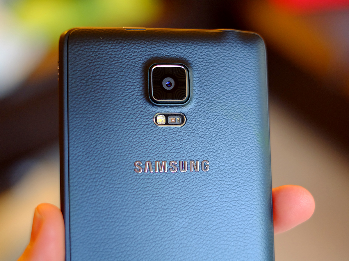
The Note Edge offers a heart rate sensor on the back and the fingerprint scanner on the front. Useful, but neither is worth basing your entire buying decision on – we actually found using a third-party app and the camera/flash combo a quicker way to tell heart rate on some occasions.
But the Note Edge’s speaker is actually pretty good. Or, at least, very loud. Its tone offers none of the nice ear-cuddling warmth of the HTC One M8’s BoomSound speakers, but it is at least louder, so if you simply want everyone in a room to be able to hear a tune it’ll do the job admirably.
Samsung Galaxy Note Edge verdict

Deeply silly or the next must-have innovation in tech? The Galaxy Note Edge is sure to polarise. But in person, the phone is actually a far more reasonable, practical device.
While the curved screen adds to the phone’s width, it does make a number of one-handed tasks easier. You don’t miss out on any extra features as a result of the curve, either. That probably explains why the phone is quite so terrifyingly expensive at launch. £700 is a lot to pay for any phone, even an ‘innovative’ one.
High price pushes the Note Edge into a niche, but that was always where it belonged. Even if curved screens become common in 2015, this is the trailblazer. We’ve had a lot of fun using the Note Edge, with our only serious regret for the thing being that it just doesn’t last quite long enough off a charge to match-up with Samsung’s more ordinary phones.
Should you buy it? Probably only if you’re determined to be first and most innovative in your gadget selection. But that doesn’t mean you shouldn’t still admire its boundary bending ways.
Stuff Says…
Distinctive but not crazy, the Note Edge is next-gen design that works – with caveats
Good Stuff
Curve has genuine value
Good camera
Feature-packed and powerful
Bad Stuff
Very expensive
Battery life isn’t great
A very wide mobile

