Samsung Galaxy S8 Plus review
UPDATE: Better battery life and a bigger screen improve on excellence - and two new colours are available now too

The Galaxy S8+ is big – bigger than anything from Samsung’s 2016 smartphone selection.
Let’s put things into perspective: the S7 Edge was 5.5in and the Note 7 was 5.7in, but the S8+ towers over them both at 6.2in.
Or at least, it does on paper: stripping away the screen bezels to almost nothing and switching to a skinny 18.5:9 aspect ratio makes this the most manageable big-screen phone… well, possibly ever.
Take a look at the spec sheet and there doesn’t seem to be much difference between the S8+ and its smaller brother, but for a smartphone that’s mostly screen, it could translate to a world of difference in real-world use.
It’s time to answer the age-old question of whether bigger really does mean better.
SAMSUNG GALAXY S8+ DESIGN & BUILD: TRENDSETTER
Last year’s Galaxy S7 Edge was easily one of the best-looking phones in the world – and yet it might as well be wearing bellbottoms and winklepickers next to the S8+. This glorious mixture of metal and glass feels every bit the premium phone.
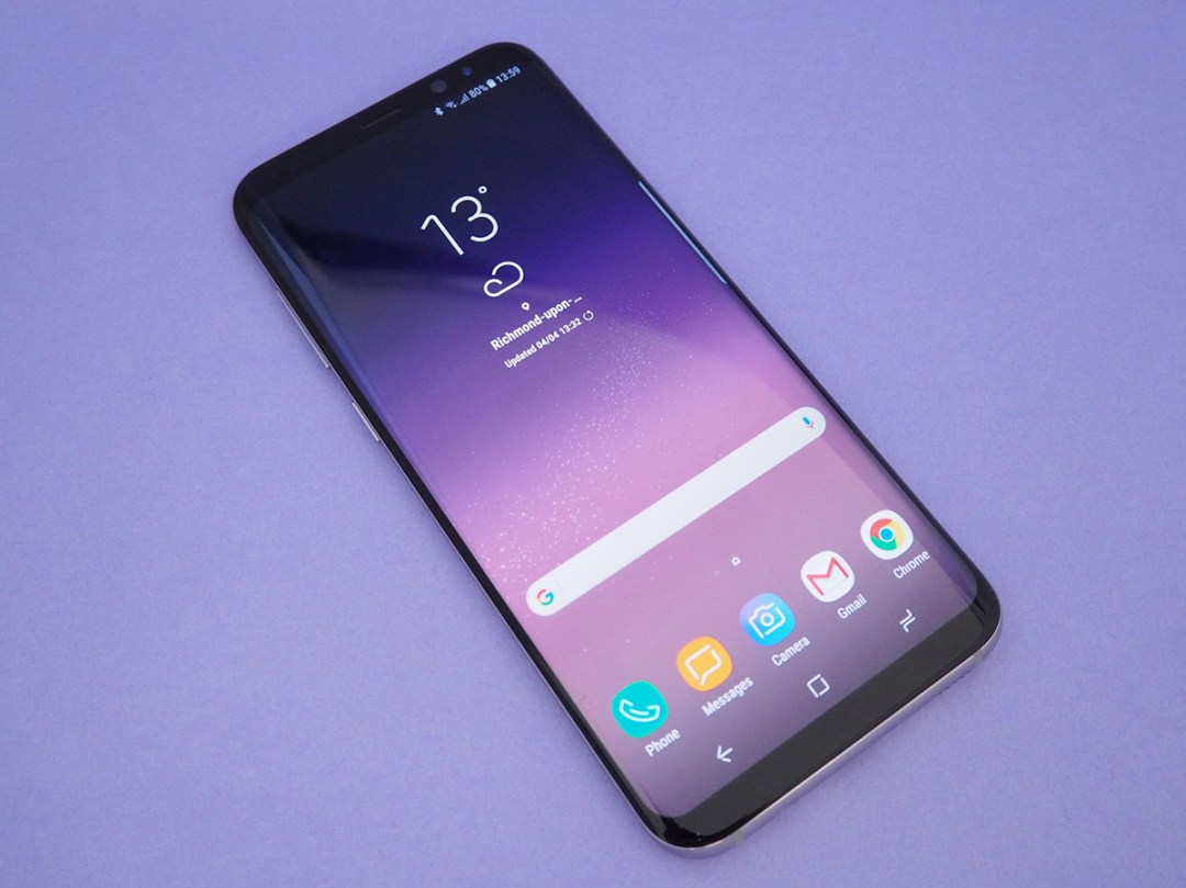
Samsung has done more than refine the design: it has stripped away the bezels and buttons to make room for an eye-catching screen that almost completely fills the front of the phone.
With the display switched off, it’s an inky, slender slab of mystery. Whichever colour you choose, the front of the phone will always be uniformly black – so you can’t tell where the top and bottom bezels end and the display begins.
That screen curves subtly around the sides, too. Nothing else comes close in terms of looks.
A 6.2in phone might sound impossibly tall, but the S8+ is actually around the same height as the 5.5in iPhone 7 Plus, and slim enough to make Apple’s slimmest phone ever look like a fat kid that loves cake.
Samsung’s compact combination of metal and glass might be taller and skinnier than other phones, on account of the odd 18.5:9 aspect ratio, but that just makes the S8+ easier to hold. Even if you’ll still struggle to reach the top of the screen without some serious finger yoga.
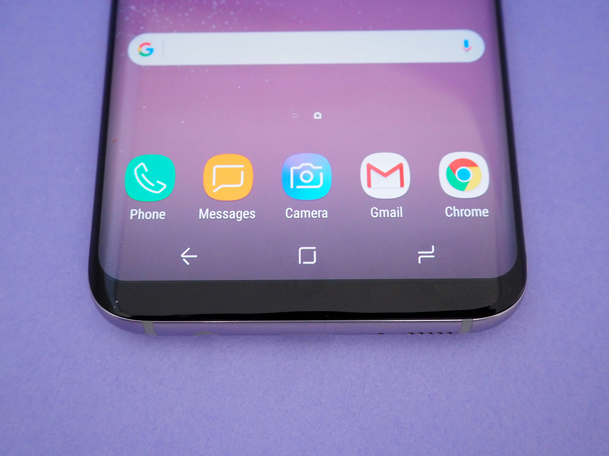
You’ll notice there’s no physical home button – once a hallmark of every Galaxy phone. In its place is a virtual home key, which responds with haptic feedback to let you know you’ve hit the right spot. It might feel a bit odd at first, but like the solid state Home key on the iPhone 7, it won’t take long to adjust.
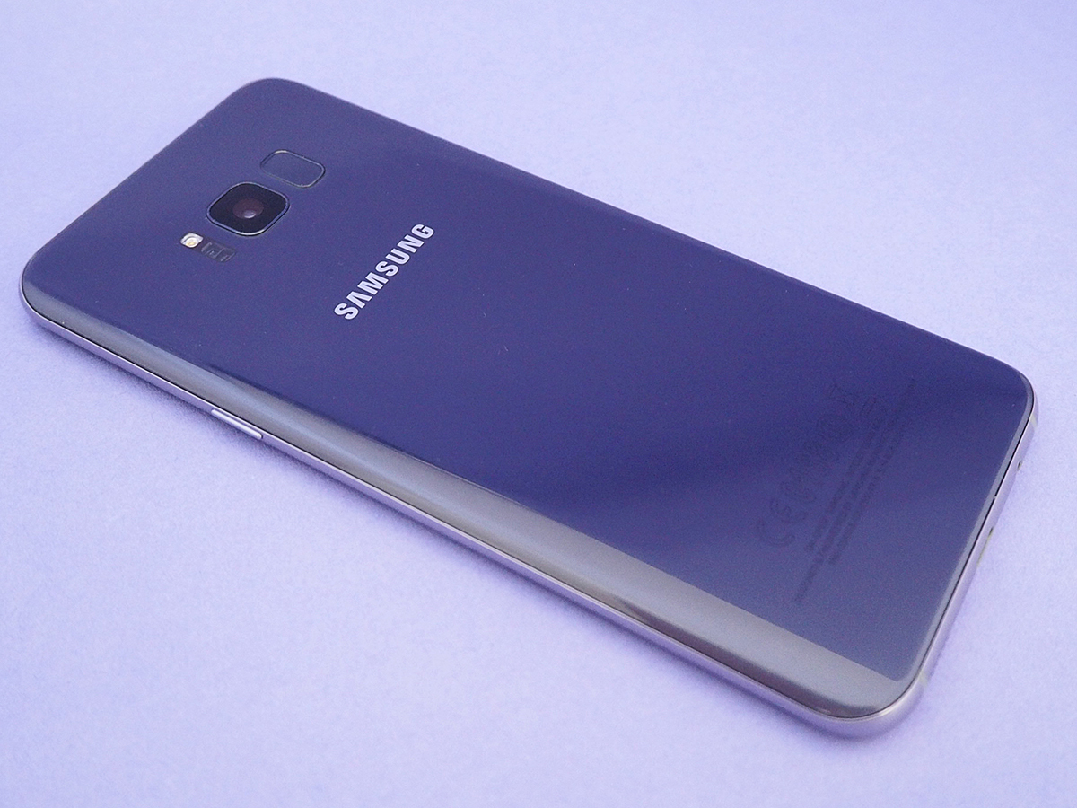
The fingerprint sensor has been forced to the back to make room for those tiny bezels. It sits a little too close to the camera lens, so you’ve got to watch out for smudges and smears showing up in your selfies, but fast, accurate iris scanning means you won’t be using it all that often.
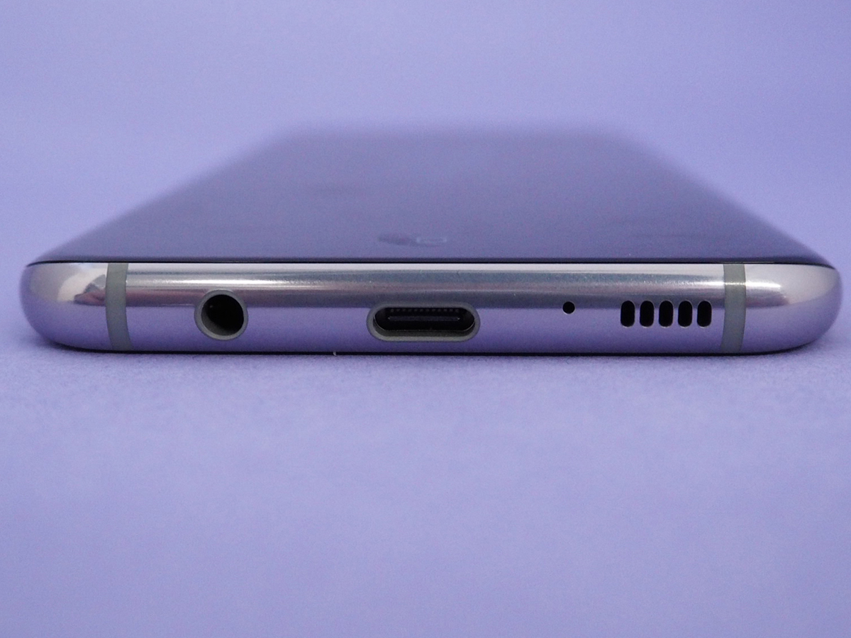
The whole thing is IP68 water-resistant, to survive any accidental dunkings, and there’s room at the bottom for a speaker, reversible USB-C charging port, and a headphone jack. Sorry Apple, Samsung isn’t interested in your cable-free future just yet.
UPDATE: 09 June 2017


