Samsung Galaxy S4 review
Think HTC’s beautifully crafted One is untouchable? How about a Full HD Samsung flagship supercharged with zero-touch tech?
You’d think Samsung’s gameplan for this year would be pretty simple after shifting more than 50 million Galaxy S3s. Make last year’s stonkingly successful phone slightly bigger and slightly better, sell bucketloads, then kick back and blow raspberries at the competition until 2014 rolls around.
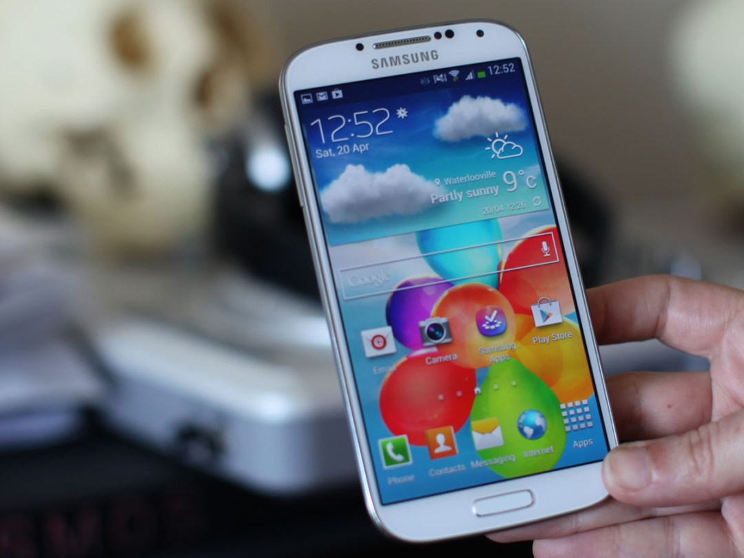
At first glance, it looks as though that’s exactly what Samsung has done: the Galaxy S4 looks almost identical to the Galaxy S3 (until you get them up close), leaving more than a few fans of the gorgeous Xperia Z, HTC One and iPhone builds bitter, tearful and with one eye on an incoming metal Galaxy Note 3.
But there’s more than meets the eye here. On top of the mandatory 2013 checklist of a big Full HD screen, quad-core Snapdragon chip and 13MP cam, we also get a stampede of snappily named new features and a promise that the S4 contains everything we never knew we needed in a smartphone.
Things like an octo-core chip that’s so advanced and rare that only 30 per cent of the handsets that hit the market will actually have it, and as yet there’s no information on where that 30 per cent might turn up. Every Galaxy S4 does at least get Air Gestures and the eye-tracking Smart Scroll for touch-free operation, plus Dual Shot, Eraser Shot and Drama Shot baked into the new camera and S Health and S Travel for your extra-curricular geek activities.
Even before the S4 was official it was being pitted against the superb HTC One on the essential specs alone. Now that it’s actually here it’s time to find out whether Samsung’s gamble on gadget innovation has paid off, and whether its single-minded determination to take the smartphone top spot will be rewarded. In short, is this the best phone you can buy right now?
More like this: Samsung Galaxy S4 Active hands-on review
design and build – If it ain’t broke…


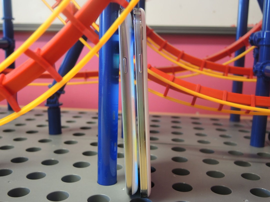
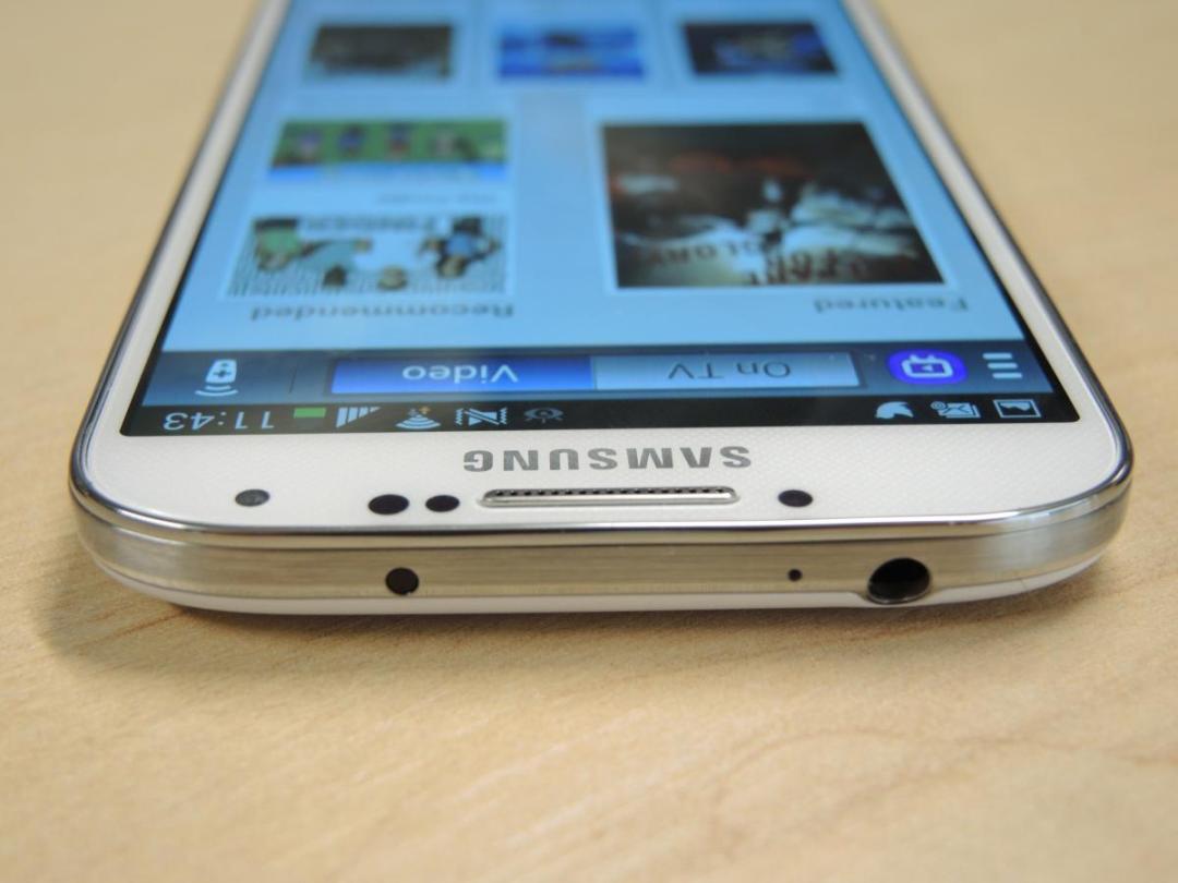
Hands-on snaps and press shots have already given away the spoiler that the one area Samsung hasn’t been quite as radical as its rivals is in the design. The Galaxy S4 may not have struck out from Samsung’s stubborn “Plastic 4 Life” design principles, but that doesn’t mean this is a carbon copy of the S3.
The difference in the dimensions between the two handsets is barely noticeable, with the S4 actually arriving with a slimmer figure than its predecessor despite containing a bigger battery. In the hand the S3 and S4 do feel very similar, although we actually slightly prefer the S3’s curvier form for one-handed use. What’s really impressive is that Samsung has managed to squeeze a 5in screen onto the front of the S4 without increasing the girth, thanks to slimmer bezels that also provide a touch of iPad Mini-style seriousness.
We’re not going to lie, this is still a big phone. Plus, after months of fondling the Sony Xperia Z and HTC One, it’s clear that it’s easier to forgive the occasional stretch of your thumb to reach an icon or a shuffle of the handset in two hands to type a message if the device you’re holding is a stylish slab of high design, which the Galaxy S4 unfortunately is not.
The S4 is slim and light, yes, but with a creak or two when it flexes and raised areas on the back for the camera and speaker (unlike the uniformly smooth and flat HTC One) it’s still a slightly underwhelming first impression.
Dig a little deeper, though, and there are nuggets to be uncovered. The front-facing camera lens is exceptionally small – as small as the each of the three sensors, in fact – and there’s an IR blaster built into the top edge alongside the headphone jack, which, like the power and volume buttons, retains the position it inhabited on the S3.
That plastic rear may feel a little low tech, but it’s easily taken off to reveal a removable battery and microSD card slot that supports cards up to 64GB in capacity. This is the only 2013 flagship phone to offer these features (you can add 32GB to the Xperia Z via microSD) and this will immediately appeal to power users who want to shove their entire HD movie library onto their smartphone and buy an extra battery for non-stop messaging, gaming and wireless internetting.
screen and sound – eye-widening Full HD
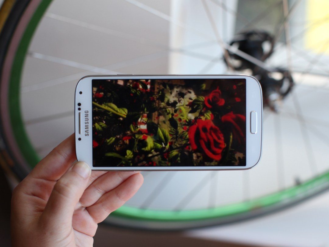
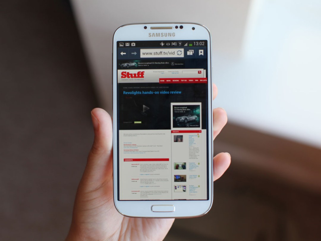
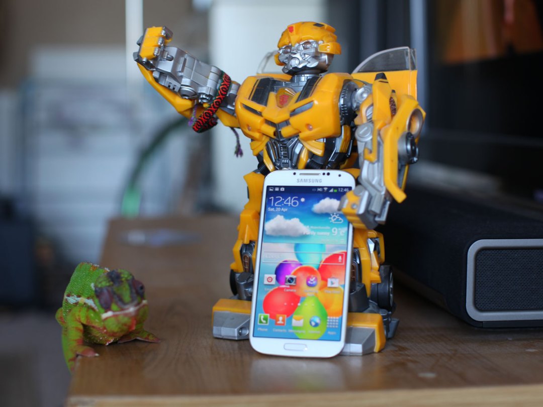
A bigger screen, higher resolution and an upgrade to Gorilla Glass 3 is only what you’d expect from a modern-day flagship phone, but the S4’s Super AMOLED display bolsters the specs with extra smarts that includes Adapt Display, which automatically adjusts saturation as well as brightness as the ambient lighting conditions change.
That’s not to say the specs don’t matter, mind you, and while the S4’s screen can’t quite match the HTC One’s 468ppi figure, that’s only because it has the same number of pixels stretched over a display that’s 0.3in bigger. There’s no denying it’s an eye-widening spectacle of a screen – the pixels look like they’re sitting right on top of the glass.
In fact, dial it up to full brightness and switch on the Dynamic setting and it’s almost retina-searing in its vibrancy. Unusually, we found ourselves settling on a brightness setting of less than half. That said, having all that punch available can be very useful when using the phone in bright sunlight.
The increase to 1080p brings with it far sharper, cleaner text that makes the S3 look downright fuzzy by comparison. Contrast is excellent, too, although side-by-side with the HTC the S4 appears to have a slight blue tinge, with the One throwing up purer whites on webpages.
We’d recommend familiarising yourself with the Screen Modes section in Settings, too, as left to its own devices the S4 can overcook skintones and leave your favourite Planet Earth episodes looking like they’ve been filmed on Pandora. The Standard, Professional Photo and Movie modes are all preferable to Dynamic. As for Adapt Display, it’s so subtle we saw no real difference whether it was turned on or off.
In terms of the S4 pumping movies to your telly box, you’re amply provided for with the MHL 2.0 (mobile high-definition link) wired standard as well as being able to toggle screen mirroring and DLNA sharing to scan for compatible devices.
The single speaker on the back goes much louder and actually sounds better than that of the average smartphone, but for serious listening headphones are really the only way to go. Plug some in (preferably not the ones in the box, as they’re not much cop) and the sound you get is smooth and open, although not quite as clear and punchy as the presentation from the HTC One.
OS – Android Jelly Bean and TouchWiz
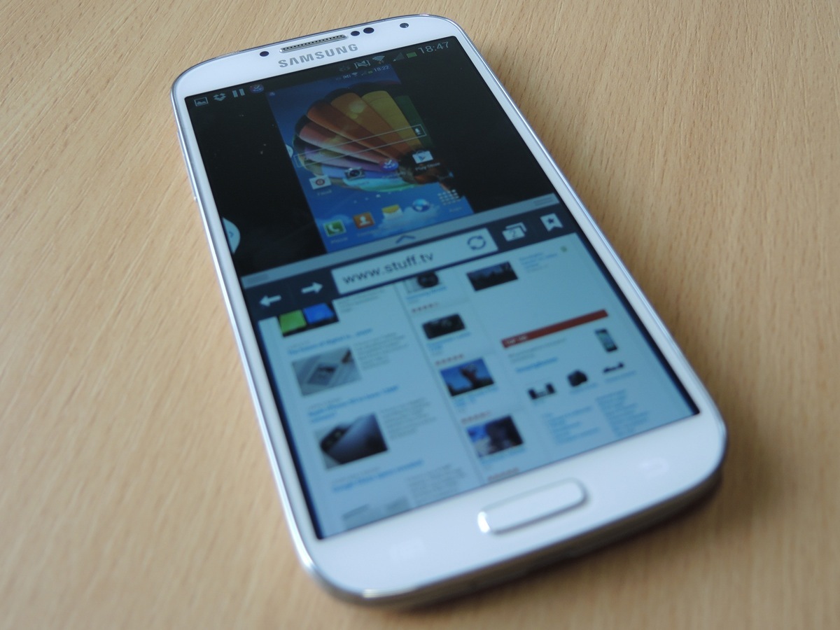
Samsung’s really gone to town here, absolutely packing its TouchWiz-skinned version of Jelly Bean with features, widgets and apps, not to mention gesture controls.
Launching with Android 4.2.2 out of the box is a small coup for starters, especially considering the One hasn’t had the official update yet, but truth be told there aren’t many standout features of the latest incremental improvement.
TouchWiz remains a little bloated compared to fuss-free stock Android, but Samsung’s done some really interesting things with the place since we last visited, and if you don’t like lively widgets like the S Travel TripAdvisor collaboration (although we’re rather partial), they can always be trashed.
We think the good-looking WatchON EPG is well worth sticking to your homescreen. It asks you for viewing preferences and your TV provider (Sky, Virgin, etc) before pulling in info and images to match so you can surf your goggle box options without interrupting what you’re currently watching. With the IR blaster, you can hit the Watch on TV button and your S4 will tune your flatscreen to the required channel.
With health tracking as popular as it now is it’s little surprise that Samsung is also pushing its own S Health suite. Pedometer apps are 10-a-penny on Google Play but none come close to this neat and addictive app’s sheer usability. There are various widgets to stick on your homescreens for encouragement, and once you dive in you’ll find a health board for calorie burning and consuming goals, food inputting tools, your step counting progress and a temperature and humidity graphic.
The pedometer keeps running continuously once started, so no steps are wasted, and if you’re not keen on strapping the S4 to your arm for your evening jog you can pick up the S Band, which tracks miles clocked and calories burned. We haven’t been able to play with it yet but it seems a tidy solution if you commit to the S Health system.
Air Gestures and Smart Screen
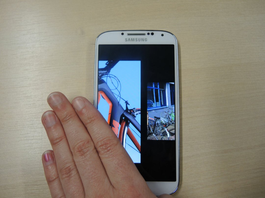
So how about the Galaxy S4’s apparent pièces de résistance, the Air Gestures and Smart Screen controls? Do they usher in a revolutionary new era of touch-free gadget operation, or are they simply gimmicks? Perhaps it’s no surprise to find they’re a little bit of both.
Take Air Gestures, which lets you scroll up and down pages and swipe between tabs by waving your hand over the screen. This could be really handy in the kitchen when your hands are covered in barbecue sauce, or when your touchscreen isn’t playing nice with your gloves, but in practice it’s only available in a handful of apps, it makes you look rather daft, and it’s a bit too hit-and-miss to be used for anything but those times that you really can’t touch your phone. That said, put in the practice and scrolling down web pages and through your galleries is satisfying when you’re not in a rush and reliable enough for geeky showing off sessions.
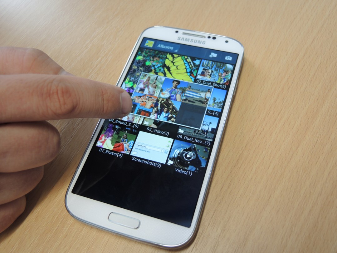
Air View involves less flamboyant gestures so will inevitably get more use. Borrowed from the Galaxy Note 2, the sensor tracks your finger hovering over video timelines, emails and gallery folders and brings up small previews of the contents. It works 2cm to 3cm away in our experience (unlike wafting Gestures, which can be up to 7cm away) and if you turn on haptic feedback (and your imagination) it feels a little like you’ve got superpowers.
Finally there’s Smart Screen, the eye-tracking tech that automatically scrolls down pages as you read and pauses videos if you look away. As with Air Gestures it’s a bit patchy in practice, but if you’re patient with Smart Scroll’s blinking eye animation, (almost) hands-free browsing, helped by tilting the S4 as you read and the S4 tracking your eyes, can be smooth and somewhat relaxing. Smart Pause, on the other hand, works only half the time – and don’t sit in front of a window the first time you show it to your mates because chances are it won’t work.
Since most of these controls are only compatible with Samsung apps, their appeal is limited. But if you’re willing to put the time in to learn a new way of communicating with your device, you’ll be rewarded with a geekier, techier – although often slower – way of controlling the S4.
performance and battery life – Missing: an octo-core chip
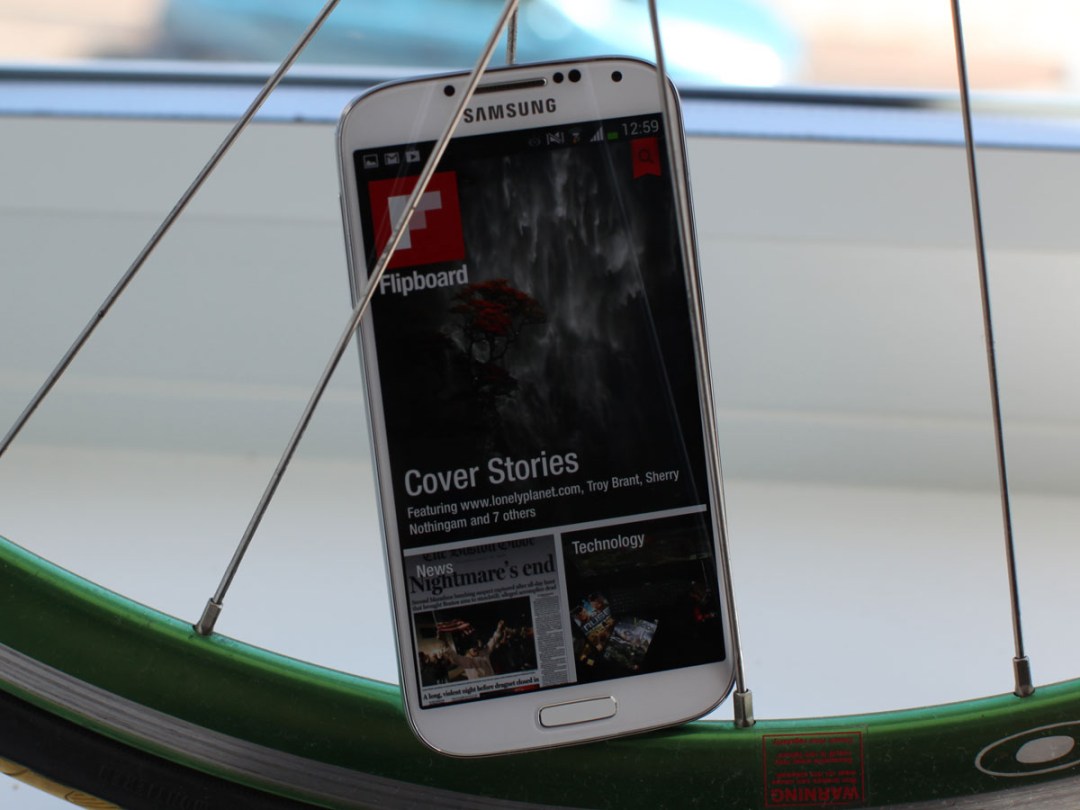
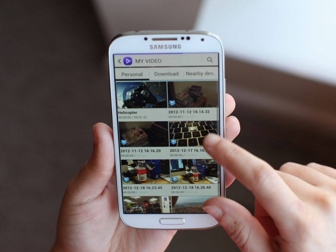
Like the majority of buyers, it’s the Qualcomm 1.9GHz Snapdragon 600 version of the Galaxy S4 that we’ve been testing, rather than the octo-core Exynos beast that only a lucky few will be able to lay their hands on.
The Snapdragon still has plenty of horsepower, of course, and as expected gaming, multi-tasking and browsing over 4G (with an EE Sim) is lightning quick, even with us piling apps in and out of its splitscreen Multi-Window feature to try to fluster it. Apps download quickly over Wi-Fi, too, and on a web browser quick draw, the S4 just pips the HTC One for loading times.
But bizarrely we have encountered a fair amount of lag during testing. Simple things such as moving around homescreens, bringing up the SwiftKey-infused keyboard and opening and closing the Gallery app have caused a touch of unsightly stutter.
We’re told by Samsung that an imminent software update will iron out some of those kinks and we’ll update this review when it’s been loaded onto our review unit. We’d expect this to give TouchWiz the pep talk it needs to run as slippery smooth as Team Stuff gliding down a Slip’N’Slide, but we’ll have to wait to be sure.
As we’re sure many Stuff readers will know, being an all-singing, all-dancing supernova requires oodles of energy, and with a 2600mAh battery that’s 25 per cent bigger than the S3’s we were excited to see if the S4 could match its predecessor’s stamina.
In reality it doesn’t quite manage it, though. While the Galaxy S4 will last you the day on a single charge, that 5in screen sucks power like an out-of-control Dyson sucks up loose change. On a video rundown test, it drained just as much juice at half brightness with Wi-Fi turned on as the HTC One. Considering that the HTC needs nightly charges and we’ve seen the low battery alert many times during our first few days with the S4, we’d wager that power users will have to find brightness or push notification compromises.
Benchmarks
camera – 13MP party tricks
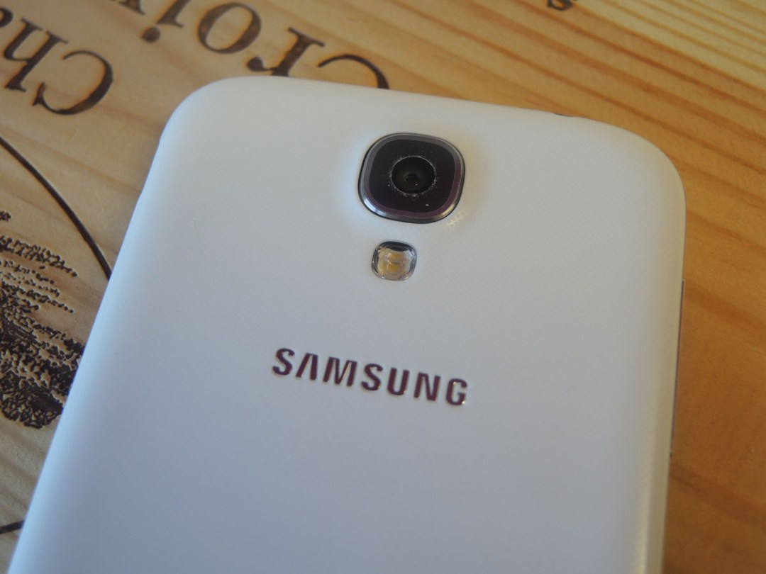
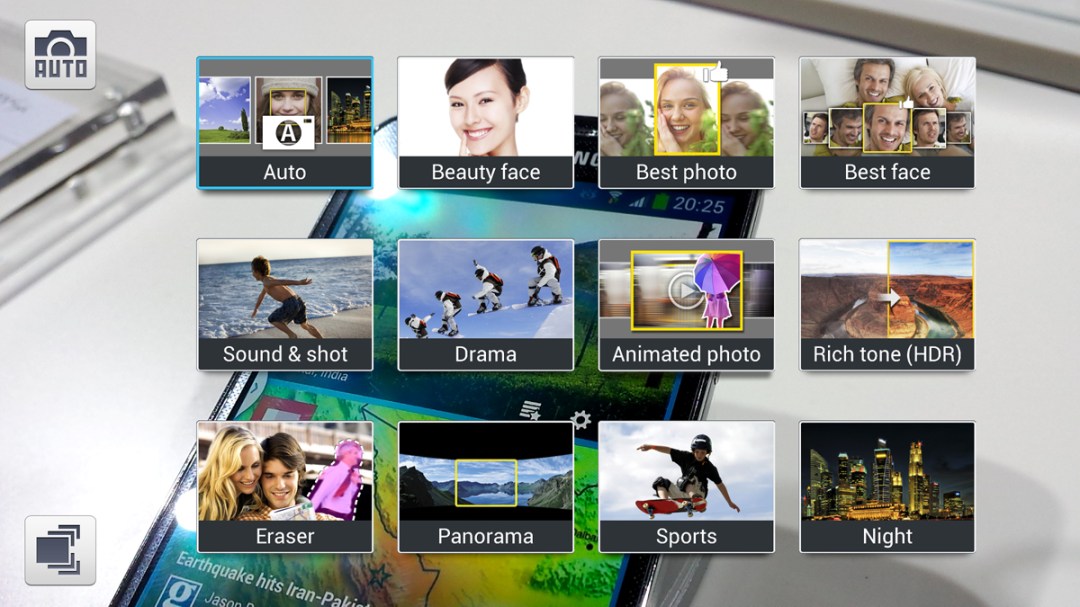
With features such as Dual Shot, Samsung hasn’t missed an opportunity to get you more involved with the S4, even as part of the reworked camera. It lets you take a snap with the front-facing 2MP camera at the same time as the 13MP rear snapper takes the main image before popping your face into the scene. A gimmick, sure, but as smartphone cameras creep up in quality and versatility, there’s no harm in having some tricks to try out in the first hour with a new handset. Its counterpart, Dual Video, means you can do the same for video calls – tons more useful and still fun.
This dual camera trickery works well, but the same can’t be said for all of the S4 camera’s playful new modes – some borrowed from the Galaxy Camera. Eraser Shot struggled a few times to pick out moving people, so we were left disappointed that we couldn’t get rid of accidental photobombers.
Away from the headline features, the S4’s camera is right up there with the best for accurate colours and incredible detail – at least by smartphone cam standards. It’s also seriously quick, like the S3, so much so that you might not realise you’ve already taken the photo.
You can choose from 4:3 13MP or 9MP 16:9 images (among others), although the options are buried in the settings menu at the top right of the redesigned camera interface, where you’ll also find burst mode, face detection, voice control and more.
While colours captured by the S4 are on the more natural side of the palette, rival cameras such as the HTC can take images with higher levels of contrast, giving colours added oomph. The S4 is also neck-and-neck with the best low-light shooters – whereas the HTC One’s camera picks out more in the dark, it often results in noisy images and the Samsung’s own impressive low-light mode can make for more useful snaps.
Video – of the 1080p variety, of course – is reliably silky from both cameras, but as with stills, as soon as you start zooming around things do get wobbly. Cranking it up to 4x zoom is a definite no-no if you don’t want a bout of sea sickness while you watch your footage back.
verdict
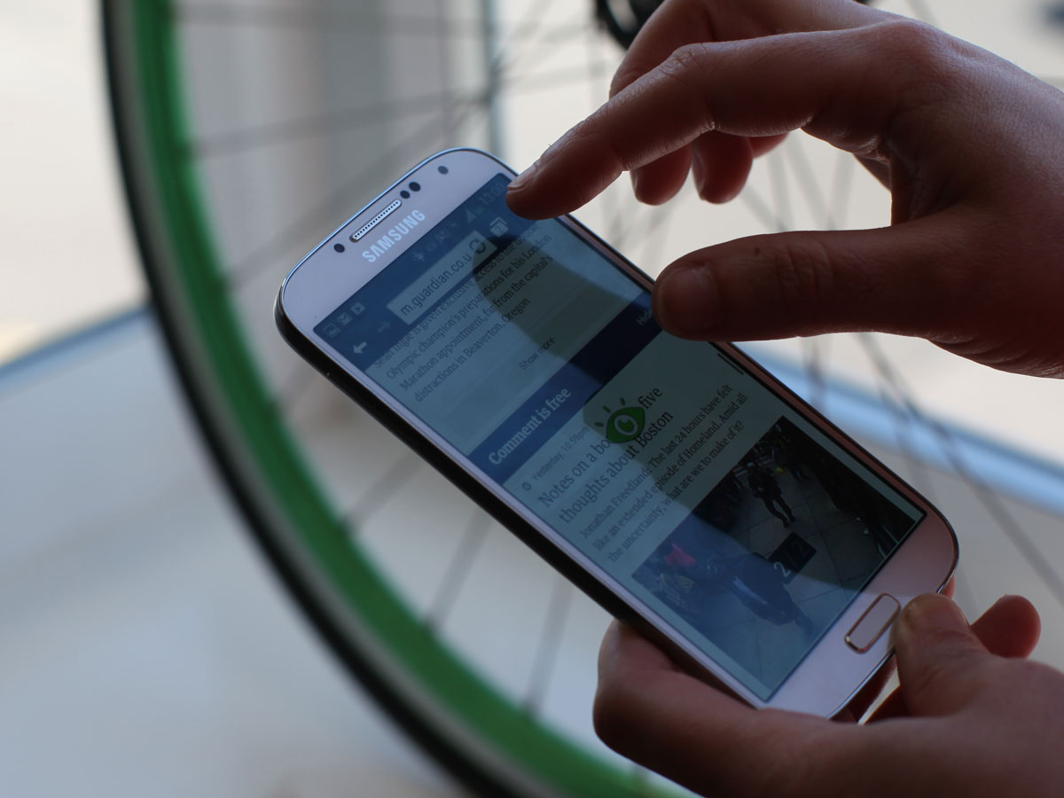
The Galaxy S4 isn’t just a phone, it’s a device that wants to track and train you into becoming a Gadgeteer 2.0. Your eyes, your steps, your surroundings, your swipes: it seems that the S4 is always ready and patting at you to turn on features, stick yourself in photos and finesse the right Air Gestures.
And the more you dive into it (and stay patient with the first-generation of this ambitious tech) the more rewarding the S4 becomes. Seriously, at times you’ll wish you could high five your phone, although at others you’ll find yourself taking the easy route and prodding the screen rather than taking the time to consider whether you’ve already got the Air features turned on and whether they’re compatible with the app you’re running.
Let’s remember that these are all extras that you can completely ignore if you want, and if you do the S4 still ticks just about all of the boxes. This is the successor to one of the most popular phones of all time and it’s smarter, faster and sharper-screened. Add the microSD expansion and it’s doing everything the most discerning Android fan could desire.
The fly in the S4 ointment is the HTC One. To us, the all-aluminium design is sleeker, sexier and more sophisticated, and while it sacrifices 0.3in to the Samsung’s 5in screen, the HTC’s display has greater contrast and more accurate colours.
We’re also keen on HTC’s understated Sense UI, which offers a less-intrusive, smoother and zippier user experience than the Galaxy’s TouchWiz. We know that Samsung is always pushing out firmware updates and if those cure the S4’s occasional operational hiccups we’ll revise the review accordingly, but for the time being at least, Samsung will have to make do with third place, now also behind the LG G2, in our Top Ten list of the best smartphones. Be under no illusion, though, the Galaxy S4 is still a fantastic device, and one with tech that paves the way for all future phones.
Review by Sophie Charara
Stuff Says…
Big, smart and sensor-packed, the Galaxy S4 is an eye-widening slab of future tech
Good Stuff
Gutsy and powerful
Lush screen
Bad Stuff
Underwhelming design
New gestures a bit gimmicky


