Ticwatch E review
The Ticwatch proves that budget smartwatches needn't be dumb...

For all of their gadgety strengths, smartwatches still have one big downside – they’re all pretty darn expensive.
What if you want a budget all-rounder to show you whether smartwatches will actually improve your life or get left in the drawer? The Ticwatch E, and its close sibling the Ticwatch S, are the closest things to that so far.
Running Android Wear 2.0, both watches have an impressive list of features for their price, including GPS, heart-rate sensors, Google Assistant, water-resistance (if not water-proofing) and full access to Google Play’s range of apps. Not bad for £200 less than an Apple Watch.
The ‘E’ here stands for ‘express’, with the only differences from the Ticwatch ‘Sport’ being the latter’s screen bezel and superior GPS accuracy.
So what is the Express skimping on? And what was it like to live with for two weeks?
Design: Simpler times
If you were going to slot the Tic E watch into any sort of fashion trend, you’d have to say it’s ‘normcore’.
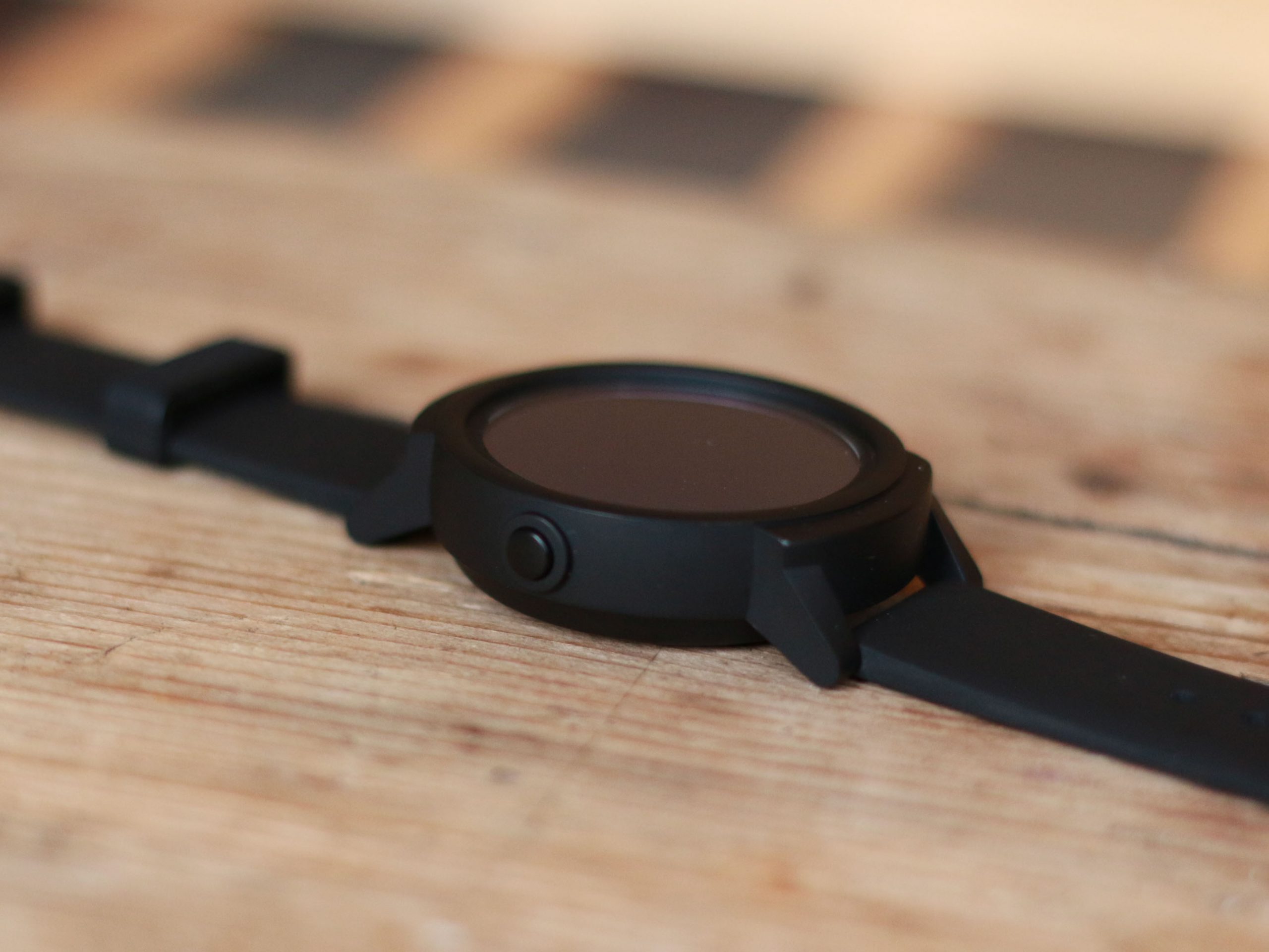
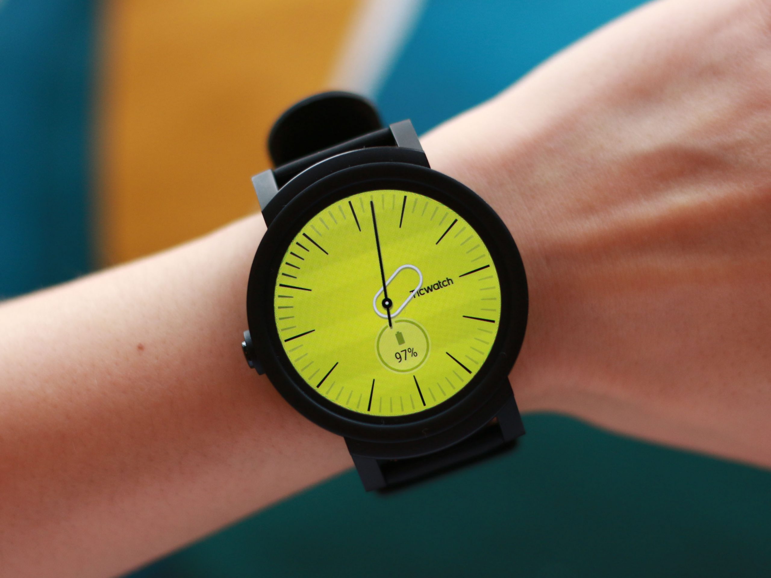
Simple shapes, silicon strap, plasticky face – but not necessarily cheap looking. With zero branding, tasteful fonts and icons, it wouldn’t look out of place in the gym, on the common, or even the office. You see, there’s a lot to be said about the safety of banality.
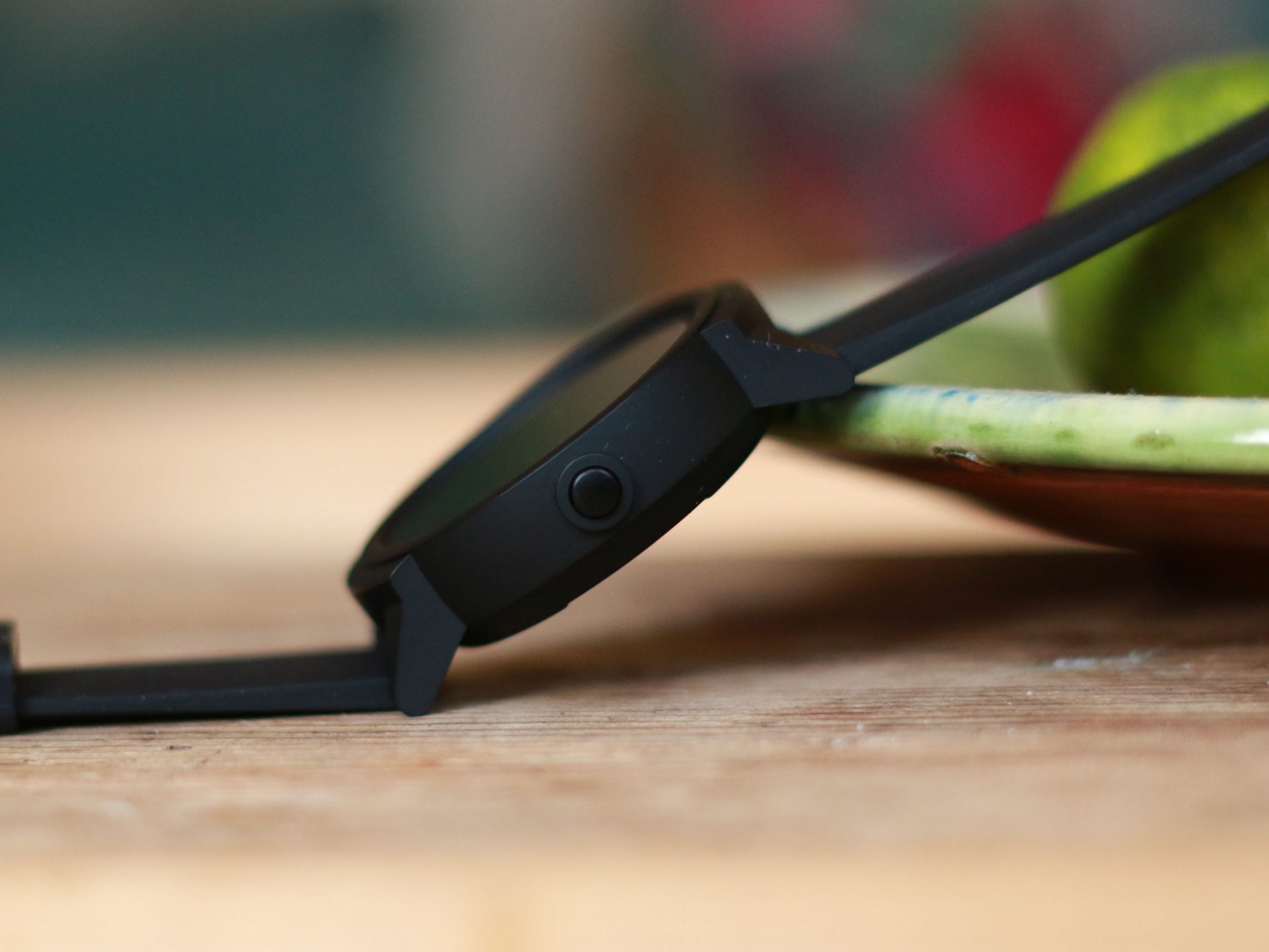
The design is just right. No, it’s not premium, but if this is a watch for both park runs and office calls, it hits the spot. I prefer a watch that looks sturdy and simple, as opposed to chunky and rugged. I was sporting the shadow (black), but it’s also available in yellow and white.
The silicone watch straps are sweat-proof, and for someone with small wrists, I found it a really comfortable fit. There’s a heart-rate sensor is on the back of the face, plus a total of six optional straps (four silicone, two leather) if you want to switcheroo.
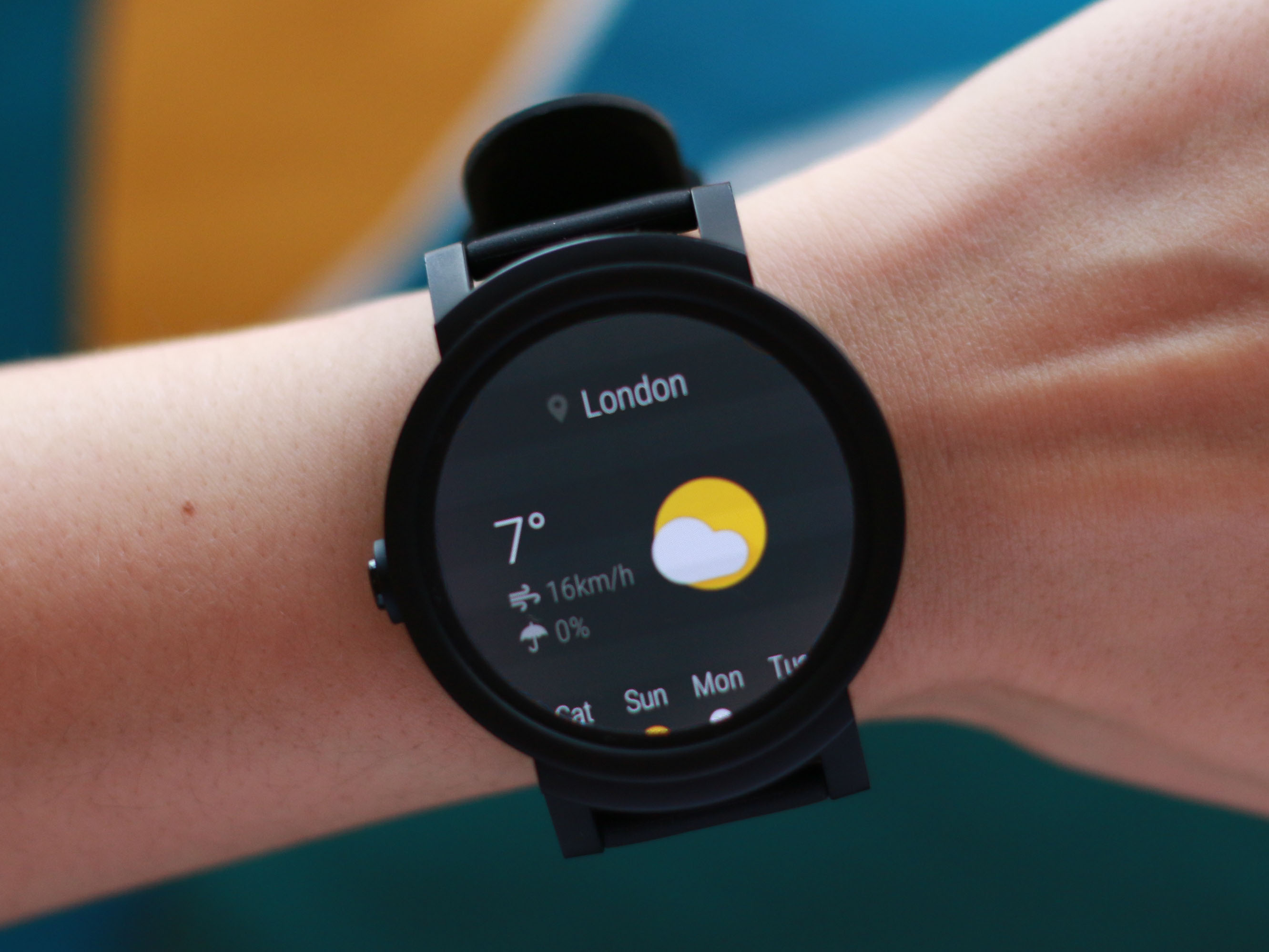
Like most Android Wear watches, there’s only one physical button, with everything else controlled on screen. This 1.4in OLED screen is quite large, making it easy to navigate, and is very responsive. It’s readable in direct light too, but the watch’s brightest setting is a bit overkill inside, so it’s worth whacking down the intensity when indoors.
Features: more than just a budget face
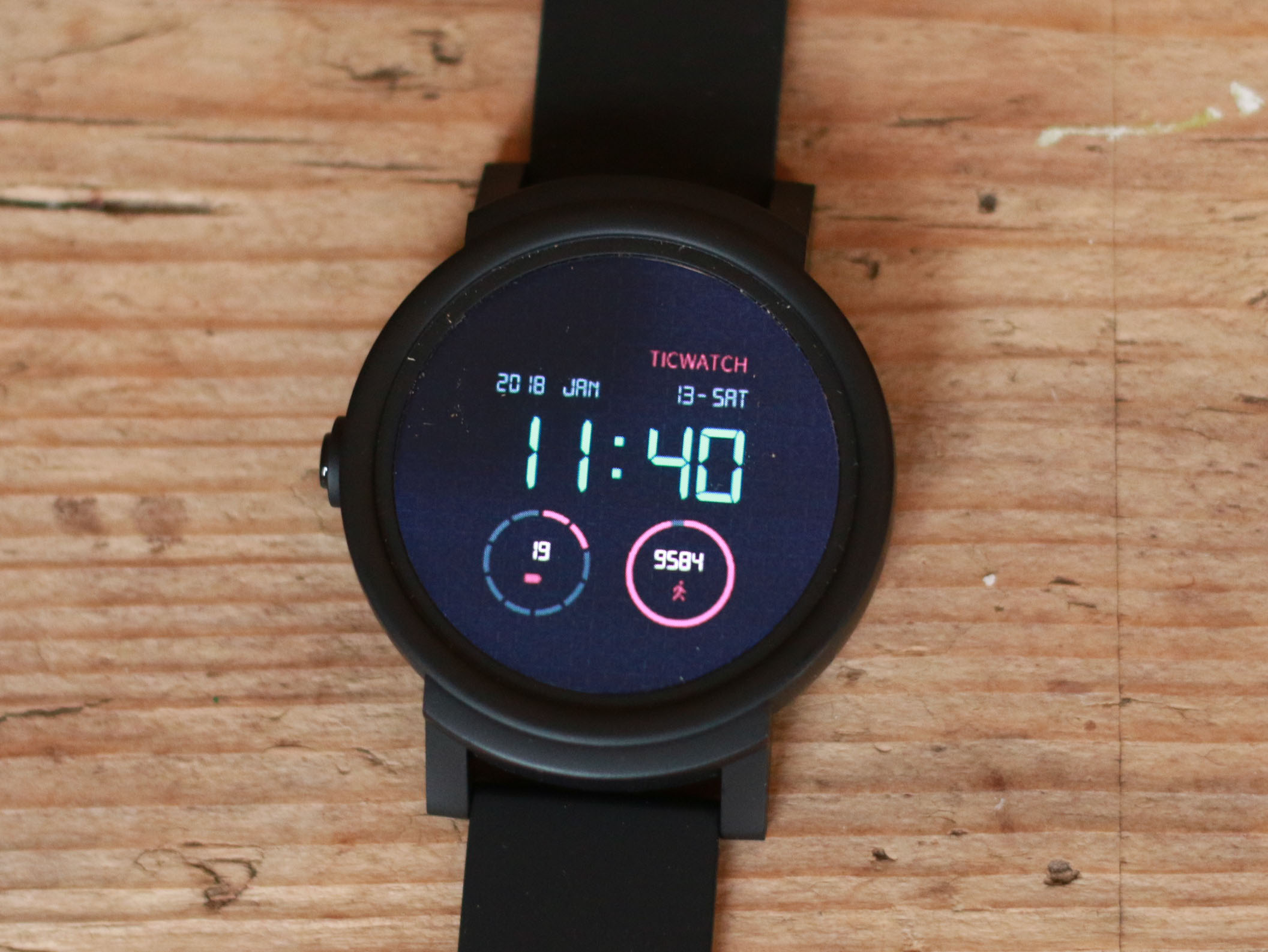
For those bemoaning the boring styling – fear not. TicWatch has designed over 20 extra watch faces. Some are bent more towards fashion, others minic an analogue display, and some are info heavy including; date, daily step count, and even the temperature.
You’re unlikely to need to download more from the Google Play store, but if you’re looking for something in particular, it’s always an option. I favoured the less cluttered faces, because I’m a normcore bore.
Other talents include all the ones you’d expect from Android 2.0, including GPS, music, and notifications with animated icons for every app on your phone. The only major missing feature is Android Pay (due to no NFC), which is a massive shame.
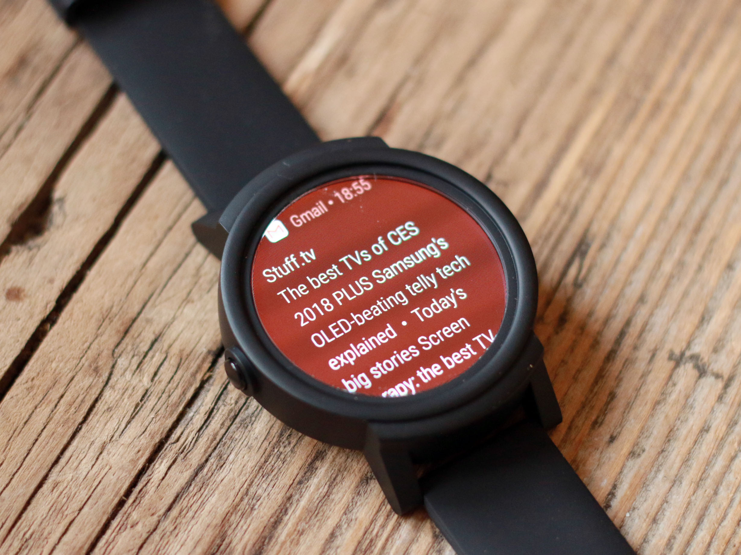
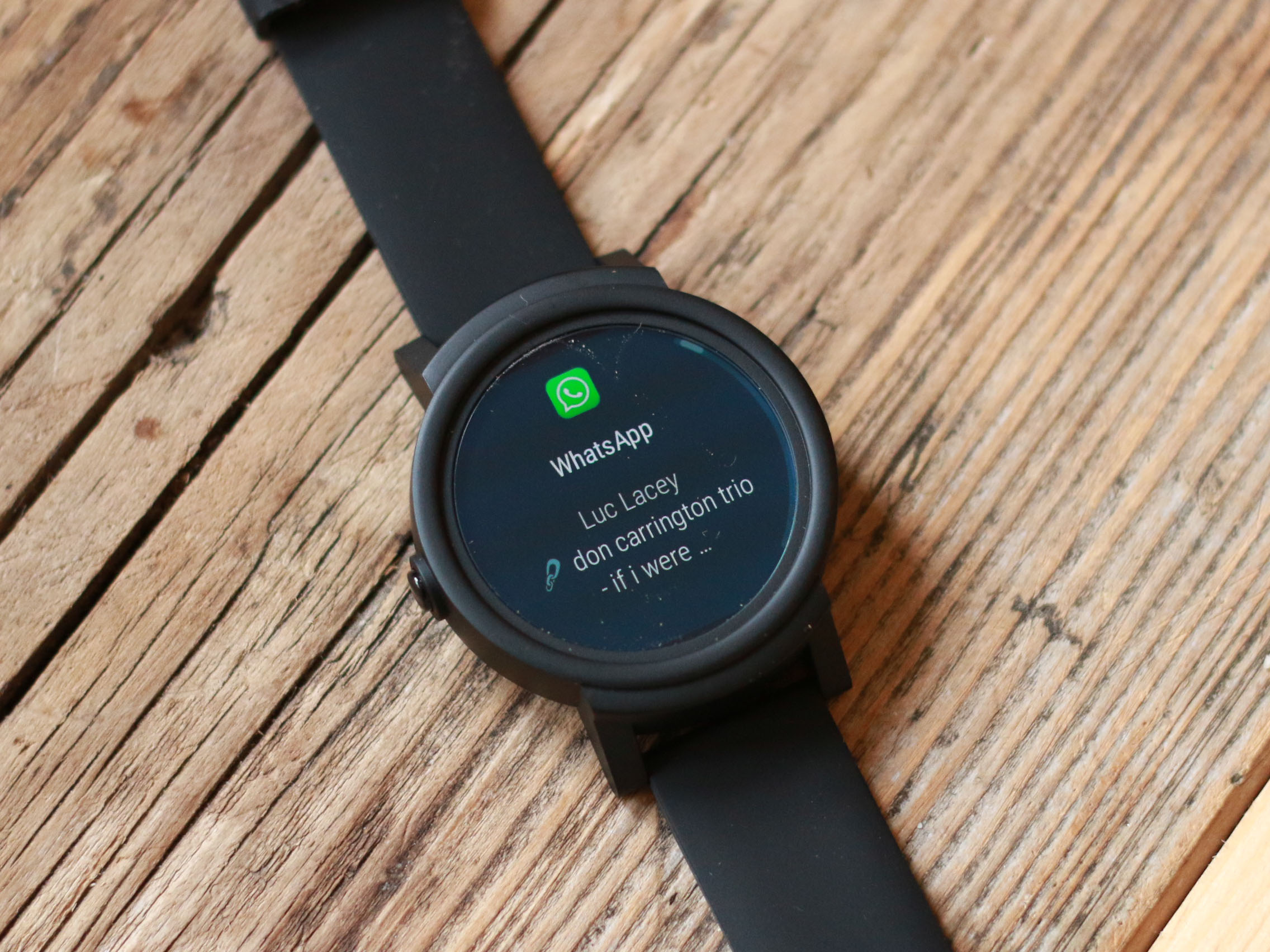
Still, notifications are particularly handy, particularly as you get to see a sizeable chunk of email content on the screen, as well as comments on social media channels.
Mobvoi, the Google-backed Chinese company behind the Ticwatches, has also added a couple of its own apps to the usual Android Wear fare – and the Tic E is all the better for it.
The Ticwatch S might be the designated ‘sport’ model, but the ‘E’ benefits from Mobvoi’s fitness apps too…
Performance: sports casual
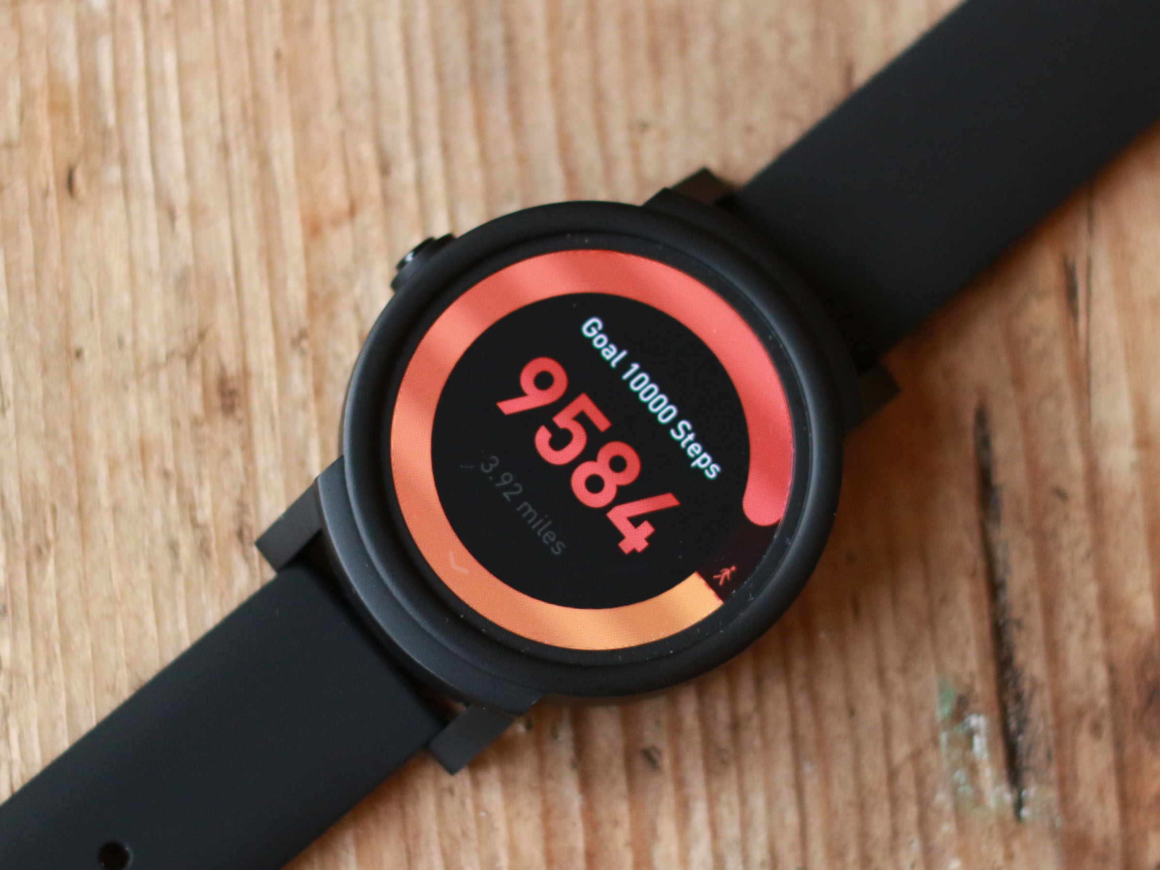
Firstly, there’s Step Ranking, which calculates your daily steps and compares you to other Ticwatch wearers nearby and even sends them encouragement.
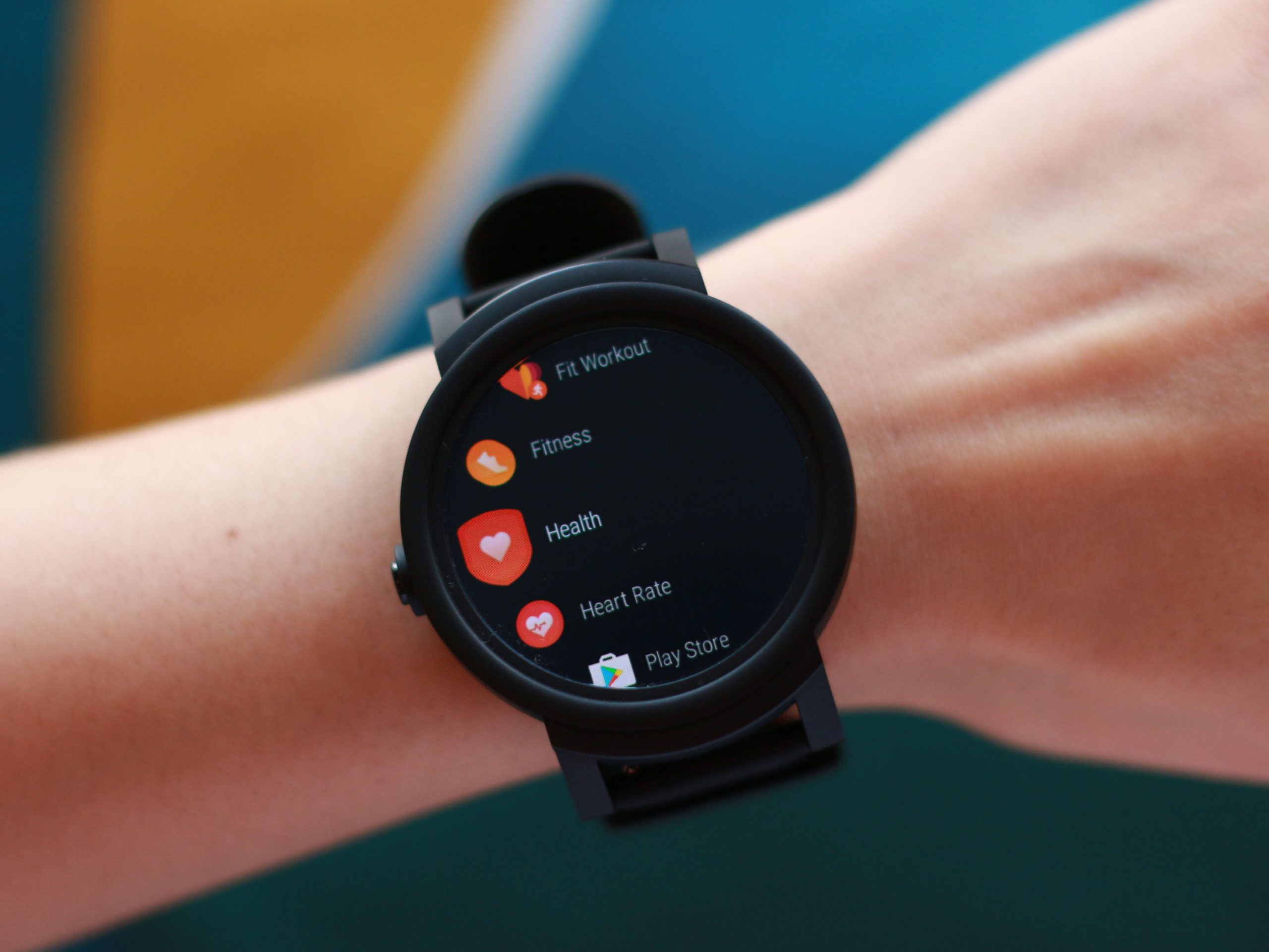
It might sound a tad pointless compared to apps like Strava, but it’s another helpful nudge to keep you moving. While there’s always the option to use Google Fit, I preferred using Mobvoi’s own Fitness app thanks to its simple interface.
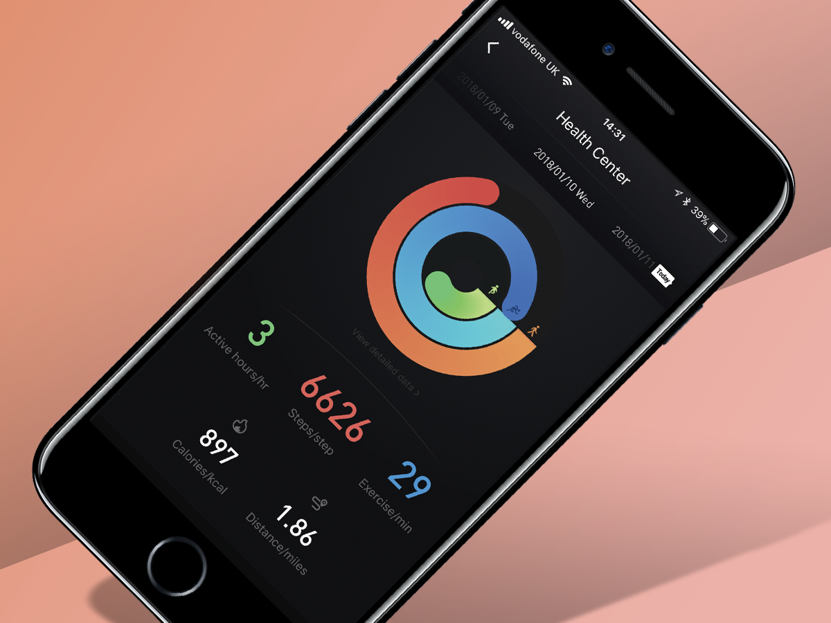
The apps collates all of your data, maps your workout, including heart-rate readings and activities, and will even chart them in strangely familiar, colour-coded swirls – just like Apple’s Rings. For more diligent tracking, you can also log more data such as calorie intake and see how many calories you’ve burned.
The Ticwatch E is no match for a dedicated sports tracker though. It’s only splashproof rather than fully waterproof, so pool dips are a no-no. And the heart-rate monitor isn’t awfully accurate either. It seems to overestimate heart-rate during intense workouts, when compared to the Garmin Forerunner 30 I tried alongside it.
Music playback is also a bit of a mixed bag – despite the 4GB onboard storage, I found Wi-Fi connectivity to be pretty temperamental, which made downloading songs from Google Play Music tricky. The lack of Android Pay holds the Ticwatch E from being a tip-top smartwatch too.
Still, it is a fun, simple entrée to the world of wearables, which meant I was willing to see past these shortcomings.
Battery life: par for a smartwatch
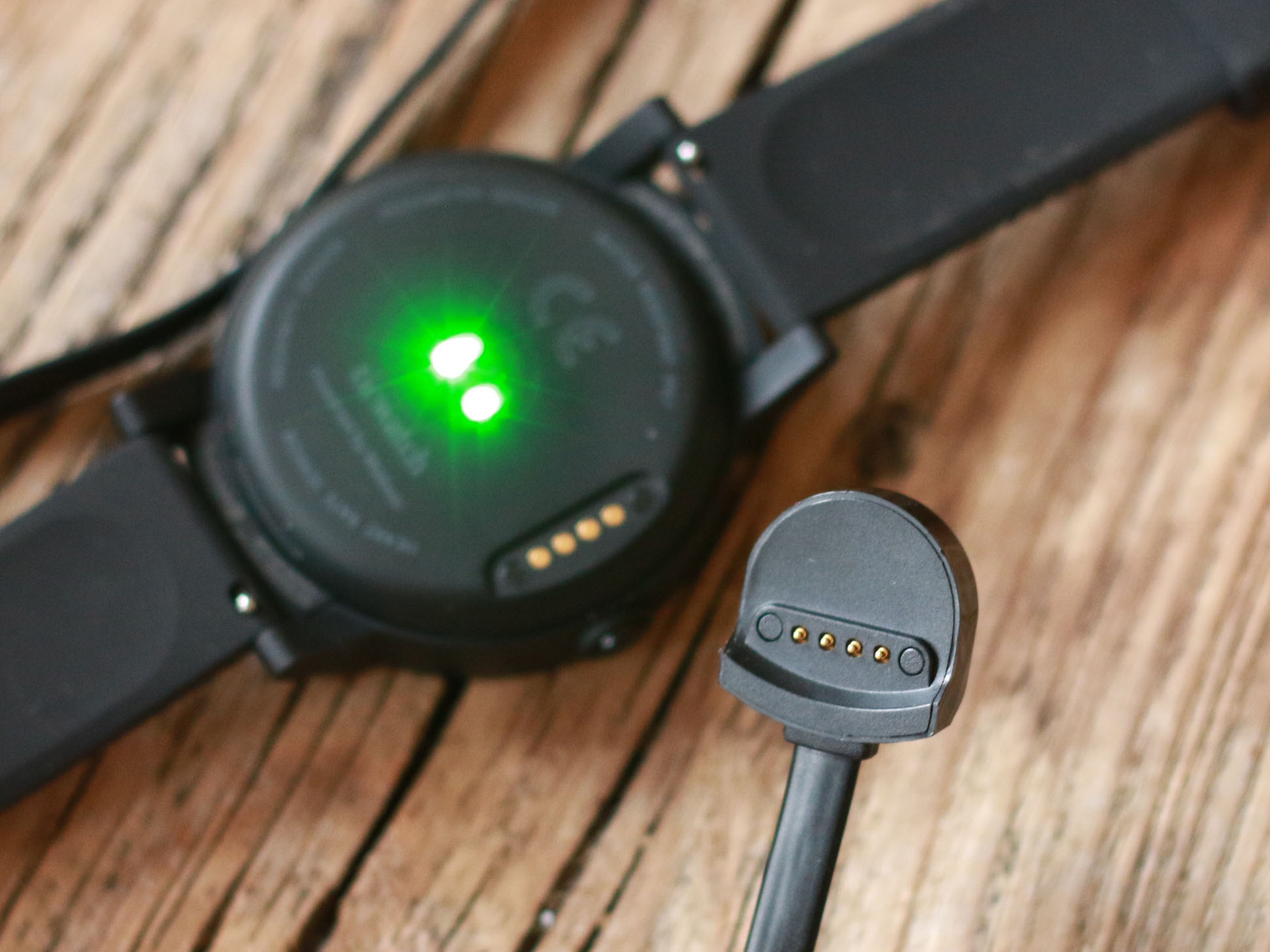
I found the Ticwatch E’s battery to last about one and half days, with quite intense use. It might last two days at a stretch, with less use. I’d recommend nightly charging to avoid battery-induced anxiety.
On the days I was relying quite heavily on Google maps, the watch would be on battery save mode by lights out. Mobvoi claims it’ll stay alive and kicking for 1.5 to 2 days, which is reasonably accurate on a regular day.
Ticwatch E verdict
If, like me, you’re a bit of a smartwatch cynic who’s coming round to the idea of having something that’ll make your life that little bit easier, more organised, more tracked – the Ticwatch E might be for you.
While it’s not a perfect performer, its minimalist design, ease of use and attractive price tag make it a solid first smartwatch for Android or iOS fans.
It doesn’t particularly excel at one thing and is no match for an Apple Watch or Fitbit Ionic for sports tracking. But as an affordable compromise between a smartwatch and fitness motivator, it’s got the edge on the pricier LG Watch Style.
Stuff Says…
It’s far from perfect, but the Ticwatch E has enough charm to make it our pick of the budget smartwatches
Good Stuff
Simple, versatile design
Bright, responsive touchscreen
Good value
Has both GPS and a heart-rate sensor
Bad Stuff
Wi-Fi connectivity can be patchy
No NFC for mobile payments
Needs daily charges
