TomTom Spark 3 review
The best fitness tracker for jamming out while you work up a sweat

Exercising is hard. And painful. And boring.
Sure, you feel great afterwards, but only after you’ve gotten out of your lovely, warm bed and hauled your arse round a cold, muddy park.
Music and podcasts can help with the boredom – if you’re putting yourself through hell, at least have some entertainment while you’re at it. Trouble is, fitness trackers rarely double up as music players.
I’d hoped the Apple Watch Series 2 would be a winner: it’s got GPS, a heart-rate monitor and on-board storage, but it’s hardly the perfect running companion. The GPS chip only works in the Apple Workout or Nike+ Run Club apps, heart-rate monitoring is erratic, and getting music onto the watch is infuriating in that unique way that only iTunes can be.
Everywhere you look, there’s some sort of compromise. We love the Garmin Vivoactive HR, but it lacks the ability to store and play music. The Fitbit Blaze is great, but you can’t take it in the pool.
Enter the TomTom Spark 3 Cardio + Music. It has a GPS chip that tracks all of your activities, then shares them to Strava and Runkeeper. It’s water resistant up to 40m, so it’s fine for a dip in the pool. And it’s got on-board storage for up to 500 songs, plus a pair of Bluetooth headphones in the box.
It sounds like it’s the complete package, but is it the fitness tracker to end all fitness trackers?
SPARK MY INTEREST
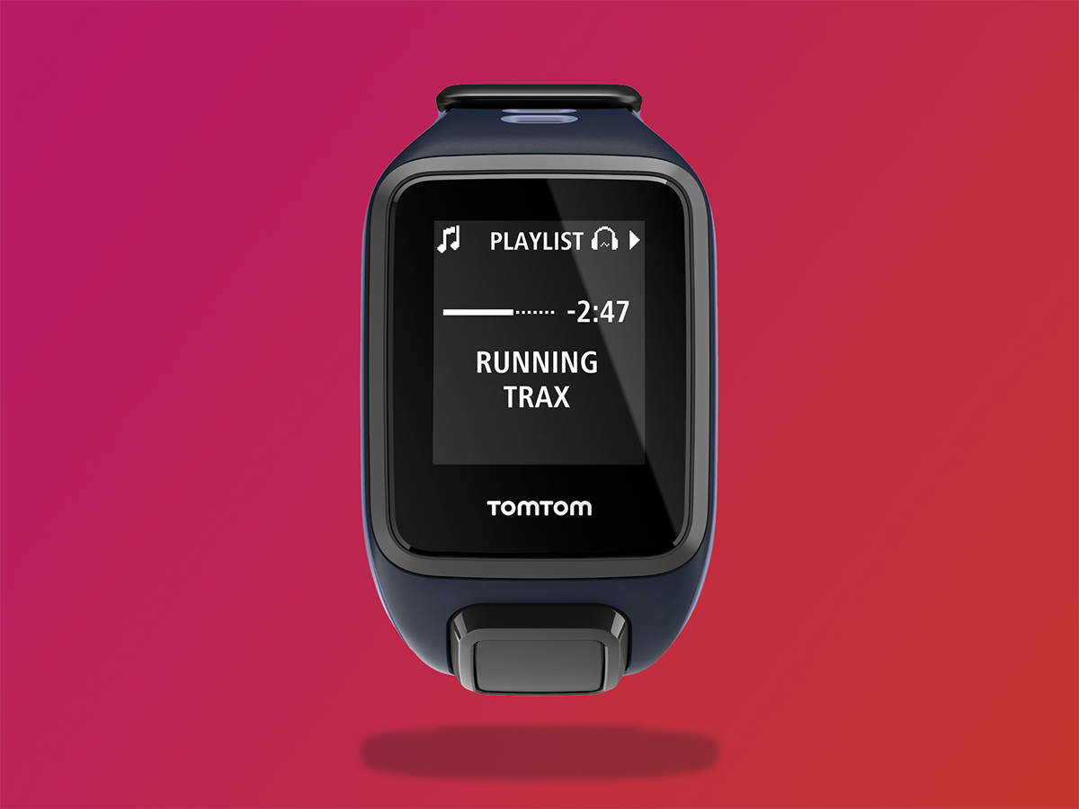
The Spark 3 Cardio + Music sticks a pair of Bluetooth buds in the box along with the watch, but if you’ve already got some, you can save some cash and buy the watch on its lonesome.
Keep in mind the Spark 3 is a fitness tracker, not a smart watch. It’s meant for tracking your activity, not sticking phone notifications on your wrist. There’s no touchscreen, and you can’t use it to pay for your cup of coffee at Starbucks.
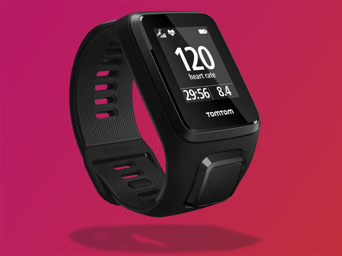
What you get instead is a watch with a simple greyscale display, large battery and robust design – something that feels like it can take a battering whether you’re getting it wet, dirty or both.
There are other advantages to such a simple design. While the display feels dated and low-res (144 x 168 pixels), it’s doesn’t drain the battery, meaning that TomTom can claim a three week battery life if you’re just using it as a step tracker. If you’re using GPS, Heart Rate and Music, then you get up to 5 hours on a full charge. In my testing, it was closer to 4.
I went on an hour long run in the morning, followed by an hour-long cycle to and from home, and I was left with 25 per cent battery. I have my phone with me when I cycle though, so could track my cycling on that – if I were to run with the TomTom every day, I could get 2-3 days’ use out of it before needing to charge it.
The Spark 3 is tall and rectangular, so not for those who like watches with round faces. The plastic strap is easy to put on and adjust, although having to remove the watch to charge it is annoying.
The watch isn’t touch-screen, so you interact with it using a four-direction button under the face. Each direction pushes you into a different feature — Up turns on bluetooth and controls music, Left shows you your day’s fitness readings (such as number of steps), Down goes to settings and Right starts your workout.
We wish the display was a bit brighter and that there were customisation options for the watch faces. However, it’s easy to see the important information when you’re running, and the watch vibrates when selecting options, so you always know when you’ve selected something when running. The physical buttons also mean you can work the watch with gloves when it’s cold.
LOCK JAW › JawBone Up3 review
DON’T FORGET LEG DAY
The Spark 3 is all about tracking workouts, and it does this brilliantly. You can use it to track running, cycling and swimming, plus there’s a freestyle option for walking and hiking.
The watch does a fantastic job of tracking these activities using the built-in GPS chip and heart rate monitors. It’s really simple to get out and do whatever routine you like, without needing extra equipment like music players or heart-rate tracking chest straps.
The Spark 3 is particularly suited to runners. You can set specific objectives for each part of your run (such as fat burning), or how many calories you want to burn, or what distance you want to cover.
I really liked being able to track runs on a simple map, which is really handy if you’re running a new route and want to figure out how to get back home. You don’t have to follow your route back exactly – a compass makes sure you’re always heading broadly in the right direction back to where you started.
That feature is cool, but if you’re after more structured training programmes, Garmin or Polar watches offer more than the TomTom Spark 3.
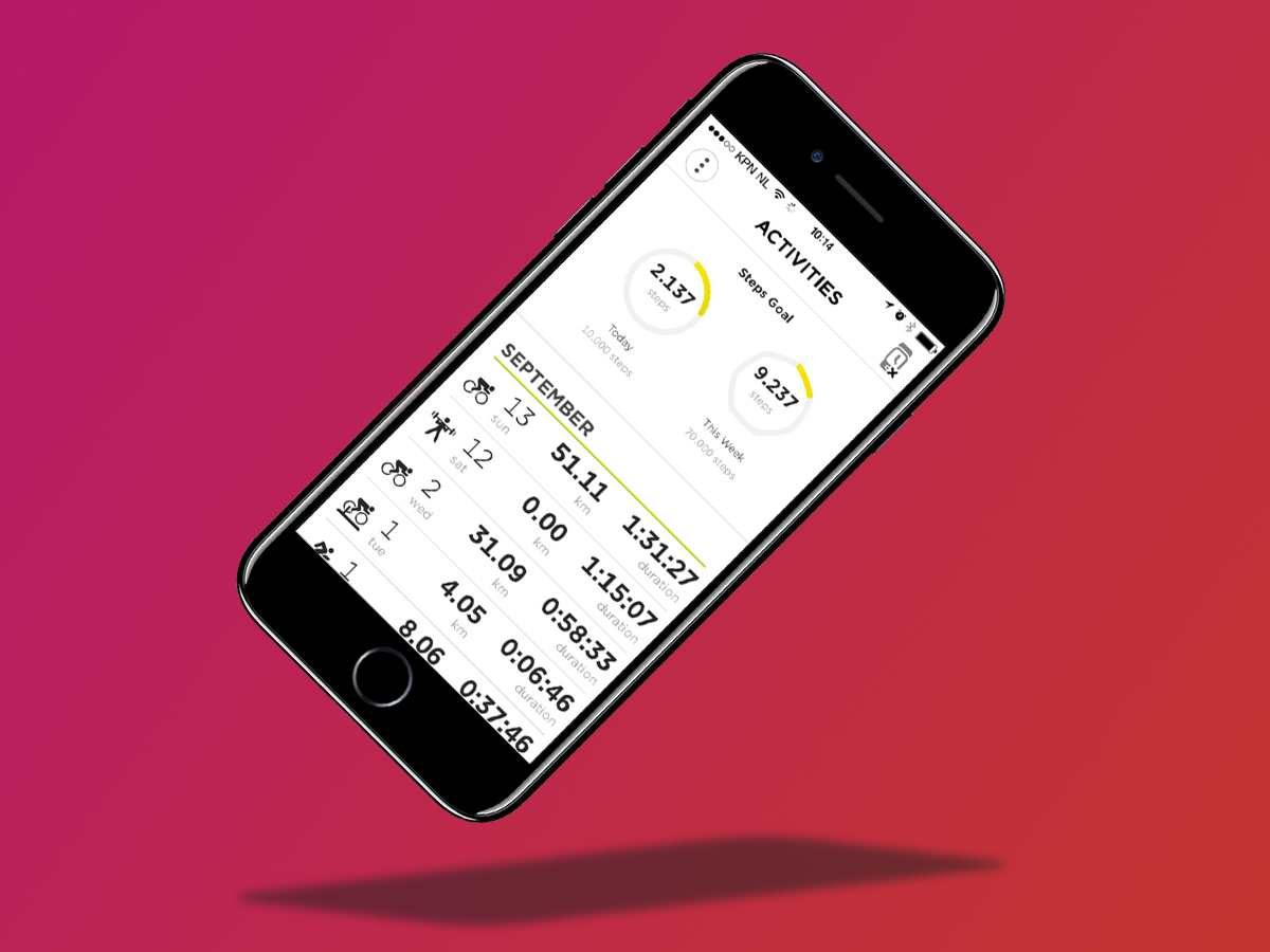
When you return within range of your phone, you can sync up your activities to the TomTom MySports iOS or Android app, or PC or Mac software.
The app keeps track of all of your workout data, including duration, calories burned, heart rate, strides per minute and more, including a map of where you actually ran, but most people are going to want to send it to their activity app of choice such as Nike+, Strava, Endomondo, Runkeeper, MyFitnessPal and many more.
The app makes it easy to connect up all of the popular platforms and share all of this data, which is fantastic for those who take their exercising seriously.
FIGHTING FIT › Fitbit Alta review
RUN TO THE BEAT
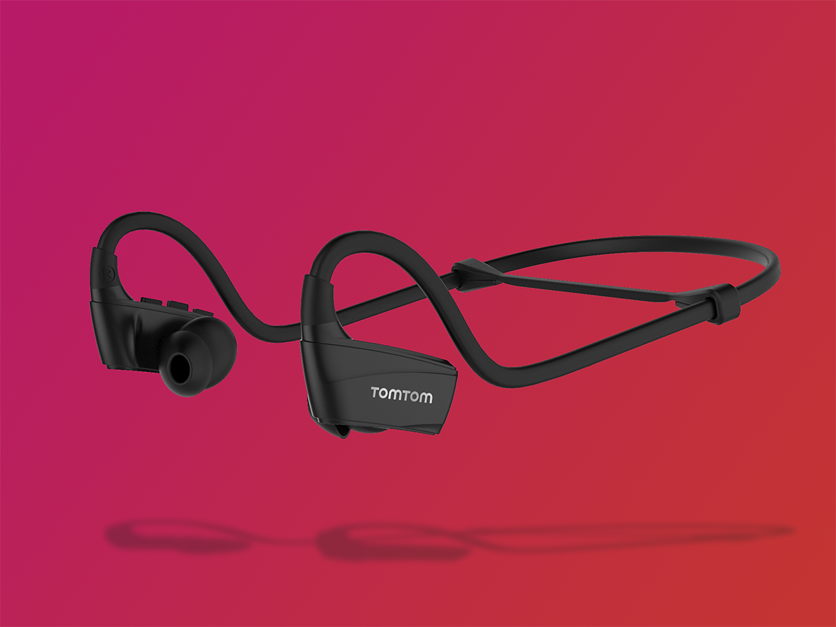
The Spark 3 has enough storage for about 500 songs, but getting them onto your wrist isn’t as simple as we’d like.
First off, you’ve got to do it on a PC or Mac – there’s no way to sync music from your phone to the watch.
You also need to import your tracks from iTunes if you want to create playlists. All my music is sitting on a NAS drive, so it was a royal pain to import albums into iTunes and then pull them into TomTom’s software.
I was hoping to keep it simple by just dragging the files across to the watch when it appeared as a drive in Windows. Do this and the watch was able to play the files, but they’ll be all jumbled, with no way to manually create playlists.
Once you’ve got your music on your watch though, the included headphones work great. In fact, they’re some of the best running headphones I’ve used.
They’re comfortable, sound good, and the audio doesn’t break up as you’re running. They don’t sound as good as the Bose Soundsport Wireless or Beats PowerBeats3 Wireless, but then again they’re £150+ each.
BOX OF TRICKS › Under Armour Healthbox review
TomTom Spark 3 verdict
The Spark 3 aims to be the best fitness tracker on the market, and through a comprehensive combination of features, it just about manages to do it.
It’ll track every sport going (including swimming), has great battery life, and is simple to use. It plays nicely with all the fitness apps you’re probably using already, including Strava and Runkeeper, has great GPS accuracy, and will play music to any Bluetooth headphones.
When we’re so used to fitness trackers that have one or more major flaw, it’s great to see something so comprehensive.
That’s not to say there aren’t any flaws, though. The screen is low-res and could be brighter, removing the watch from the strap to charge is annoying, and we’d have liked some customisation for the watch faces.
Wisely though, TomTom has focussed on the things fitness fans love, like great battery life, robust design and a simple interface. If you like listening to music while running, cycling or swimming, this is the fitness tracker you’ve been waiting for.
Stuff Says…
Built-in GPS tracking, heart-rate monitoring and music playback — the TomTom Spark 3 is all the fitness tracker you’ll ever need.
Good Stuff
Route tracking to find your way home
GPS tracking and music playback
Works with all of the big fitness platforms
Bad Stuff
Lack of customisation
Low-res screen
Removing the watch from its strap to charge is annoying


