HP TouchPad tablet hands-on
We get our mitts on HP's webOS-powered iPad tablet rival

HP has finally lifted the lid on its much-leaked, WebOS-toting TouchPad; and what an exciting announcement it is. Not only is it the company’s first foray into the tablet market, which could potentially mean people finally take notice of its unappreciated WebOS operating system, but more importantly, it’s a viable alternative to the iPad. We were at the launch in San Francisco to get our greasy mitts all over its iPad-baiting 9.7-inch screen. Well, kind of – we weren’t actually allowed to touch it – but here’s what we’ve gleaned so far…
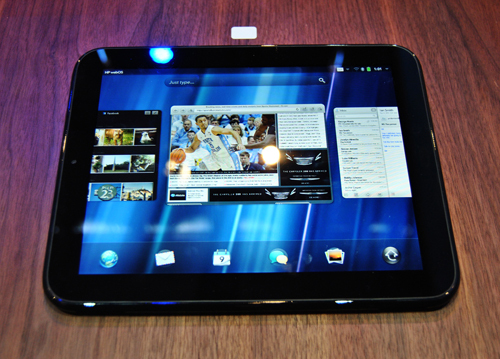
In the flesh, the TouchPad delivers a pleasant picture that’s eminently watchable thanks to bright colour reproduction and a wide viewing angle. Its glossy finish makes for reflective viewing, though, so using it outdoors could prove problematic. With its capacitive display and screen-res of 1,024×768 pixels, it’s on a par with the iPad, but both are trumped by Motorola’s recently announced Xoom, with its eyeball pleasing 1,280×800 pixel display. The screen is also crafted from hardened Gorilla Glass, so if you’re the careless type, it’ll remain injury free.
With almost identical dimensions, it’d be hard not to accuse the TouchPad of copying the current king of tablets, but there are some noticeable differences. It’s slightly heavier at 770g versus the iPad’s 680g, and thicker at 13.7mm; it lacks the iPad’s snazzy aluminium design and it’s much chubbier, sporting volume buttons, a micro-USB port and a pair of stereo speakers with Beats audio support – a tablet first.
WebOS transfers nicely onto the tablet platform, bringing with it some of its neatest tricks that look super-slick on the big screen – like the cards based interface, which stacks related apps together, which can then be be removed with a simple skyward flick, making multitasking a doodle. The OS throws up a smart homescreen system that’s refreshingly simple and more importantly, nothing like the iPhone and its dopplegangers. Best of all, it’s intuitive and feels like a proper tablet OS, not something that’s been rushed and repurposed to keep up with the rest of the market.
Core apps like email, photos, calendar and media player have been optimised to work on the big screen, using that familiar system of panes and collapsing menus. However, only TouchPad specific apps work full screen; existing apps like Twitter and Facebook cannot be maximised, so will only stretch to card size. There are other ways to access your favourite social networks, though; the photo viewer app, for example, allows instant uploading to Facebook with the option to leave comments.
And talking of apps, its app catalogue has a long way to go before it catches up with the likes of Apple’s and Android’s, but its making the effort by forming partnership deals with Time Warner, Last.fm, Rovio (Angry Birds) and Amazon, to name a few.
The brains behind the beauty are provided courtesy of Qualcomm’s Snapdragon dual-core 1.2GHz processor and a dedicated graphics processor, both of which promise excellent overall performance. In practice, the Flash-supporting web browser ran impressively fast, with smooth scrolling, hassle-free video playback, and on the whole, the tablet appeared responsive, even when running a bunch of applications simultaneously. It’s even powerful enough to support 3D gaming, which was demoed using a graphically intensive 3D flight simulator that looked good and, for the most part, ran very smoothly. We noticed a small amount of lag, though, but certainly not enough to doubt its capabilities.
Surprisingly, there’s no dual camera set-up, which is fast becoming the norm for both tablets and smartphones. Instead, there’s just a front-facing 1.2MP shooter for some narcissistic photo-taking action, or probably more useful, video calling. We were given a preview of this during the press conference using a Pre 3 and the TouchPad; it’s hardly groundbreaking stuff, but appeared to work well.
The TouchPad’s Touch and Share feature, which allows you to instantly sync content with a WebOS phone is pretty clever, allowing you to touch your phone to the TouchPad’s sensor, to automatically open the same URL, for example. The Touchpad can also receive and answer your WebOS enabled phone’s texts and phone calls via Bluetooth. Great feature, but safe to say that unless you’re prepared to fully buy into the HP WebOS ecosystem, it’s pretty useless.
Other features include the option to resize the keyboard directly from a contextual menu on the keyboard, which is a nice customization option, we just wonder how often we’ll find ourselves using it.
Battery life appeared to be the only feature HP were reluctant to talk about. A dual-core processor is inevitably going to put a heavy strain on battery life, but by how much, we don’t know.
Early signs suggest the TouchPad has a lot of potential and is good enough to square-up to the competition. But there are many factors working against it, such as pricing, battery life and the development of its app catalogue, which currently stands at around 8000. The Wi-Fi only model will be available in 16 and 32GB flavours across the pond in summer, with 3G and 4G models to follow shortly after. We can only hope the European market gets a look-in shortly after.
Also…
HP TouchPad brings webOS to tablets


